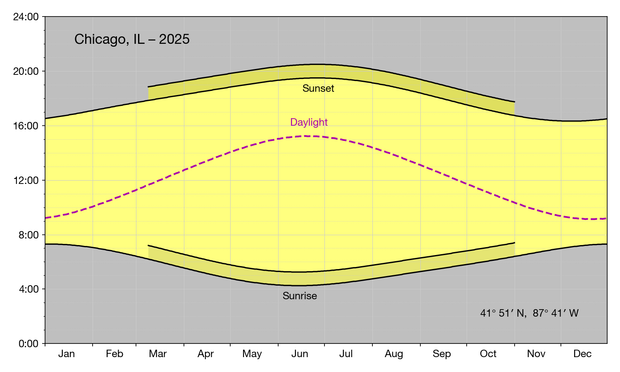
As we approach Daylight Saving Time, I will show this graph again, which I hope explains why I like DST. Call me crazy, but 4 am sunrises just don’t appeal to me. Should I advocate for something that might harm others just because it benefits me? Well, that’s the way the US works now, right?
By the way, this may be my favorite among all the graphs I’ve built. Might be more self-explanatory if I change the “Daylight” label to “Hours of daylight,” but the shorter label has its advantages.
@drdrang Nice graph, and indeed I did not know what Daylight meant until I read this post.
@atlds I know it might be too late for this, but do you think “Daylight Hours” would have triggered recognition? It’s less explicit than “Hours of Daylight” but a little more compact.