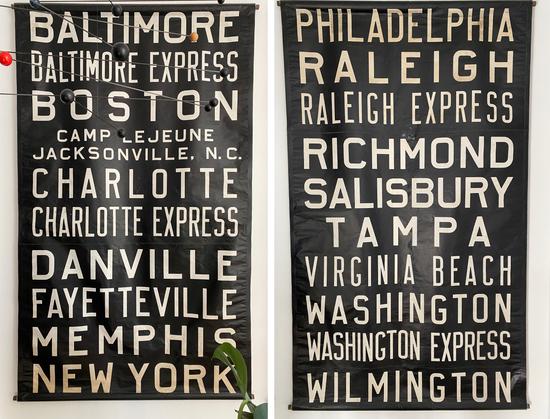
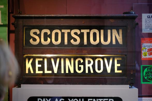
🎉 A new thing I made — Citywide, a sans serif typeface inspired by mid-1900s bus roll signs.

It has some real charm, feeling both informal and buttoned up in the same breath. It’s still a work in progress, but already a large family of widths and weights, plus italics.

Read more about Citywide and bus roll signs, and grab a license: https://shop.jasonsantamaria.com/products/citywide

Citywide

Citywide’s letterforms draw from a bus roll sign I found at a flea market years ago. I’ve probably lost myself staring at that sign everyday since, thinking about how the type system works while trying to puzzle out some of the unusual choices.

I love the little inconsistencies in proportions and strokes across widths, as well as its desire to be unambiguous, large, and legible from a distance.

I originally used this inspiration as a subject to teach myself how to use font making programs. My first run at it a couple years ago was pretty rudimentary, my second was a bit better.

Citywide is my third iteration on the idea, and one I felt good enough about to release. I’m happy with the current milestone, and would love to keep adding to it: lowercase, and maybe more widths and weights.

I hope you enjoy it too ✌️

Also, I know there is so much awfulness to process and try to overcome every damn day. Continuing to make things has been a small light for me, a way to fill my heart and mind up again to deal with everything else. 💜
@jasonsantamaria This looks amazing! Can’t wait to try it out. 😄
@jasonsantamaria Wow, great find, they don’t make them like this anymore! Very nice you turned it into a typeface!
@martinmajoor I catch myself just staring at these shapes constantly! Thank you 🙌
@jasonsantamaria Congrats on the font, it's very beautiful! I had a similar experience when I was in a museum in Glasgow a few years ago, where I took this photo. Thank you for reminding me!