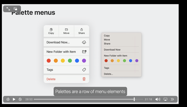
Why does iOS (a platform where bringing up a context menu requires a clunky press-and-hold that no-one discovers) have context menus that look so much better than macOS (where context menus are accessed via right-mouse and are a fundamental part of the experience)?

macOS definitely needs some love, here. In the meantime, I have to keep using popovers for everything.

It's weird since NSMenuItem has image, attributedTitile, view and badge properties for a long time. It has recently gained subtitle and isSectionHeader properties. You *can* do a lot with a macOS menu item.

Is there an element of fashion I'm not understanding where designers prefer unstyled menus? Or does it all fall into the category of people stopped loving menus back in Classic Mac OS and nobody cares?

@cocoawithlove the only thing that comes to mind is mouse travel distance? macOS has no touch screen and having bigger menus might be worse mouse wise? Doesn't really explain all the missing images, etc though.
@cocoawithlove I just recently read somewhere: „on macOS context menus don‘t have icons“ so I think it‘s „the rule“ 🤷‍♂️
@cocoawithlove I find that menus with icons aren’t any faster to navigate than menus without, actually I find them slower because my brain spend time trying to decode yet another weird icon that often has little to do with the actual action of the menu item.