Home
Explore
mastodon.social
infosec.exchange
mstdn.jp
social.vivaldi.net
piaille.fr
hachyderm.io
mastodon.world
troet.cafe
m.cmx.im
mastodon.uno
techhub.social
mastodon.gamedev.place
social.tchncs.de
mastodon.nl
norden.social
flipboard.social
kolektiva.social
mathstodon.xyz
mastoturk.org
nrw.social
occm.cc
tech.lgbt
defcon.social
mastodonapp.uk
mstdn.ca
universeodon.com
c.im
masto.es
sueden.social
toot.community
mstdn.party
det.social
sfba.social
mastodon.scot
tkz.one
ohai.social
mastodon.ie
ruhr.social
hessen.social
mastodontech.de
mastodon.nu
mastodon.sdf.org
pouet.chapril.org
livellosegreto.it
mastodon.au
social.linux.pizza
mastodont.cat
ioc.exchange
indieweb.social
social.cologne
mastodon.eus
ieji.de
mastodon.bida.im
muenchen.social
mastodon.green
feuerwehr.social
social.anoxinon.de
wehavecookies.social
cyberplace.social
masto.nu
ruby.social
nerdculture.de
mindly.social
mastodon.ml
metalhead.club
phpc.social
uri.life
m.otter.homes
dresden.network
mastodontti.fi
toot.wales
qaf.men
sunny.garden
climatejustice.social
noc.social
sciences.social
bark.lgbt
privacysafe.social
mstdn.plus
freiburg.social
furry.engineer
tooting.ch
blorbo.social
rollenspiel.social
hostux.social
mastodon.me.uk
rivals.space
mastodon.com.pl
bonn.social
urbanists.social
rheinneckar.social
mastorol.es
mastoart.social
mast.lat
mastodon-belgium.be
gaygeek.social
expressional.social
wien.rocks
discuss.systems
ursal.zone
masto.pt
mstdn.games
todon.nl
mapstodon.space
h4.io
hcommons.social
glasgow.social
sakurajima.moe
snabelen.no
cupoftea.social
lgbtqia.space
shelter.moe
fairy.id
darmstadt.social
tilde.zone
mastodon.gal
urusai.social
retro.pizza
ludosphere.fr
qdon.space
bookstodon.com
muenster.im
peoplemaking.games
socel.net
mast.dragon-fly.club
freeradical.zone
mastodon.berlin
toot.aquilenet.fr
pawb.fun
veganism.social
kanoa.de
famichiki.jp
vmst.io
mstdn.dk
union.place
theblower.au
machteburch.social
witter.cz
toad.social
mastodon.uy
xarxa.cloud
oslo.town
eupolicy.social
tooot.im
burningboard.net
musicworld.social
fandom.ink
stranger.social
mstdn.business
masto.nyc
disabled.social
tea.codes
graphics.social
mountains.social
cultur.social
4bear.com
gardenstate.social
thecanadian.social
pnw.zone
mastodon.pnpde.social
furries.club
mustard.blog
hear-me.social
fedi.at
bahn.social
musician.social
dizl.de
toot.kif.rocks
musicians.today
toot.re
archaeo.social
libretooth.gr
ciberlandia.pt
dmv.community
babka.social
tyrol.social
vkl.world
tuiter.rocks
ani.work
mastodon.energy
frikiverse.zone
masto.nobigtech.es
drupal.community
lou.lt
gamepad.club
social.seattle.wa.us
donphan.social
tchafia.be
mast.hpc.social
is.nota.live
social.silicon.moe
mastodon.vlaanderen
fulda.social
bzh.social
toot.si
muri.network
social.politicaconciencia.org
puntarella.party
hometech.social
norcal.social
wargamers.social
mograph.social
datasci.social
devianze.city
lsbt.me
toot.funami.tech
theatl.social
opencoaster.net
mastodon.africa
drumstodon.net
epicure.social
hispagatos.space
est.social
toot.garden
elekk.xyz
mastodon.pirateparty.be
mastodon.london
friendsofdesoto.social
indieauthors.social
kurry.social
mastodon.education
mastodon.cr
apobangpo.space
hoosier.social
colorid.es
mstdn.animexx.de
lewacki.space
ruhrpott.social
planetearth.social
leipzig.town
library.love
esq.social
burma.social
fikaverse.club
techtoots.com
fairmove.net
frontrange.co
mastodon.bot
raphus.social
cwb.social
toots.nu
fribygda.no
khiar.net
arvr.social
mastodon.wien
mastodon-swiss.org
rheinhessen.social
rail.chat
opalstack.social
seocommunity.social
h-net.social
mastodon.sg
poweredbygay.social
mastodon.free-solutions.org
bologna.one
epsilon.social
okla.social
birdon.social
camp.smolnet.org
stereodon.social
elizur.me
k8s.social
mastodon.cipherbliss.com
growers.social
paktodon.asia
mastodon.hosnet.fr
masto.yttrx.com
biplus.social
episcodon.net
squawk.mytransponder.com
skastodon.com
mastodon.babb.no
cville.online
balkan.fedive.rs
mastodon.frl
lounge.town
mastodon.iow.social
23.illuminati.org
silversword.online
mastodon.ph
kzoo.to
mcr.wtf
mastodon.bachgau.social
synapse.cafe
kcmo.social
social.diva.exchange
mastodon.ee
social.ferrocarril.net
nfld.me
voi.social
mastodon.bahia.no
nautical.social
troet.fediverse.at
polsci.social
mikumikudance.cloud
mastodon.mg
darticulate.com
nomanssky.social
fpl.social
dariox.club
nwb.social
social.sndevs.com
kjas.no
ms.maritime.social
ceilidh.online
bvb.social
netsphere.one
nutmeg.social
wxw.moe
computerfairi.es
learningdisability.social
Log In
Matt Hamilton
Nov 15, 2024
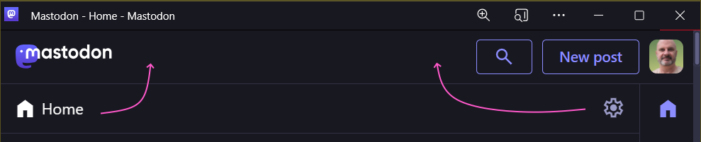
I don't get why Mastodon needs this second header row. Can we not merge the UI elements into one row and get back some vertical space?
2
0
0
Show thread
Matt Hamilton
Bluesky has the same sort of issues. Merge the top two "header" rows and gain back some space!
0
0
0