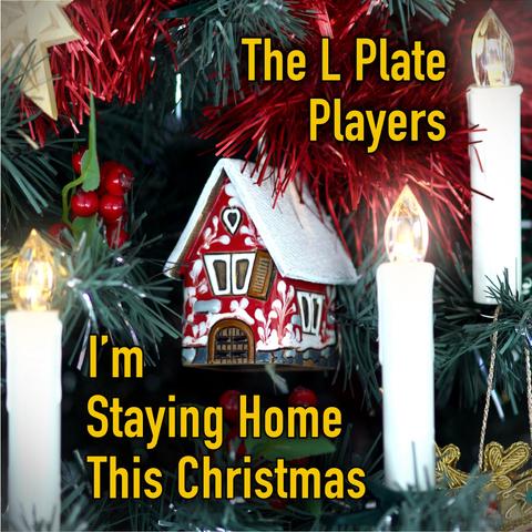
Typography's tricky to do well. You've got to manually mess with line spacing on a line-by-line basis depending on the shape of the letters. The line "Staying Home" needed dragging left a few pixels to give the illusion of a consistent left margin against the straight "I'm".