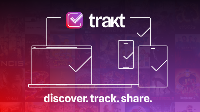
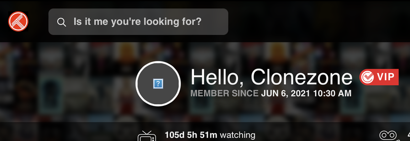
Here are some updates I just released: Dark Knight: lighter purple used for more contrast Font: reduce the boldness and fixed some spacing Logos: removed the top and loading animations Progress Bars: improved bar contrast and fixed some calculation bugs Progress: icons colors for watched (purple) + collected (green) Release Notes: purple badge VIP: red is used for VIP badges + related VIP buttons Watching Now: red is used for checkins + real time watching progress On Deck: fixed missing 1px bo...
@trakt nice!
I‘d like to give you money, how about that lifetime tier? :P
@trakt Personally, this feels like a miss to me.
The new icon is a bit too "generic todo list" imo, and the purple everywhere has weird contrast issues that makes everything feel a bit blurry.
I noticed this in the morning, looks really fresh!