Home
Explore
mastodon.social
mstdn.social
infosec.exchange
mstdn.jp
social.vivaldi.net
piaille.fr
hachyderm.io
mastodon.world
troet.cafe
mastodon.uno
m.cmx.im
mastodon.gamedev.place
social.tchncs.de
mastodon.nl
norden.social
flipboard.social
kolektiva.social
mathstodon.xyz
mastoturk.org
nrw.social
occm.cc
tech.lgbt
defcon.social
mastodonapp.uk
mstdn.ca
universeodon.com
c.im
masto.es
sueden.social
toot.community
mstdn.party
det.social
sfba.social
mastodon.scot
tkz.one
ohai.social
mastodon.ie
ruhr.social
hessen.social
mastodontech.de
mastodon.sdf.org
mastodon.nu
pouet.chapril.org
livellosegreto.it
mastodon.au
social.linux.pizza
mastodont.cat
social.cologne
indieweb.social
mastodon.eus
ioc.exchange
ieji.de
muenchen.social
mastodon.bida.im
mastodon.green
feuerwehr.social
social.anoxinon.de
wehavecookies.social
masto.nu
nerdculture.de
ruby.social
mindly.social
mastodon.ml
metalhead.club
phpc.social
uri.life
m.otter.homes
mastodontti.fi
dresden.network
toot.wales
qaf.men
sunny.garden
climatejustice.social
noc.social
sciences.social
privacysafe.social
mstdn.plus
bark.lgbt
tooting.ch
freiburg.social
blorbo.social
hostux.social
furry.engineer
rollenspiel.social
mastodon.me.uk
rivals.space
mastodon.com.pl
bonn.social
urbanists.social
gaygeek.social
mast.lat
mastoart.social
rheinneckar.social
mastodon-belgium.be
expressional.social
discuss.systems
masto.pt
mapstodon.space
wien.rocks
h4.io
ursal.zone
mstdn.games
todon.nl
hcommons.social
snabelen.no
fairy.id
sakurajima.moe
shelter.moe
lgbtqia.space
cupoftea.social
darmstadt.social
tilde.zone
mastodon.gal
retro.pizza
urusai.social
ludosphere.fr
mastorol.es
bookstodon.com
qdon.space
muenster.im
peoplemaking.games
toot.aquilenet.fr
mastodon.berlin
socel.net
mast.dragon-fly.club
pawb.fun
veganism.social
vmst.io
famichiki.jp
union.place
kanoa.de
mstdn.dk
witter.cz
machteburch.social
toad.social
mastodon.uy
theblower.au
xarxa.cloud
oslo.town
eupolicy.social
musicworld.social
burningboard.net
tooot.im
masto.nyc
fandom.ink
stranger.social
gardenstate.social
mstdn.business
tea.codes
cultur.social
disabled.social
mountains.social
graphics.social
4bear.com
thecanadian.social
pnw.zone
hear-me.social
furries.club
mustard.blog
mastodon.pnpde.social
bahn.social
fedi.at
toot.kif.rocks
freeradical.zone
musician.social
dizl.de
libretooth.gr
musicians.today
ciberlandia.pt
babka.social
archaeo.social
dmv.community
toot.re
ani.work
vkl.world
tyrol.social
mastodon.energy
tuiter.rocks
frikiverse.zone
masto.nobigtech.es
lou.lt
drupal.community
gamepad.club
social.seattle.wa.us
mast.hpc.social
donphan.social
fulda.social
social.silicon.moe
tchafia.be
is.nota.live
puntarella.party
toot.si
muri.network
bzh.social
mastodon.vlaanderen
social.politicaconciencia.org
norcal.social
hometech.social
datasci.social
wargamers.social
lsbt.me
mograph.social
mastodon.africa
opencoaster.net
theatl.social
toot.funami.tech
devianze.city
hispagatos.space
drumstodon.net
epicure.social
elekk.xyz
est.social
toot.garden
friendsofdesoto.social
apobangpo.space
mastodon.pirateparty.be
mastodon.london
mastodon.education
kurry.social
mstdn.animexx.de
mastodon.cr
hoosier.social
lewacki.space
indieauthors.social
colorid.es
ruhrpott.social
esq.social
leipzig.town
fikaverse.club
planetearth.social
fairmove.net
library.love
burma.social
mastodon.bot
techtoots.com
frontrange.co
toots.nu
fribygda.no
mastodon.wien
raphus.social
cwb.social
arvr.social
h-net.social
opalstack.social
mastodon-swiss.org
rheinhessen.social
rail.chat
paktodon.asia
seocommunity.social
mastodon.sg
poweredbygay.social
khiar.net
epsilon.social
camp.smolnet.org
bologna.one
k8s.social
okla.social
birdon.social
growers.social
elizur.me
episcodon.net
masto.yttrx.com
stereodon.social
mastodon.cipherbliss.com
biplus.social
mastodon.hosnet.fr
squawk.mytransponder.com
skastodon.com
mastodon.frl
mastodon.babb.no
silversword.online
cville.online
23.illuminati.org
balkan.fedive.rs
kzoo.to
mastodon.iow.social
lounge.town
mastodon.ph
mcr.wtf
mastodon.bachgau.social
social.diva.exchange
kcmo.social
synapse.cafe
social.ferrocarril.net
voi.social
nfld.me
mastodon.ee
mastodon.bahia.no
darticulate.com
polsci.social
nautical.social
fpl.social
mikumikudance.cloud
troet.fediverse.at
mastodon.mg
dariox.club
social.sndevs.com
nomanssky.social
kjas.no
nwb.social
ms.maritime.social
bvb.social
ceilidh.online
netsphere.one
nutmeg.social
wxw.moe
computerfairi.es
genealysis.social
learningdisability.social
Log In
Amy
Oct 16, 2024
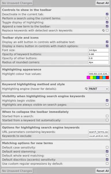
how is this for a user-friendly settings page?
please do comment your first thought :]
pretty
ugly
digestible
overwhelming
Poll ends at
Jan 1, 1970 at 12:00am
.
6
3
0
Show thread
Chloë Ada
[0x636174]
Oct 16, 2024
@NotThatDeep
I think it could use a little more line spacing... right now everything is so close together it's kinda hard to separate the different options in my brain
- posted by Chloe
1
0
0
Show thread
Chloë Ada
[0x636174]
Oct 16, 2024
@NotThatDeep
I do like the alternating colored backgrounds, it just feels very cramped vertically
- posted by Chloe
2
0
0
Show thread
Amy
@Chloe
thanks, yeah
you're definitely right
0
0
0


 [0x636174]