how is this for a user-friendly settings page?

please do comment your first thought :]
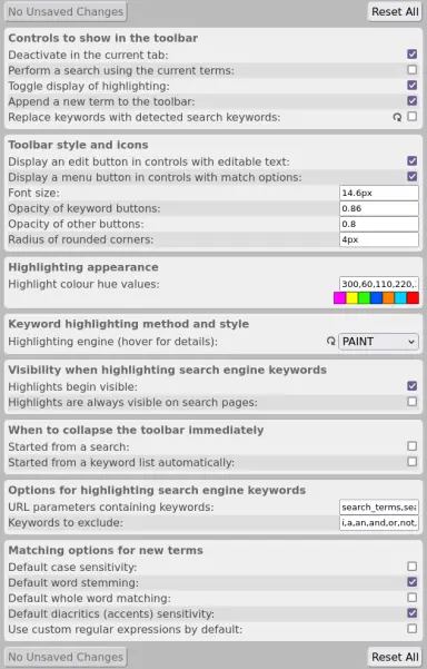
pretty
ugly
digestible
overwhelming
Poll ends at .
it's better than the previous (and currently published) iteration, at the very least ​
on a personal note, i find this code and design very interesting, because it was my first ever attempt at a settings page and my first HTML page (possibly apart from the popup)

this is how i thought a configuration display should look! it was probably vaguely inspired by those old-style Windows configuration windows.
the code is also limited and hard to work with, because it was designed around a direct mapping to Mark My Search's settings schema. that's why you've only got booleans, awkward text fields, and now enumerations.

this is also why it would be a
lot of work to change the groupings of settings ​​ ​
as with everything else in Mark My Search, the HTML is generated by Javascript (which is what makes decisions in the code time consuming to change). this is one of the several reasons i am rebuilding this entirely!
@NotThatDeep with how dense everything is, it does feel a bit overwhelming
@lily thanks, good to know ​

i am planning to split this into separate 'tabs' which organise the settings more clearly, and include significantly more spacing, possibly including some visuals
@NotThatDeep It's one of those anti memetic pages for people with adhd. Neat.
@Axolotl2 this is useful information! thank you ​
@Axolotl2 what does anti memetic mean in this context?
@NotThatDeep @Axolotl2 there's no such thing as an anti-memetic hazard
@admirallazuli @NotThatDeep Is this an attempt at a joke or do I need to explain what I meant when I said that?
@Axolotl2 @NotThatDeep its a joke dw
@admirallazuli @NotThatDeep tone indicators. They're important when something can have two different interpretations. Though that was legitimately funny after I knew which one.
@NotThatDeep I can't process any of this. I can read it, but my brain won't process any of the information.
@Axolotl2 oh wow. I've really messed up then lmao

honestly, I've already had 2 or 3 users telling me they don't touch the settings / can't understand them, which clued me in that I have got something wrong. I will be exploring ways of making it better

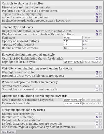
@NotThatDeep ugly (although its not that ugly) but powerful

a bit intimidating at first, but seems categorised well to me. a user less confident in their ability to use a computer might* be too afraid of breaking something to change anything, even with the reset button at the bottom.

*i cant say for certain since i am not one of those users

@CauseOfBSOD oh interesting, thanks! I didn't realise several people would find it ugly. I knew it was overwhelming at least.

@NotThatDeep its pretty borderline honestly, id say it looks good enough

not every settings menu has to look perfect

@NotThatDeep I think it could use a little more line spacing... right now everything is so close together it's kinda hard to separate the different options in my brain

- posted by Chloe
@NotThatDeep I do like the alternating colored backgrounds, it just feels very cramped vertically

- posted by Chloe
@Chloe thanks, yeah
you're definitely right
@Chloe I've just been looking over replies to this again. I have a new version now. it's a lot lot less cramped :3

also haiii!
@NotThatDeep change the coloring of reset all to either be red background or red text to separate it from the rest.
@puppygirlhornypost2 yeah good point, thanks
definitely didn't forget about this for
checks notes 3 months, o no

I'm working on a completely new settings page because turns out the UX for this is terrible

btw long time no see, hru? :3
@NotThatDeep im ok just a bit tired, at work rn