Been working on @charty 2.0 for the last couple of weeks!

- 90% of the apps actions have been rewritten as AppIntents, which I think is a good start for the controversial Apple Intelligence features
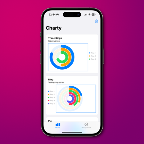
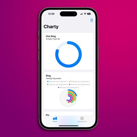
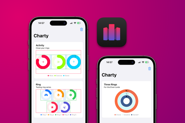
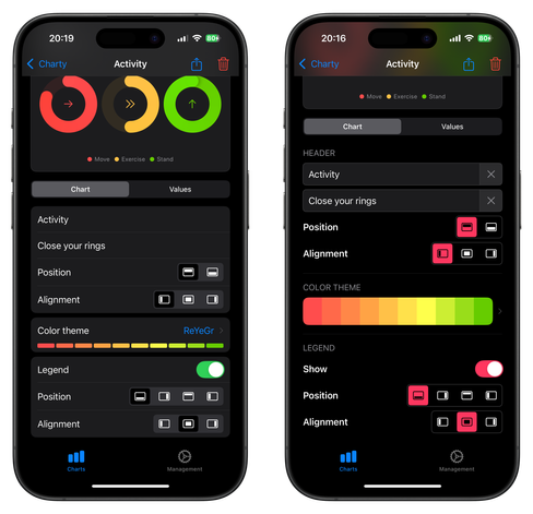
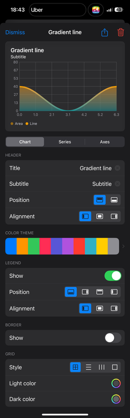
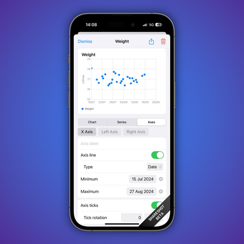
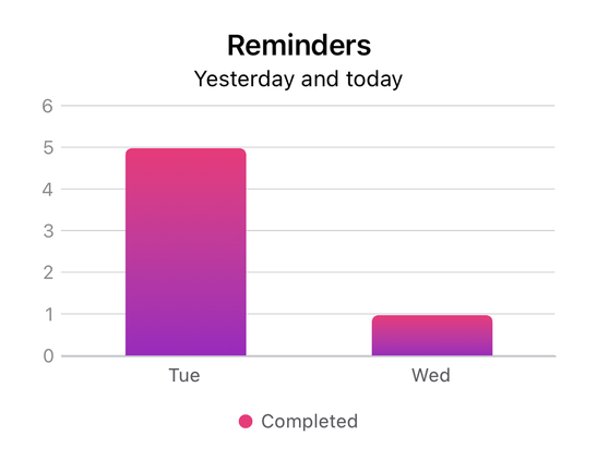
- Numeric and circular charts mostly work, save for some axes’ scaling issues
- I’ve managed to add secondary axis support to #swiftcharts
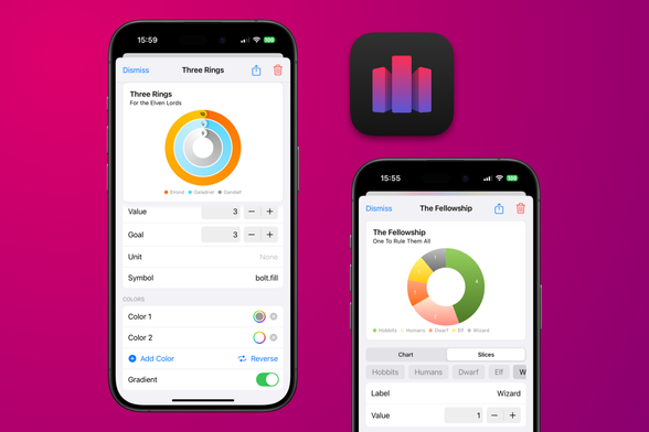
- I’m now rewriting Ring Charts in #swiftui. Things are going well! 🚀

Framed with @Shareshot 😍

Ring charts are now nice and centered! On to implementing the grid layout for rings now 💪

Managed to get some solid #iosdev done this week: the grid layout for ring charts is now working, and it’s all done in #swiftui! Still some adjustments to be made (hence the borders), but they’re looking good!

On @charty 2.0, since the last post:
- Ring grids can now have any combination of rows and columns;
- When displayed on a condensed view, ring symbols now appear at the top;
- Also, here’s my first try on supporting #iOS18 dark icons.

I was inspired by @pilky work on Coppice’s iPad update and tried some of his ideas for @charty 2.0 #swiftui redesign.

On the left what I was going for before, and on the right the result of implementing his ideas. But I’m still not sure what I should do.

https://mastodon.social/@pilky/112717009531562928

Ok, reverted back to my old style (at least for iPhones for now), but tried to improve it with better labels and section headers.
Also, did a lot of work on the CoreData migration and fixing some paper cuts.

Charty 2.0 is gonna have a substantial update on the CoreData model, and I had no idea how to manage a heavy weight migration. 😬

So spent a couple days trying to get this right and I’m happy to report things are working now! Charts created on v1 will not be lost once users update to v2. 😎

Also, here’s a screenshot of the export view under construction! 🔨

Spent last night working on pie/donut charts UI for @charty 2.0!

🎨 Users can now change the colors on pie charts, toggle gradients and even create their own.

📅 Also, a sneak peek on the current work on the axis editing view. Long time users will notice min/max selection for date axes is now *a lot* easier!

📱Also, both images in the post were made with the awesome @Shareshot!

Here’s another sneak peek at @charty 2.0!
📈 On the new version, users will be able to update their series’ values using the UI in addition to using Shortcuts!
🎨 Also, all charts now support fully customizable color gradients!
✅ Very happy to report that completed tasks charts will still be possible on @charty 2.0!
🚀 And they’re easier than ever to generate, thanks to the better grouping actions and the new labeled axis.
📊 Here’s a chart showing all tasks completed in Reminders yesterday and today.

☁️ Thanks to CloudKitSyncMonitor by ggruen, @charty will have a nice sync status view!
🐜 This’ll make it a lot easier to debug sync problems and understand if #CloudKit is working.

#swift #swiftui

@rmaraujo Not an easy task well done!
@Ampsonic definitely, and there are a lot of nitpicky details. I lost a lot of time trying to understand why the migration wasn’t triggering, to finally discover I just had to refresh the mapping file 😅
@rmaraujo @rosemary Well done Rodrigo. When can I take it for a spin!

@ashpole @rosemary getting there! Heres an overview of what I want to get ready before the TestFlight:
- Export view and action
- Values UI for pie, donut and ring charts
- Widget updates

With that, I’d be comfortable to open a TestFlight 😊

@rmaraujo @rosemary I’m looking forward to it. 👍 Hope you and yours are well.