Boy the Apple Private Relay thing continues to be a problem for Tapestry Kickstarter backers. Don’t worry though, we’ll get your reward delivery sorted. 👍
More work designing the timeline for #projecttapestry today. Pretty happy with how it’s coming, but there’s a long way to go, so many unknowns ahead. Thankfully that’s the part I enjoy the most.
Designing for #projecttapestry is like opening Pandora’s Box, except that each day there’s an entirely new box to open and inside each one are ten more boxes. 🤯
Today’s the day when I think I finally got a handle on the timeline design for #projecttapestry. Still so much to do but the design of the content itself is coming along nicely. Whew!
You know you’re having fun designing a UI when you can’t stop thinking about it and want to get back to it even on your days off. 🥰
Long but good UI design meeting today for #ProjectTapestry. Things are coming along nicely but more importantly @chockenberry approves. THATS ALL THAT MATTERS REALLY ISNT IT?
Well, back to the drawing board I go. I should never have named the design file Tapestry-Timeline-Final.PSD. 🤦♂️ #ProjectTapestry
Tapestry’s timeline has been redesigned (again). Fourth time a charm I always say. Lots of improvements and better accessibility so it was more than worth it. #ProjectTapestry
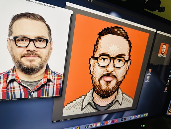
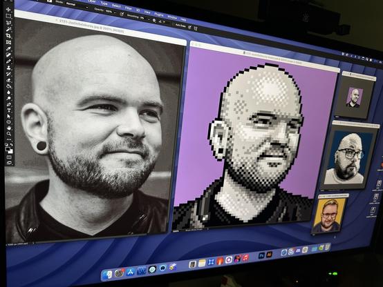
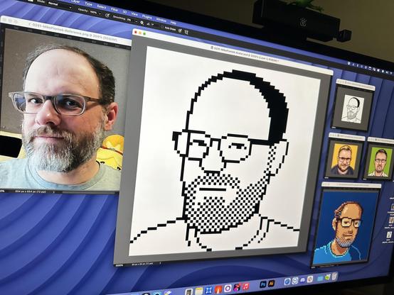
Draw Pixelated Beards - Achievement unlocked! 🧔🏻♂️ #ProjectTapestry
Actual footage from our #ProjectTapestry huddle just a few minutes ago.
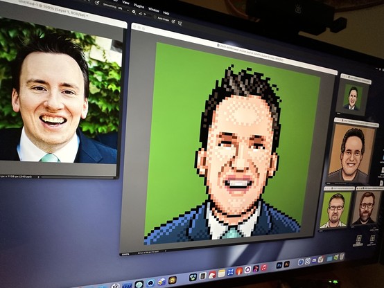
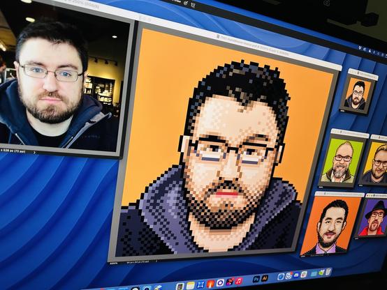
One of the best things I learned from my instructors at RIT a billion lifetimes ago was the concept of signal vs noise in graphic design. It’s a guiding philosophy in my work & I use it almost every day. It’s been especially handy for the pixel portraits for #ProjectTapestry.
Does a placed pixel increase the message/clarity/signal or add distractions/junk/noise to the icon? It’s a constant struggle but once you “get” signal vs noise, designing becomes a whole lot more fun/effective. ✍️
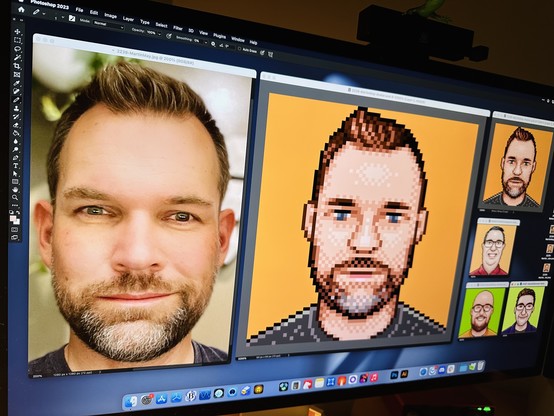
If I didn’t have a million other things to do, I think I could spend all of my days just drawing pixel avatars for #ProjectTapestry. It’s extremely satisfying to render someone’s likeness in pixels.
Capturing someone’s unique “look” in pixels can be tough but I’m having a blast attempting it, that’s for sure. ✍️ #ProjectTapestry
Meanwhile I was pushing pixels by hand into the portraits of people who appreciate human artists during that keynote. #ProjectTapestry
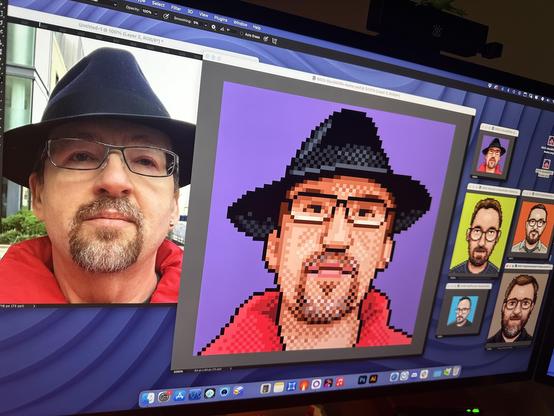
I might have been channeling Tim Apple a bit too much while drawing the latest pixel portrait of David for #ProjectTapestry. 🤓 Adjusting… ✍️
Thanks to today’s internal build of #ProjectTapestry the app nudged closer to actually being able use it day to day. I can finally start to get a real feel for its potential. It’s exciting. 👍
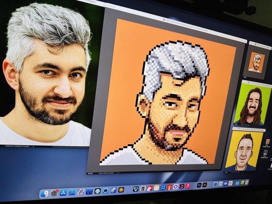
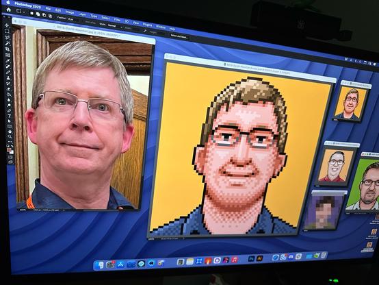
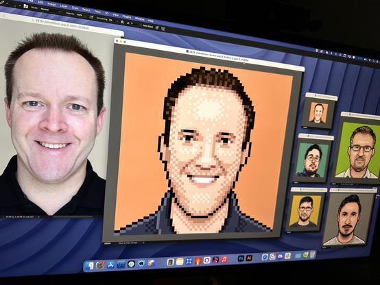
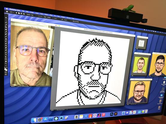
Drawing pixel portraits for #ProjectTapestry is a lot easier when you have great reference material! This one was fun. ✍️
I’m not just visiting my happy pixel place – I may set up camp and never leave. #ProjectTapestry
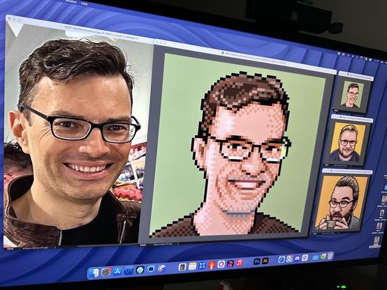
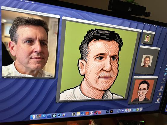
So here’s a fun fact! When we started drawing the pixel portraits for #ProjectTapestry we held up the pixel avatar of @robotspacer as the ideal example to shoot for because it was so damned good.
Now I have to try and draw Mike’s very own pixel portrait that he commissioned and do *at least* as good a job as he did. No pressure what-so-ever. 🥵
Keep your collective fingers crossed! ✍️🤞
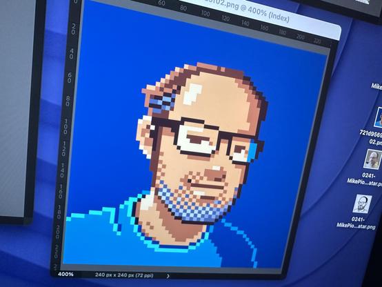
“I don’t even see the pixels anymore. All I see is a beard here, a pair of glasses there…” 🤓 #ProjectTapestry
Sometimes the toughest part about being a designer is knowing you won’t be the one to take the ball over the goal line.
I did a lot of work early on #ProjectTapestry but we’re out of the App design phase (mostly) and into the coding phase so I’m living vicariously through @chockenberry and @bigzaphod as they bring designs to life.
I know there’s more design challenges to come, but it’s tough to sit on the sidelines sometimes. 🏈
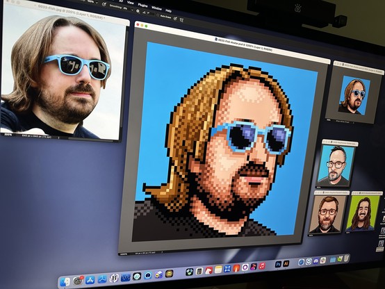
Sometimes these pixel portraits make me want to pull my hair out. Other times they just flow like pixelated water. This one was practically a river, so much fun to draw! #ProjectTapestry
Tonight I used Tapestry all through the DNC to read and track social media posts, blog posts and more all in the app’s unified timeline. It’s finally crossed the usability threshold for me and gone from potentially good to actually great.
It’s a big milestone in its development life cycle. Exciting! 🤓 #ProjectTapestry
I’m going to attempt to live stream drawing a pixel portrait for #ProjectTapestry over on my Instagram starting in a few minutes. If you want to watch you head over to my page there and check it out. A behind the scene sneak peek as it were. I have no idea how this will go so keep that in mind! 😂 https://www.instagram.com/gedeonm
I think if I live stream any more #ProjectTapestry drawing sessions I’ll probably do so over on YouTube. The tools to stream seem more flexible there. Just a head’s up. https://www.youtube.com/@GedMaheux
@gedeonm it’s one of my favourite features of Twitterrific! Can’t wait for Tapestry!!
@DimitryJacobs Thanks! This one we’re using in Tapestry is Encode Sans Narrow. It’s similar to Amelia which we used in Twitterrific but has lots more flexibility and weights. Theres one small snag however, for some strange reason it doesn’t have an italic face which we need. May have to end up switching it out. I really hope not but it’s a possibility :-/
@gedeonm Hope you can make an custom italic face but if not there are enough other font to choose I hope

@gedeonm Sounds fantastic. I missed out on the Kickstarter. Any other ways to support?
@chase Not currently I’m afraid. Once we get closer to launch that’ll probably change. Try and hang in there, appreciate your support. 🖖
@gedeonm take my money! 💸

@gedeonm @chockenberry Screenshots or it didn’t happen 😂
@DimitryJacobs Ooooh no. Long way to go. Hang in there!
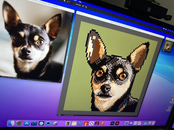
Drawing pixelated doggos for #ProjectTapestry. Have I mentioned I love my job? 🐶 🥰

@gedeonm That guy looks familiar…
@gedeonm That sounds a little like some of my print projects that I produce. Sure, I finish the actual printed pieces, but sometimes I would love to see how they were used/distributed at an event and people's reactions. I do get to experience that on rare occasion.
@gedeonm Those look great! 🤩
@gedeonm Hi! I found out about the project tapestry too late and missed the kickstarter. Is there any other way I can pay to get into the TestFlight? I’m super interested in the concept.
@dudeguypal No, I’m afraid not. Wouldn’t be fair to the people who backed the project. Unfortunately you’ll have to wait until the app is released. I’m super sorry, hope you understand!
@gedeonm bummer! Is there an idea of when it will be opened up to the public, or if more spots will be up for purchase to get into the beta?
@gedeonm It’s too late for this, yeah?
@Brilliantcrank For the moment, yes. When Tapestry ships we’ll prob open pixel portraits back up.
@gedeonm Oh gosh, thank you! You've been doing an amazing job on these—I’m super impressed with the consistent high quality of them. Can't wait to see mine finished!
@robotspacer Took much longer than the others cause I wanted to do a bang-up job on it but I think it came out nice. Really was a group effort over here, LOL. Not as “chonky” as your excellent version but that’s just my personal style. Watch for it to go out at the end of the week. Hope you like it. 🤞

@phranck @gedeonm @robotspacer You could have had one, there was a kickstarter where that was one of the rewards, AFAIR.