#ClimateDiary Yep, this is where we are at.
@pvonhellermannn the last half of your alt text is very confusing; listing the digits is not useful at all.
It could be rephrased like this :
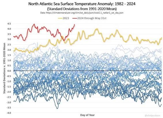
A widely used and shared graph showing 1991-2024 sea surface temperature anomalies across each year.
1991-2020 in blue lines more or less one big block, ie diverging and going up but incrementally, between -3.5 degrees and +2 degres.
2023 is in yellow, much higher than the rest, between +2 and +4 degrees.
2024 is in red, EVEN higher, between +3 and +4.5 degrees and increasing.
