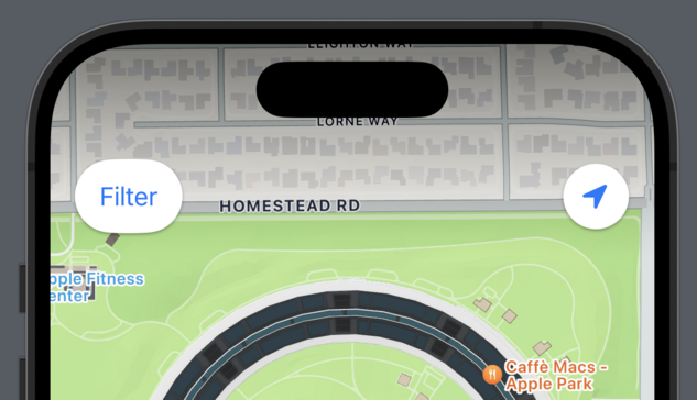
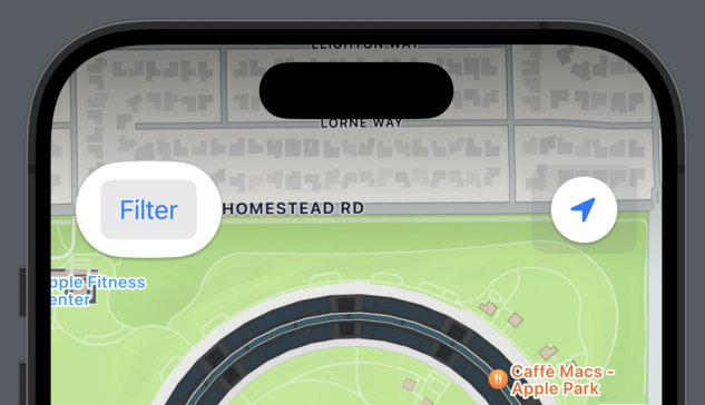
Here's a subtle #accessibility interaction I frequently see developers overlook:

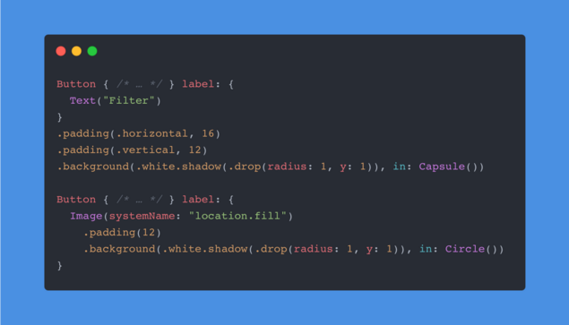
#SwiftUI makes it very easy to customize Button's appearance at the call-site, either by decorating the Button's label or by applying View Modifiers to the Button itself.

However, SwiftUI's default ButtonStyle will react to the Show Button Shapes accessibility setting by adding padding and an additional translucent background. If your buttons are configured like the ones above, the results can be unsuspected.
While a quick fix would be to apply a combination of the .plain Button Style and the .tint Foreground Style, I recommend implementing a custom ButtonStyle that responds to the .accessibilityShowButtonShapes Environment Value as needed.
It's a pretty common problem and I recommend everyone enabling the setting for a week.
@dlx nice, just found a new button in my app 👌
@dlx
Would the accessibilityShape modifier fix that? (I’m not at my Mac, so can’t check the exact modifier name…)
@dlx My favorite find in #SwiftUI recently is .accessibilityRepresentation for those times you have to create a fully custom control (looking at you Slider API)
@dlx Guilty of this.
One option to customize this without monitoring the environment yourself is the buttonBorderShape modifier:
@auramagi yeah, though the default button style will still affect layout through the additional padding. Ideally your layout can deal with that anyway for Dynamic Type reasons but if the button is effectively bordered like it is here, there‘s no need to add more :)