Home
Explore
mastodon.social
mstdn.social
infosec.exchange
mstdn.jp
social.vivaldi.net
piaille.fr
hachyderm.io
mastodon.world
troet.cafe
m.cmx.im
mastodon.uno
mastodon.gamedev.place
techhub.social
social.tchncs.de
mastodon.nl
norden.social
kolektiva.social
flipboard.social
mathstodon.xyz
mastoturk.org
nrw.social
occm.cc
tech.lgbt
mastodonapp.uk
universeodon.com
mstdn.ca
defcon.social
c.im
masto.es
sueden.social
toot.community
mstdn.party
det.social
sfba.social
mastodon.scot
ohai.social
mastodon.ie
tkz.one
ruhr.social
hessen.social
mastodontech.de
mastodon.nu
pouet.chapril.org
livellosegreto.it
mastodon.sdf.org
mastodon.au
social.linux.pizza
mastodont.cat
ioc.exchange
social.cologne
indieweb.social
mastodon.eus
ieji.de
mastodon.bida.im
feuerwehr.social
muenchen.social
mastodon.green
social.anoxinon.de
wehavecookies.social
masto.nu
cyberplace.social
nerdculture.de
ruby.social
mindly.social
mastodon.ml
metalhead.club
phpc.social
uri.life
m.otter.homes
mastodontti.fi
dresden.network
toot.wales
sunny.garden
climatejustice.social
noc.social
sciences.social
bark.lgbt
mstdn.plus
privacysafe.social
freiburg.social
furry.engineer
tooting.ch
rollenspiel.social
hostux.social
blorbo.social
mastouille.fr
mastodon.me.uk
rivals.space
mastodon.com.pl
bonn.social
rheinneckar.social
urbanists.social
mast.lat
mastorol.es
mastoart.social
gaygeek.social
mastodon-belgium.be
wien.rocks
expressional.social
discuss.systems
ursal.zone
todon.nl
masto.pt
mapstodon.space
mstdn.games
h4.io
glasgow.social
hcommons.social
sakurajima.moe
snabelen.no
cupoftea.social
lgbtqia.space
shelter.moe
fairy.id
darmstadt.social
tilde.zone
mastodon.gal
urusai.social
retro.pizza
ludosphere.fr
qdon.space
muenster.im
bookstodon.com
peoplemaking.games
pawb.fun
mast.dragon-fly.club
toot.aquilenet.fr
mastodon.berlin
freeradical.zone
veganism.social
kanoa.de
socel.net
famichiki.jp
vmst.io
mstdn.dk
union.place
theblower.au
machteburch.social
qaf.men
witter.cz
toad.social
mastodon.uy
xarxa.cloud
oslo.town
eupolicy.social
burningboard.net
musicworld.social
tooot.im
fandom.ink
stranger.social
mstdn.business
masto.nyc
disabled.social
tea.codes
mountains.social
graphics.social
4bear.com
cultur.social
gardenstate.social
pnw.zone
thecanadian.social
furries.club
mastodon.pnpde.social
mustard.blog
fedi.at
hear-me.social
bahn.social
toot.kif.rocks
musician.social
dizl.de
toot.re
musicians.today
ciberlandia.pt
libretooth.gr
archaeo.social
dmv.community
tyrol.social
babka.social
tuiter.rocks
ani.work
vkl.world
mastodon.energy
frikiverse.zone
masto.nobigtech.es
lou.lt
gamepad.club
social.seattle.wa.us
drupal.community
donphan.social
mast.hpc.social
tchafia.be
social.silicon.moe
bzh.social
mastodon.vlaanderen
fulda.social
is.nota.live
toot.si
social.politicaconciencia.org
muri.network
puntarella.party
hometech.social
norcal.social
mograph.social
wargamers.social
datasci.social
lsbt.me
toot.funami.tech
devianze.city
theatl.social
opencoaster.net
mastodon.africa
genealysis.social
epicure.social
drumstodon.net
hispagatos.space
est.social
toot.garden
elekk.xyz
mastodon.pirateparty.be
friendsofdesoto.social
apobangpo.space
mastodon.education
mastodon.london
indieauthors.social
mastodon.cr
colorid.es
kurry.social
hoosier.social
lewacki.space
mstdn.animexx.de
planetearth.social
leipzig.town
ruhrpott.social
library.love
burma.social
fikaverse.club
esq.social
frontrange.co
techtoots.com
fairmove.net
mastodon.bot
raphus.social
toots.nu
cwb.social
khiar.net
mastodon.wien
fribygda.no
rail.chat
rheinhessen.social
h-net.social
arvr.social
mastodon-swiss.org
seocommunity.social
opalstack.social
poweredbygay.social
mastodon.sg
mastodon.free-solutions.org
bologna.one
epsilon.social
k8s.social
okla.social
camp.smolnet.org
stereodon.social
elizur.me
growers.social
paktodon.asia
mastodon.cipherbliss.com
birdon.social
mastodon.hosnet.fr
masto.yttrx.com
biplus.social
episcodon.net
squawk.mytransponder.com
skastodon.com
mastodon.babb.no
mastodon.frl
balkan.fedive.rs
cville.online
lounge.town
mastodon.iow.social
23.illuminati.org
mastodon.ph
mastodon.bachgau.social
kzoo.to
silversword.online
mcr.wtf
kcmo.social
synapse.cafe
social.diva.exchange
mastodon.ee
social.ferrocarril.net
nfld.me
voi.social
nautical.social
polsci.social
troet.fediverse.at
mikumikudance.cloud
mastodon.mg
mastodon.bahia.no
darticulate.com
dariox.club
fpl.social
nomanssky.social
social.sndevs.com
nwb.social
kjas.no
ms.maritime.social
bvb.social
ceilidh.online
netsphere.one
nutmeg.social
wxw.moe
learningdisability.social
computerfairi.es
Log In
Emmet Broaders
@cabel
a redesign for your consideration
3
0
4
Show thread
Emmet Broaders
May 3, 2024
@cabel
another one that changed the entire orientation
0
0
2
Show thread
Phil Nelson
May 3, 2024
@broaders
@cabel
0
0
1
Show thread
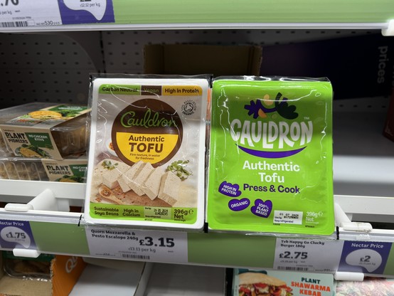
Michael Cook
May 3, 2024
@broaders
@cabel
The left makes it look like a food product. The right makes it look more synthetic. That green (and pink in the follow up) don’t read natural at all.
0
0
0