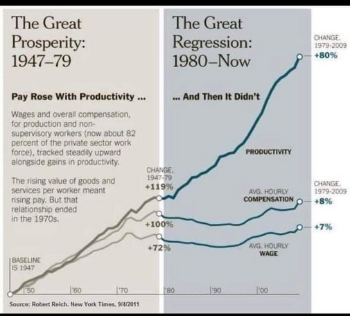
@DrRGST I was curious of how that trend has progressed to the present day, since that infographic only goes to ~2011. Strangely, this graph from U.S. Bureau of Labor Statistics looks very different from @[email protected] 's
@DrRGST I was curious of how that trend has progressed to the present day, since that infographic only goes to ~2011. Strangely, this graph from U.S. Bureau of Labor Statistics looks very different from @[email protected] 's
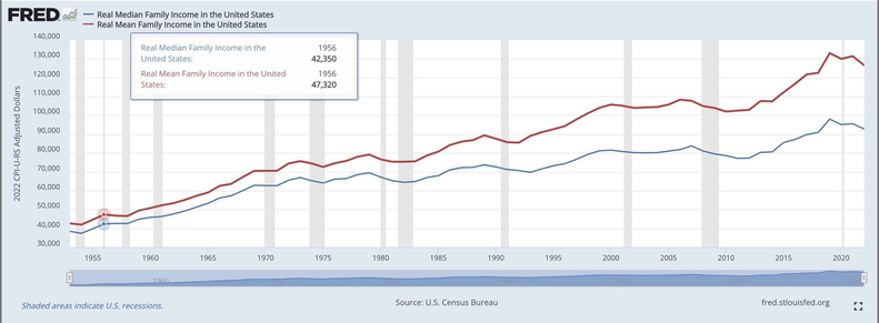
@andrew this is a better way to see it with FRED data. You can see a divergence starts around the 70s and massively increases through the 80s into the present day