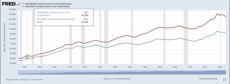
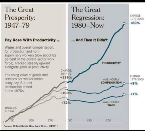
@DrRGST I was curious of how that trend has progressed to the present day, since that infographic only goes to ~2011. Strangely, this graph from U.S. Bureau of Labor Statistics looks very different from @[email protected] 's

https://fred.stlouisfed.org/series/COMPRNFB#0

Nonfarm Business Sector: Real Hourly Compensation for All Workers

Graph and download economic data for Nonfarm Business Sector: Real Hourly Compensation for All Workers (COMPRNFB) from Q1 1947 to Q4 2023 about per hour, compensation, sector, nonfarm, business, real, and USA.

@andrew I think using 2017 as the 100 percent mark has warped this significantly- because both productivity and wages will seem to converge there, but that is a completely arbitrary and incorrect view of things (you won’t see a diversion using the y axis as 100 percent for both)

@andrew this is a better way to see it with FRED data. You can see a divergence starts around the 70s and massively increases through the 80s into the present day

https://fredblog.stlouisfed.org/2015/05/the-mean-vs-the-median-of-family-income/?utm_source=series_page&utm_medium=related_content&utm_term=related_resources&utm_campaign=fredblog

The mean vs. the median of family income | FRED Blog

@kinetic Ah interesting, I appreciate the info! That makes more sense.
@andrew of course! Happy to help