Material Design

Build beautiful, usable products faster. Material Design is an adaptable system—backed by open-source code—that helps teams build high quality digital experiences.

Material Design

About a third of the way in, it just suddenly introduces "Serif or sans serif typefaces work well for headlines, especially at smaller sizes." from out of nowhere.

There is no introduction explaining categories of typefaces. And reading further doesn't clear matters up.

By contrast, here's a well written document that starts with "There are five basic classifications of typefaces:"
https://www.toptal.com/designers/typography/typeface-classification#:~:text=There%20are%20five%20basic%20classifications,are%20only%20used%20for%20headlines.
Understanding the Nuances of Typeface Classification | Toptal®

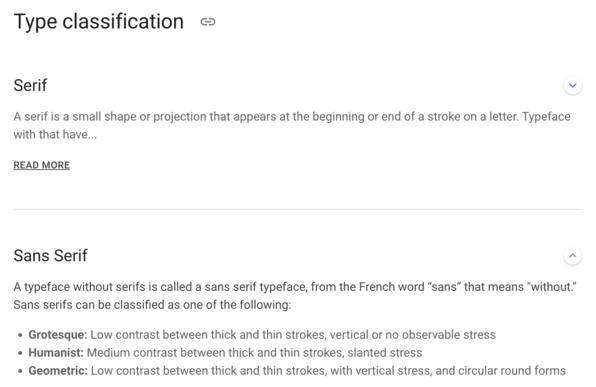
Virtually all designers, from brand designers to UI designers to dedicated typography designers, can benefit from expanding their knowledge of typography. Possibly with the exception of color, the typeface styles used in a design have a greater impact on user perception than virtually any other individual design ele...

Toptal Design Blog
To a naive reader, there are precisely two categories of fonts: "serif" and "sans serif" which meant that the Material Design article was nonsensical.

It'd be easy to _fix_ the m2 article by adding a paragraph explaining what world view it's envisioning. But there isn't any indication of how to provide feedback on this document.

#ShoutingToTheVoid

> Button text can be sentence case, sans serif, or serif.

This "sentence" needs a lot of love. Is "sentence case" another font family?

Is it saying button text must be "sentence case"?

Is it saying that you can only use sentence case if your font family is neither sans nor sans serif? (Or that you must choose sentence case if your font family is neither sans nor sans serif?)

For the curious, the type classification stuff came _after_ the preceding article (which is a problem for people actually trying to read documentation according to its directed order!):
https://m2.material.io/design/typography/understanding-typography.html#type-classification
Material Design

Build beautiful, usable products faster. Material Design is an adaptable system—backed by open-source code—that helps teams build high quality digital experiences.

Material Design
Don't ask me why `Serif Fonts` and `Sans Serif fonts` are written the way they are here. It doesn't make any sense!
No, I can't explain why Sans Serif fonts, Monospace Fonts, Handwriting Fonts, and Display Fonts are in the Serif section under Type classification. But I can prove they are by collapsing the section!
Here's a great example of an example not following the context of a document. Note that the pictured text is not in small caps and is not in uppercase: https://m2.material.io/design/typography/understanding-typography.html#readability
Material Design

Build beautiful, usable products faster. Material Design is an adaptable system—backed by open-source code—that helps teams build high quality digital experiences.

Material Design

New document category!

"Sound can compliment [sic] the visual UI by accompanying actions."

No, that isn't right. Don't write that. This is not a compliment on your writing quality. The word you wanted was "complement".

#Sound #UserExperience #ConfusedWords

https://m2.material.io/design/sound/about-sound.html#types-of-sound

Material Design

Build beautiful, usable products faster. Material Design is an adaptable system—backed by open-source code—that helps teams build high quality digital experiences.

Material Design

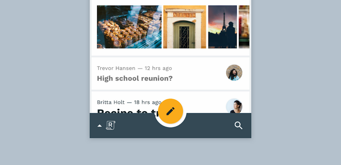
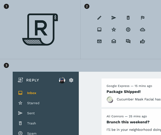
Why does the caption say "This email app uses two-tone brand elements, such as its logo." when the prominent ✏️ isn't in two-tone style?

https://m2.material.io/design/iconography/system-icons.html#icon-themes

Material Design

Build beautiful, usable products faster. Material Design is an adaptable system—backed by open-source code—that helps teams build high quality digital experiences.

Material Design

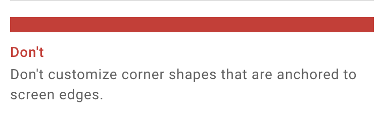
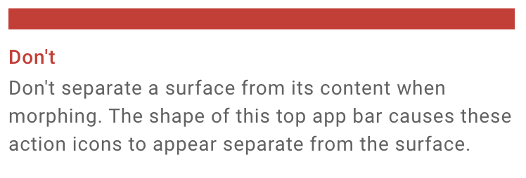
Don't be inconsistent. Choose not to always write in the same style for the same color boxes and headings.

#Material #WTF

https://m2.material.io/design/shape/shape-motion.html#displaying-content

Material Design

Build beautiful, usable products faster. Material Design is an adaptable system—backed by open-source code—that helps teams build high quality digital experiences.

Material Design

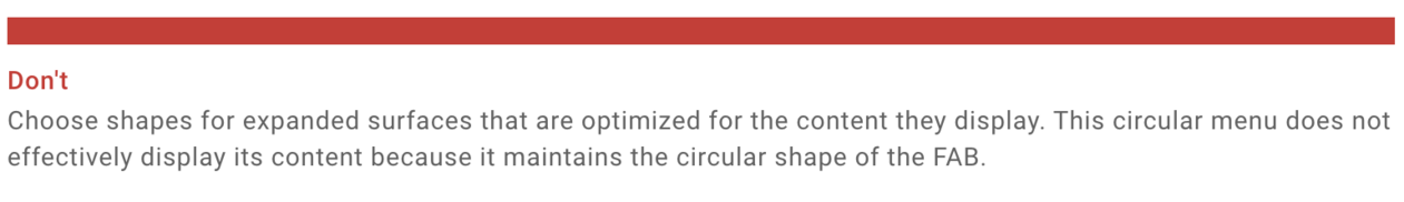
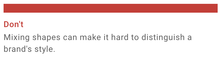
Continuing adventures in inconsistency. Are these call outs supposed to be imperative? I've lost the plot.

https://m2.material.io/design/shape/applying-shape-to-ui.html#picking-shapes

Material Design

Build beautiful, usable products faster. Material Design is an adaptable system—backed by open-source code—that helps teams build high quality digital experiences.

Material Design
Are you supposed to be able to interact with this thing? Or is it a _picture_ of an interactive tool?
https://m2.material.io/design/motion/the-motion-system.html#container-transform
Material Design

Build beautiful, usable products faster. Material Design is an adaptable system—backed by open-source code—that helps teams build high quality digital experiences.

Material Design