I’m so disappointed in the design of the new Apple Sports app, which does not degrade gracefully on smaller screen sizes, like my iPhone SE2.
Apple used to get this stuff right.

I’m so disappointed in the design of the new Apple Sports app, which does not degrade gracefully on smaller screen sizes, like my iPhone SE2.
Apple used to get this stuff right.
Several people have asked about text size.
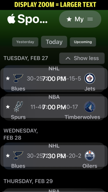
My "Dynamic Type" is set just below middle, and "Display Zoom" is "Larger Text".
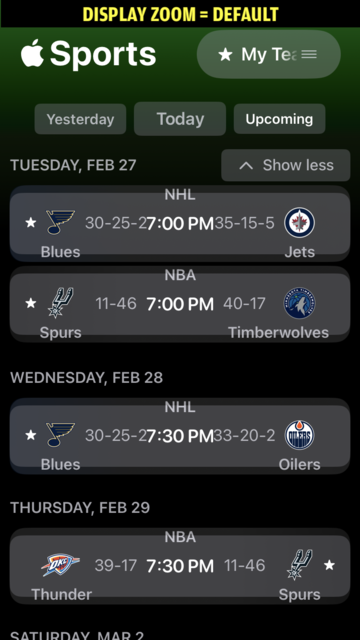
Changing "Display Zoom" to "Default" reduces the effects, but the root problem persists. Scores still overlap. Team names still spill out of their containing boxes. etc, etc.
I wish the #UI was responsive. When screen size is small, or type is big, move side-by-side elements into stacks.
#Apple should account for its settings and device sizes.