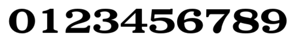
damn, what IS the font for the JR East clock numbers???I thought— maybe a Bodoni? gosh, I can't figure it out.
you know, it could very well be a japanese font and we'd never be able to identify it
@louie Is it Volta EF? The 1's look a little different to my eyes though.
@stevezeidner @Bas Also the 8 doesn't have the contrast on the spine (except for Volta in Italic, it seems.)
@louie Kinda made me think of Volta by Linotype. But it doesn't match up.

@louie Closest I could find is Gloucester Bold Extended. It's not quite spot on (there are some subtle differences in the shape or angle of the serifs), but – to my eye – the characteristic qualities of those numerals are a match with this set (e.g. the blobby base of the 7, the unique lean of the 6 and 9, the straight, unserifed crossbar of the 4, etc).

https://www.linotype.com/167282/gloucester-bold-extended-product.html

Gloucester™ Bold Extended Font - Licensing Options | Linotype.com

Gloucester™ Bold Extended Font: Licensing Options and Technical Information

@joshapos hey!! This is it! Thanks for finding that! 💛