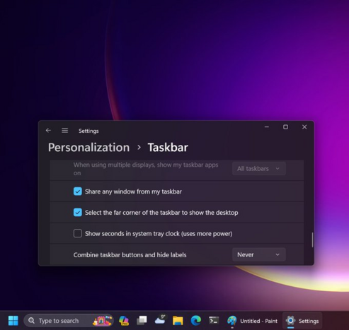
For those that need it - the latest update rolling out to Windows 11 22H2 includes the ability to uncombine taskbar icons

Appreciate everyone that took the time to share feedback about this 🙏 #windows

If you haven't been keeping up with the latest changes, there's actually a whole pile of improvements the team has been working on - you can see a list of them here: https://support.microsoft.com/topic/november-14-2023-kb5032190-os-builds-22621-2715-and-22631-2715-f9e3e13c-5e98-42c2-add8-f075841ca812
November 14, 2023—KB5032190 (OS Builds 22621.2715 and 22631.2715) - Microsoft Support

@JenMsft That link takes me to a machine-translated page that's full of nonsense translations.
@JenMsft, I have been following you on X (Twitter), so there is no chance of staying outdated.

@JenMsft WE ARE SAVED!!!!!!!

👏👏👏👏

@JenMsft
Still want the ability to immediately switch to the last active window when clicking on a multi-instance combined taskbar button. And repeatedly clicking on the button cycling through the instances in MRU order. This is a HUGE productivity win. Having to click, hunt through (sometimes nearly identical) thumbnails to figure out which instance you want to go back to is a flow-killer. It's like the "uncombine" feature, but for people who have TONS of active apps & multi-instance apps and no more room on the taskbar for all of them to spread out. This feature existed as an option in Windows 7 through 10, but was lost in Windows 11, and is the #1 reason I haven't updated my work/development boxes to Windows 11. I _need_ this feature. The sooner it arrives/returns, the sooner I adopt Win11 across all my devices.
@JenMsft where can I send feedback to restore the option to make the taskbar horizontal on the right or left of the screen please?

@JenMsft As I wrote before: it's like whoever implemented this really hated the idea of non-grouped taskbar buttons and made them as bad as possible:

  • there are no borders between inactive buttons (active program button gets a very low contrast background)
  • the icons of all open programs are underlined, and the only difference between active and inactive programs is the underline width (where the difference is barely noticeable, since the underline does not extend to the label, and the active program underline doesn't even extend the full width of the icon; similarly, if a program is displaying progress through the taskbar button, the progressbar is only as wide as the active window underline)
  • button widths now change dynamically – but widths are only adjusted when a new window opens or closed, not when the taskbar text changes, so eg. if you start Word, and then open a new document, the taskbar button stays the same width as when it just said Word: