I have a soft spot for #typefaces that don’t really count as #blackletter but are infused with characteristics of broken script. Think Fanfare (Louis Oppenheim, 1929), ITC Honda (Bonder & Carnase, 1970), or, more recently, Eskapade Fraktur (Alisa Nowak, 2012) and Birra Bruin (Elena Schneider, 2019).

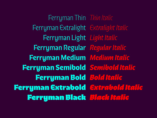
Felix Braden’s Ferryman is a fine new addition to this hybrid genre, and a convenient one: it comes in a full range of weights, with italics.

Now out on Floodfonts:
https://www.floodfonts.com/ferryman/

Ferryman – A Blackletter type family designed for everyday use

Microsite of the typeface Ferryman by Felix Braden.

In Ferryman, letterforms that are unfamiliar to contemporary readers were given a modernized form. If you want to, you can dial up its blackletter mien through the use of the alternates for d, z, M etc., though.

By the way, Floodfonts does a great job with their #microsites, and the one for Ferryman is no exception. It has everything I’m looking for (and not more), including a peek into the process. See for yourself: https://www.floodfonts.com/ferryman/

Ferryman – A Blackletter type family designed for everyday use

Microsite of the typeface Ferryman by Felix Braden.