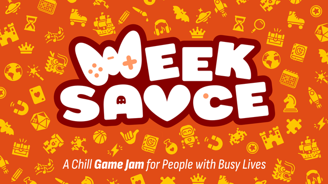
Have been working on and off on a new logo for the #WeekSauce #GameJam. Still a WIP, but I think it is getting there?

#ScreenShotSaturday

@mysterycoconut globally it looks great! The only think that's disturbing is the β™₯️ I read as a V. But appart from that it looks cool (and a very tempting game jam πŸ˜„)
@Holi yeah, you are not the first one to point that out about the heart. I tried other things (like this one), but I just like having a ❀️ as part of the logo of a jam that is about having a nice environment to work on games without all the pressure
@mysterycoconut @Holi I had the same feedback. If you pull Week off-center a bit the U could be a big smile and the Es could suggest the squeezed eyes of a smiling person, if lower-case?

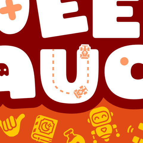
@mysterycoconut Given the overall roundness of the design, the E's look a bit too square for my liking. I'd suggest rounding the top and bottom left corners off a little more.

Also I'd go all in with the Pac-Man reference on the C by getting rid of the circle in the middle and making the eye fill darker. Hurts readability a bit, but nothing compared to the heart, which I (like @Holi) read as a V first. Making it a little rounder as well might alleviate the problem, though?

Quick mockup:

@njamster @Holi Funny, I did have a previous version of this with the C as Pac Man, but decided against it because of both readability and not wanting to get in trouble with Bandai Namco πŸ˜† Thanks for the suggestions!
@mysterycoconut @njamster he's so cute πŸ₯ΊπŸ˜„ do you really think that might be a case big enough for Namco/Bandai to sue you?