Bay Area peeps, I starting building a BART Live map that shows where the trains in real time https://bart-view.vercel.app/
What do you think?
What do you think?
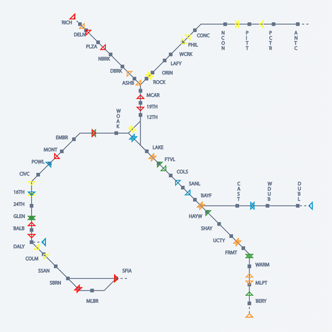
@bgmunny I think this is very cool! It's clear, simple, and visually compelling.
In your shoes I might separate the tracks going different directions; the "collisions" make me somehow uncomfortable. And you could try using use some animation to give continuous motion for things that are in motion. You might also see what turning the station labels into mouseovers does. But that would shift it away from practicality and toward art, so it depends a lot on your goals.
@bgmunny I think it looks awesome. If I were going to distribute it as a working app I'd try to make it work for color-blind folks but I have no idea how I'd do that with the otherwise brilliant use of colored directional triangles.
Also I'm reminded that in 47 years of using the fremont station I still think of it as a terminus and should ride to the new stations just to see.