Home
Explore
mastodon.social
mstdn.social
infosec.exchange
mstdn.jp
social.vivaldi.net
hachyderm.io
piaille.fr
mastodon.world
troet.cafe
m.cmx.im
mastodon.uno
mastodon.gamedev.place
techhub.social
social.tchncs.de
mastodon.nl
norden.social
flipboard.social
kolektiva.social
mastoturk.org
mathstodon.xyz
nrw.social
tech.lgbt
occm.cc
defcon.social
mastodonapp.uk
mstdn.ca
universeodon.com
c.im
masto.es
sueden.social
mstdn.party
toot.community
mastodon.sdf.org
sfba.social
mastodon.scot
tkz.one
mastodon.ie
ohai.social
ruhr.social
hessen.social
mastodontech.de
pouet.chapril.org
mastodon.nu
livellosegreto.it
mastodon.au
ieji.de
social.linux.pizza
muenchen.social
mastodon.bida.im
indieweb.social
social.cologne
mastodon.eus
ioc.exchange
mastodon.green
mastodont.cat
wehavecookies.social
social.anoxinon.de
feuerwehr.social
nerdculture.de
mindly.social
ruby.social
masto.nu
mastodon.ml
cyberplace.social
metalhead.club
uri.life
m.otter.homes
phpc.social
dresden.network
mastodontti.fi
toot.wales
sunny.garden
climatejustice.social
sciences.social
noc.social
mstdn.plus
tooting.ch
freiburg.social
blorbo.social
furry.engineer
mastodon.me.uk
privacysafe.social
hostux.social
rollenspiel.social
mastodon.com.pl
woof.tech
bonn.social
urbanists.social
mastoart.social
mast.lat
gaygeek.social
rheinneckar.social
ursal.zone
rivals.space
fairy.id
h4.io
mapstodon.space
wien.rocks
expressional.social
discuss.systems
mstdn.games
masto.pt
mastodon-belgium.be
todon.nl
bark.lgbt
hcommons.social
snabelen.no
sakurajima.moe
cupoftea.social
darmstadt.social
lgbtqia.space
tilde.zone
mastodon.gal
retro.pizza
glasgow.social
urusai.social
ludosphere.fr
muenster.im
qdon.space
mastodon.berlin
socel.net
pawb.fun
peoplemaking.games
toot.aquilenet.fr
union.place
freeradical.zone
veganism.social
mast.dragon-fly.club
kanoa.de
vmst.io
bookstodon.com
mstdn.dk
famichiki.jp
theblower.au
witter.cz
eupolicy.social
masto.nyc
oslo.town
machteburch.social
toad.social
xarxa.cloud
tooot.im
mastodon.uy
stranger.social
fandom.ink
musicworld.social
thecanadian.social
disabled.social
gardenstate.social
mstdn.business
burningboard.net
graphics.social
pnw.zone
cultur.social
hear-me.social
mountains.social
furries.club
mastorol.es
mustard.blog
mastodon.pnpde.social
ciberlandia.pt
musician.social
dizl.de
archaeo.social
toot.kif.rocks
bahn.social
fedi.at
tea.codes
tuiter.rocks
libretooth.gr
4bear.com
babka.social
musicians.today
dmv.community
ani.work
vkl.world
mastodon.energy
frikiverse.zone
drupal.community
qaf.men
tyrol.social
gamepad.club
masto.nobigtech.es
mast.hpc.social
social.seattle.wa.us
donphan.social
fulda.social
lou.lt
toot.si
social.politicaconciencia.org
tchafia.be
is.nota.live
hometech.social
muri.network
bzh.social
puntarella.party
mograph.social
social.silicon.moe
norcal.social
datasci.social
wargamers.social
lsbt.me
opencoaster.net
toot.funami.tech
mastodon.africa
hispagatos.space
theatl.social
mastodon.vlaanderen
toot.re
burma.social
epicure.social
est.social
elekk.xyz
mastodon.london
leipzig.town
genealysis.social
lewacki.space
kurry.social
toot.garden
mastodon.pirateparty.be
apobangpo.space
mstdn.animexx.de
mastodon.cr
planetearth.social
friendsofdesoto.social
mastodon.education
indieauthors.social
devianze.city
esq.social
mastodon.wien
ruhrpott.social
colorid.es
mastodon.bot
hoosier.social
techtoots.com
toots.nu
frontrange.co
opalstack.social
library.love
mastodon-swiss.org
fribygda.no
paktodon.asia
h-net.social
raphus.social
fairmove.net
mastodon.sg
rheinhessen.social
cwb.social
poweredbygay.social
rail.chat
arvr.social
seocommunity.social
episcodon.net
camp.smolnet.org
stereodon.social
epsilon.social
mastodon.free-solutions.org
okla.social
masto.yttrx.com
growers.social
bologna.one
biplus.social
mastodon.cipherbliss.com
k8s.social
elizur.me
birdon.social
mastodon.hosnet.fr
skastodon.com
khiar.net
mastodon.babb.no
squawk.mytransponder.com
mastodon.frl
cville.online
lounge.town
social.diva.exchange
silversword.online
balkan.fedive.rs
mastodon.iow.social
kzoo.to
mastodon.bachgau.social
kcmo.social
ailbhean.co-shaoghal.net
23.illuminati.org
synapse.cafe
mastodon.ph
mcr.wtf
nfld.me
voi.social
mastodon.bahia.no
social.ferrocarril.net
troet.fediverse.at
nwb.social
darticulate.com
nautical.social
mastodon.ee
mastodon.mg
social.sndevs.com
polsci.social
fpl.social
dariox.club
ms.maritime.social
nomanssky.social
mikumikudance.cloud
kjas.no
bvb.social
nutmeg.social
ceilidh.online
netsphere.one
learningdisability.social
computerfairi.es
wxw.moe
Log In
Daniel Moser
Jul 4, 2023
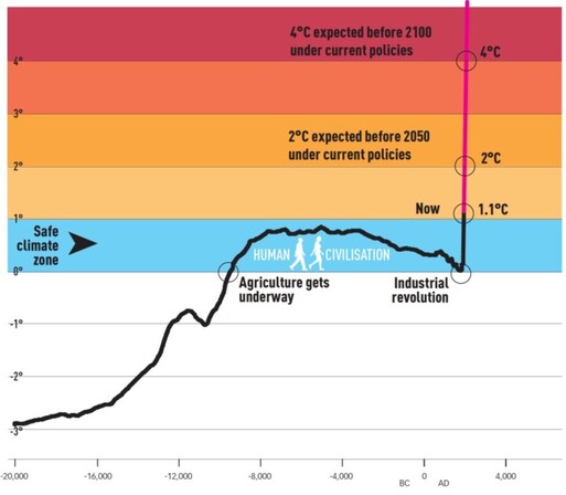
This Climate Graphic is quite powerful 👇👇
14
408
478
Show thread
Swiss Chalet Sommelier
I don't understand the time labels (2° expected before 2050 vs a shorter time period for 4°?)
0
0
0