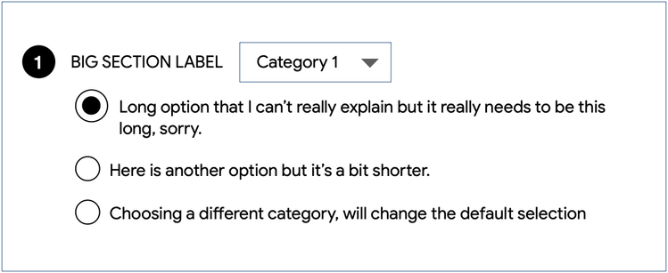
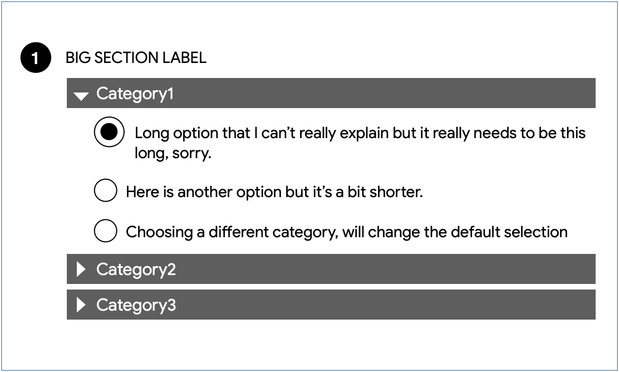
Here's a #ux design question I'm facing: how can I display 12 options to the user where they can pick only one. The classic is of course a list of radio buttons or just a drop down menu.

However the labels are >40 chars which makes both menus and radio buttons cumbersome. (Hard constraint)

It turns out these 12 options are in 4 categories (3 options for each category) which might offer a helpful collapse mechanism.

I've got a solution in mind but thought I'd ask if anyone had any fun ideas

Thank you for all the suggestions. Like so many real world examples, the details are hard to explain easily (e.g. why the long labels) but I'm going with (for now) what some of you suggested: an accordion based on the categories. The only trick is having the exclusivity remain intact while you open/close the categories. What does it mean to select one and close its category?

Hope to post examples soon

Here is my *tentative* solution. Showing all 12 creates a bit of a parsing/scanning problem, it's just SO MUCH to go through. If we prioritize the categories we can choose the one most likely to be needed so we can present just the 3 most likely options. The category picker is 'sticky' so if you do choose another, it will remember your choice.

What I struggled with is that changing category WILL change your default choice (it would be weird to keep hidden radio button as your choice) Comments?

@scottjenson my two cents:

1. I can't see other categories right away until I click and Dropdown pops up
2. it takes 2 clicks to change a category

I'd prefer to choose a category first and only then to go deeper into more specific options. Like in Accordion.

But generally speaking it depends on how well it splits up. If the categorization is somewhat vague then it makes sense to prioritize those 12 options instead.

@deepsweet fair enough an accordion requires a line for each category so takes up more vertical space. That's not a for-the-user argument of course, just a trade off

@scottjenson @deepsweet could consider tabs then so the categories are listed horizontally? Or an additional step so first choosing the category and then the options?

But my mind keeps going back to whether or not the user needs to compare all 12 options to make a decision. If they do, might be best to try to show all options at once, but make the list more digestible in some way (showing the categories along side the options in some way, or having a bite-sized primary label and the hard constraint labels more secondary in the list?)

@jonoor @deepsweet All very fair questions. If I could explain the whole project to you we could get into the details. I tried to make it as mathematically pure as possible even though obviously context matters.

@jonoor @deepsweet I've been thinking about it more and it may be worth the extra vertical space and go with your accordion approach. It does take more vertical space but as you point out, it makes the categories so much more approachable and obvious.

What I find interesting about this problem is that there is no 'perfect' answer, just a series of trade offs.

@scottjenson @deepsweet definitely had an immediate reaction of “this feels right” so I think you’re making the right trade offs!