 Scott Killen
 Andy Bell
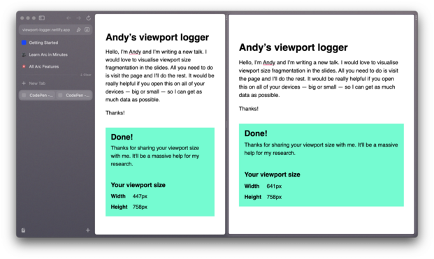
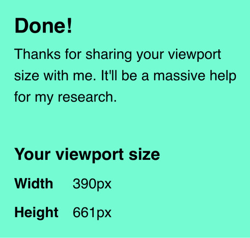
I made this little viewport logger: https://viewport-logger.netlify.app/
I'd really appreciate it if you could visit it on your devices — especially small screens — because I want to use the data to illustrate just how much screen fragmentation there is.
Please share with your pals too!
🚨Edit: this is now closed. Thanks everyone: we got > 100k datapoints!

 Thain
Thain Mike Aparicio
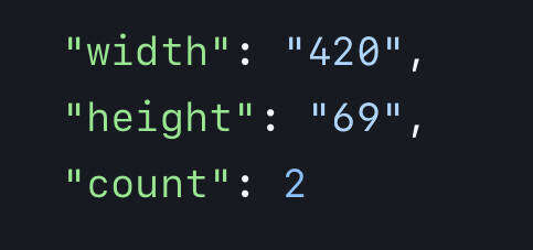
 Jens Grochtdreis
 Charis Rooda 🌿
 Steve Frenzel
 Adrian Roselli, pH0
 Callie 🏳️⚧️
 AliveDevil
 Just Boby
 Stephanie
 Kevin Frost
 Garry Aylott
 Egor Kloos
 Nicd
Nicd 
 Stuart Langridge
 Matt Hobbs
 Nicolas Hoizey
 kaiserkiwi
 Etcetera Type Co
 Vasilis
 Philipp
 Daniel Schildt
 Nikolas Evers
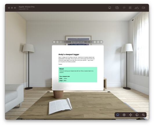

 acetone_kitten
 Anthony Sorace
 DeeAnn Little
 חנן כהן • Hanan Cohen
 Samer Farha
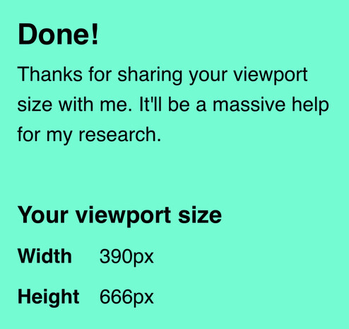
 nzjames
 Tomer Cohen 🖖
 Andy Carolan