Today I discovered https://www.whocanuse.com and I wanted to yell it to the world, but 56 people will have to do.


@marcamos holy trinity boost, favourite, bookmark! Thank you

@marcamos it’s wonderful, I’ve known it for some time too
@daria There are probably so many more cool tools I don’t know about.
@marcamos coolors.co is one of my favourite.
@marcamos @daria https://www.myndex.com/APCA/ is an actually good one that uses a perceptually based algorithm for calculating a contrast score. Current WCAG is actually pretty garbage (though AFAIK the next version will adopt a very similar system to this! The future, but now!)
@marcamos Bookmarking this!
And maybe I can offer another in exchange. I use COBLIS for graphics testing: https://www.color-blindness.com/coblis-color-blindness-simulator/
It's geared to simulating colorblindness for whole images. Both might be useful for different reasons.
There is an updated version, that offers improved algorithms, here: http://mapeper.github.io/jsColorblindSimulator/
Happy you find it useful.
@marcamos This is really cool. I'm going to send it to my color blind family members.
@marcamos That's a good one - Lots of details on different user types. I think my favourite for formulating (rather than just checking) is still https://colorable.jxnblk.com/
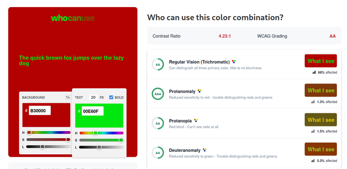
@marcamos Kind of disagree for the red text on black, though. I find it very hard to see.
@marcamos a friend of mine built https://play.google.com/store/apps/details?id=net.inclem.colourblind which use the android camera to simulate a few conditions. it's open source, too https://github.com/inclement/colour-blind-camera

@marcamos Thanks for sharing! This will come in very handy.
@marcamos ooo I'll definitely be using this
@marcamos Wow nice, dodn't know that. Thanks a lot!
@marcamos what a great page! And kudos for this paragraph on the bottom left!
@marcamos this is nice. It’d be useful to have something like this for a design system, so you can easily test whether multiple button types (e.g. primary, secondary, etc) have contrast with each other, even if they pass when they’re standalone.
@marcamos That is awesome.
@securopean You’re awesome.
@marcamos But those 56 will boost to another 56, and they to another, and I don't find the original Dune quote to finish the toot with its full inspirational potential.
@chrysn So long as the spice keeps flowing.

@marcamos One nice trick is that you can paste your
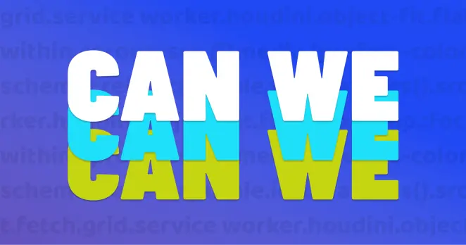
rgb(a) definitions in there (eg. rgba(49,53,67,.95)) and it'll convert them to hex (stripping the alpha part, but that's understandable)@marcamos You might discover some other useful on https://canwe.dev (I maintain it).
@marcamos holy shit, this is exactly what I wanted when I was looking for ways to help make my own site more accessible, thank you. Tools like this are so useful in helping devs understand how to make the web more accessible.
@marcamos here’s another great one for anyone else doing data visualisation and wanting to test palettes for being colourblind safe 😊 https://gka.github.io/palettes/ #rstats #dataviz
@marcamos this tool is in my faves since i discovered it last year !

@marcamos oh that is really useful
@marcamos *trying to create text invisible to one of my partners* :>
@marcamos yay for total equity of my website's shitty theme!
In all seriouslyness tho, good tool
It's a screenshot of the colour…
A screenshot of the website, wh…
A screenshot of the website, wh…
In all seriouslyness tho, good tool
It's a screenshot of the colour…
A screenshot of the website, wh…
A screenshot of the website, wh…
@marcamos
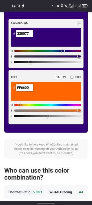
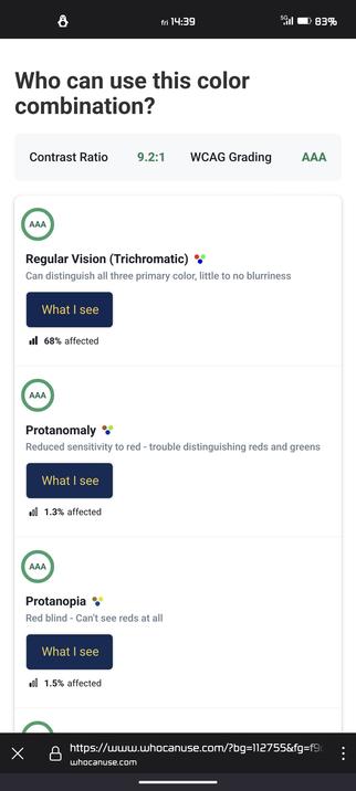
like to see that my current color combination works (AA rating only in direct sunlight )
like to see that my current color combination works (AA rating only in direct sunlight )
@marcamos this is really cool. Thank you for sharing it!
@marcamos
Thank you for this.
The moment I saw this, I thought "Crap, there's one customer with links in the footer of their login page that I bet wouldn't do well here."
Yeah. 100% fail.
Opened an issue, and am adjusting the colors to pass at least most of them.
@marcamos I actually love this little detail as well, I hope they don't change it
@marcamos Das ist cool.
@marcamos What?! Awesome! Thanks for the heads up. 😍
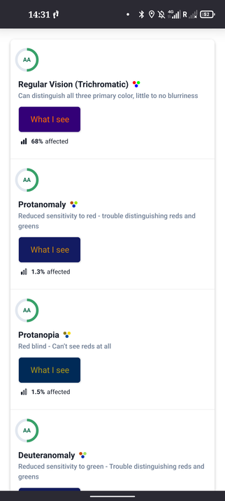
@marcamos Huh, interesting. I tried to create the "worst case scenario" for Protanomaly and it somehow scores *better* than Regular Vision there? I Guess my naive intuition about how color blindness works is way off (or the tool is).
@marcamos Maybe of interest @dogwonder
@markcooper @marcamos awesome. Very good tool!
@marcamos Make it 57 thanks to the magic of retooting
@marcamos thanks for sharing. Looks like a very useful tool.
@marcamos 56 people, but it looks like I was the 250+th person to boost it. So yeah: good find and great work getting it out there!
@dkreidler Well thanks!

LB: if anyone wants to extend https://quietmisdreavus.github.io/mkcolor/ with the color-blindness math that that site links to, that would be cool 👀
@marcamos this is FANTASTIC
@marcamos I'm disappointed that sir doesn't show what it looks like with astigmatism.
@marcamos
Oh thank you! I have actually been looking for something exactly like that
Oh thank you! I have actually been looking for something exactly like that
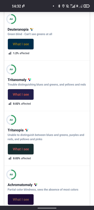
@marcamos As one of the 0.05% of the population (apparently) with complete Achromatopsia, it does feel nice to be included!
@Meyerweb you might like this
@marcamos I had no clue something like this existed, but that's awesome. Not useful for me specifically but there's clearly a use case it meets.
@marcamos omg, the favicon even updates as the colors do