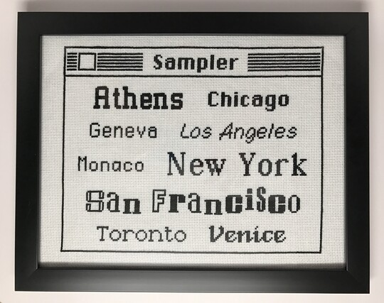
Another throwback #NerdStitch, I loved the old original Mac fonts, so I decided to do a pixel perfect font sampler!
@Gmatom @wezm it wasn’t until the third time I saw the image I realized it was stiched and not digital 🙃 Nice work!
@Gmatom My favourite story about those fonts was that they were originally named after stops on the Long Island Railroad, because that was a list of temporary code names that was as good as any. Jobs barged in and, misreading the situation as always, chastised the developers for not picking more glamorous cities.
@spacehobo I’d never heard that, that’s hilarious!

@Gmatom This is amazing!

I loved "Chicago" so much. I love the attention to detail in creating a font that's both bold and legible on low-resolution monochromatic screens.

I think it was one of the subtly great things about the iPod: Apple had a font that just worked so well on that screen. It looks so smooth at low-resolution because it makes choices to avoid a lot of diagonals.

@Gmatom @jentrification I never even owned/used a Mac until deep in the OS X timeline but this is somehow very nostalgic
@Gmatom This is absolutely superb, wow 🤩.
@Gmatom @hypertalking need to do one with the extremely janky way it rendered Palatino italic at small font sizes 😃
@Gmatom Why did San Francisco look like a ransom note?