Very much enjoying @HXLNT's Carousel 
https://partytimehexcellent.itch.io/carousel
https://merveilles.town/@HXLNT/110341086483979609

Very much enjoying @HXLNT's Carousel
https://partytimehexcellent.itch.io/carousel
https://merveilles.town/@HXLNT/110341086483979609
Oh interesting! After realising DOSBox was using the US keyboard layout, I found out how to switch the layout to UK and as a side effect, the font has changed!
I like that the apostrophe is more centrally positioned between the two letters, but I am less of a fan of the descenders being squished above the baseline, so “p” and “g” look smaller than “e”. 😤
Most of all, I hadn't realised that the font is user-controllable, but now I can find a more agreeable one myself! 
cc @HXLNT
Just managed to change the font used in Carousel!
It all hinges around a custom EGA.CPI file in the current dir: you can get DOSBox's default one by extracting one of the byte arrays in src/dos/dos_codepages.h to a file and decompressing it with upx.
The tools inside http://www.kostis.net/freeware/cpi120.zip edit EGA.CPI: extract your codepage with CPIGET, extract the fonts from that with CP2FNT, replace CPxyz.F08 with your chosen font, then use FNT2CP, CPIDEL and CPIADD to overwrite the codepage entry. ✨
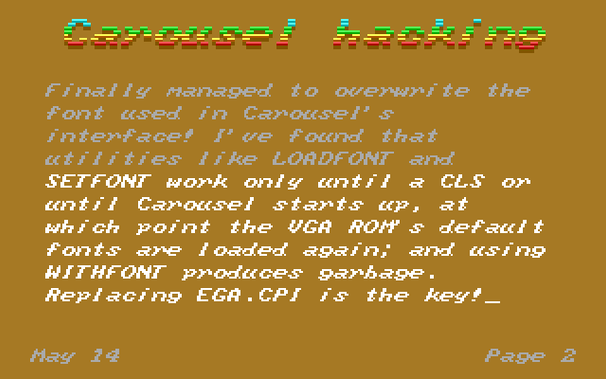
Finally, I have the default DOSBox character set (which itself had to be extracted from src/ints/int10_memory.cpp) back into Carousel, like I originally wanted.
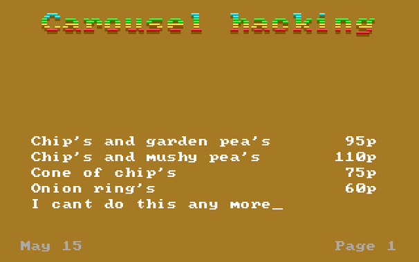
I nudged the apostrophe over a pixel, just to make it look a little nicer. There's evidence in the screenshot, even if the subject matter is a bit painful!