Updated my 2015 post on typefaces for dyslexia with the DysTitles subtitle font making the rounds lately:
https://adrianroselli.com/2015/03/typefaces-for-dyslexia.html#Update14

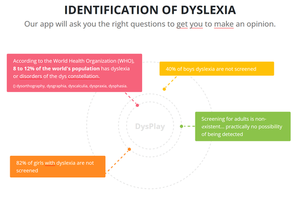
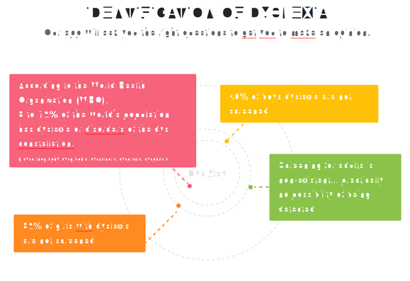
Attached is a set of all characters, and a comparison of the source font swapped on the maker’s site.

#accessibility #a11y

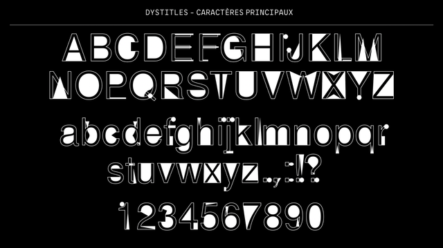
Typefaces for Dyslexia

Both typefaces claim that heavier strokes on the bottom prevent dyslexic readers from flipping the letters when viewing them. The original caption: A heavier bottom is used to show which way is supposed to be down. I’ve been writing this post in fits, so it may be a bit disjointed.…

Adrian Roselli

@aardrian Hi, Frenchie here. Gave it a quick look and didn't find any research references in French.

At first I thought this was supposed to be a "here's a font for neurotypical people to experience what someone with dyslexia might experience with a classic font", but no, it's actually supposedly better? I'm neurotypical so not the target here, but I have a feeling pairs like r/t or b/6 are easy to confuse at smaller sizes. Would love some actual research shown besides a few testimonials. 😬

@chriskirknielsen I feel a little better about my ability to find stuff (or not).

I would love some research as well, or at least pointers to supporting data. But nope.