Of course, these were hand-made. There’s imperfections if you look closely. It’s also internally inconsistent. Look at the stems of different characters. The stem of the R is much thicker than the stem of the T. Look how the whole logo bows. See how the top of the last S is narrower than the bottom of the S? None of these things point to it being wrong, but it’s indicative to me that these titles were never made with a “font” in mind. So if you emulate just one part, you miss the whole picture.
That’s only part of it. Star Wars only has 5 unique letters. For “The Empire Strikes Back” they added quite a few more: H,E,M,P,I,K,B,C. But the S was different, it’s squarer. Also, there were no ligatures. In the original logo, the ST and RS connect. But in ESB, nothing connects. Please try to ignore that incredible E, that’s another topic for another day.
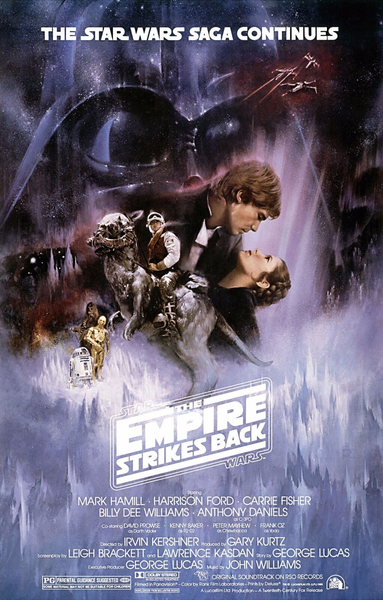
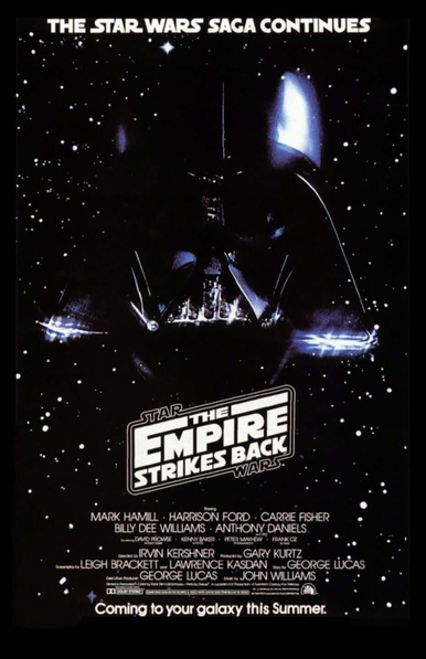
Theatrical poster has a bottom bar in the logo, the teaser doesn’t. In the tagline on the top of each poster, the Ns and Cs are different.
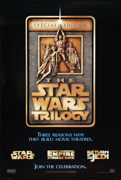
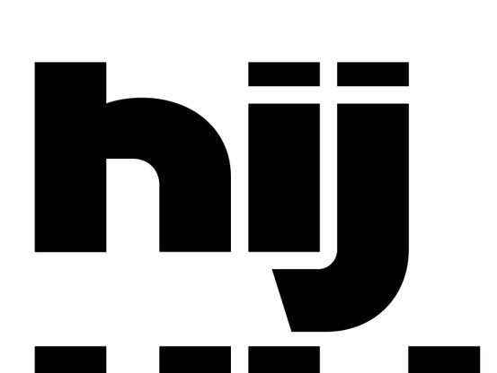
And while they didn’t release Return of the Jedi with this style of logo, on a 95 re-release of the Trilogy on VHS, it got a new logo that introduced a bunch of new things into this design language. More like “Return of the Ligatures” am I right? RE TU RN? None of these follow the same design rules the original logo had. The E had a shorter crossbar than the ones in Empire. “of the” was stacked and set into its own lockup, with a descending J. Lots of new letters and things to consider.
And that doesn’t even address the changes to the 1977 film’s logo. Wider, wormier Ss, pointy W? But then— the Special Edition appeared. And now there was something entirely new: that TR ligature. What in the world! We’ve seen the Star Wars “R” before, but now it’s modified to make a connection that would rival ROTJ’s interesting ligature choices. This *one* decision influences a lot of the way people think about Star Wars fonts, and absolutely inspired the one you saw I made several posts up.
But check out all the other things! The stem of the T is extremely wide compared to the I and L. The O is not only ultra-wide, but it’s varied more in line thickness. Each diagonal of the Y is a different angle and thickness. Lots of Antique Olive inspiration (and maybe straight-up substitutions or modifications). And later, also Gill Sans substitutions. You can see here that in the main lockup, you still have the flatter W, but in the *movie*, it’s the pointy version.
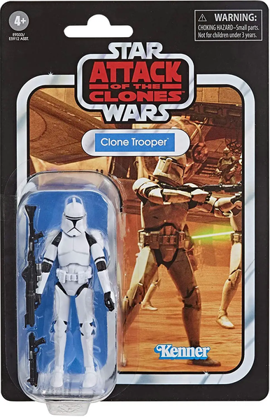
In the DVD release of the Original Trilogy, the T and R are not connected. And the leg of the R is ...straight? The GY don’t connect anymore either. By the time the prequels come around, the style was basically not in use. Attack of the Clones got an alternate logo that was barely in any marketing material but did end up on some merch. They still use a variation of it on the Kenner toys. Note the TT. Also how ATTACK is stretched vertically and CLONES is stretched horizontally.
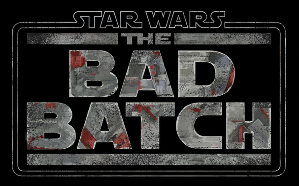
Honestly, the most prominent use of this style in recent years has been from animation. The Clone Wars. The Bad Batch. Notice how the E’s crossbar in CLONE is not quite as tucked in as the ROTJ logo above, but also not fully extended like the one in Empire. That’s 3 Es, if you’re keeping track.
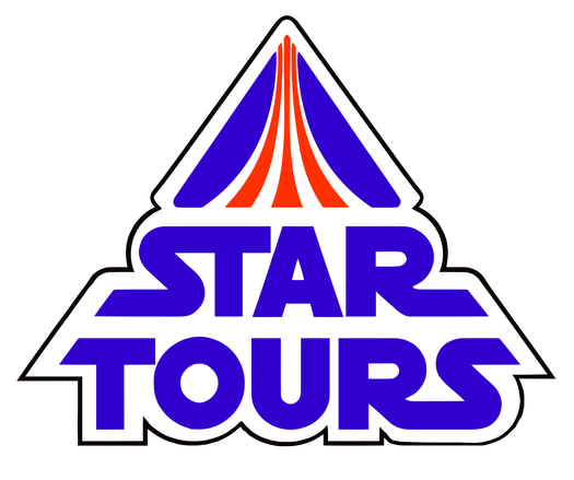
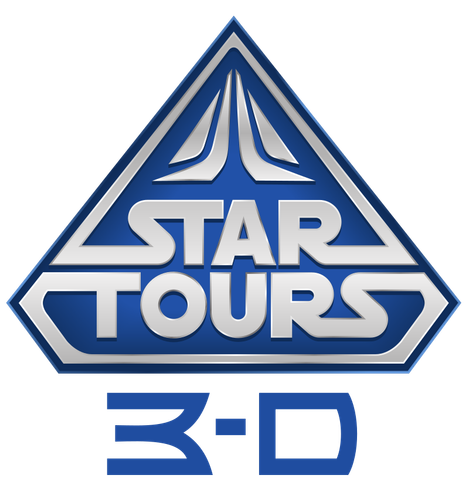
It’s also worth mentioning the Star Tours logo (attraction at Disney Parks). The original was a bit sharper, but they’re mostly the same. Here we see a U, a rounder O (compared to TRILOGY). But generally speaking, more “mono weight” throughout.
But then— the sequel trilogy. Here we see a different M (in my opinion, a bit out of place), and maybe for the first time... numerals? Interesting choices all around.
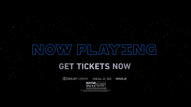
There’s a few examples from recent memory that made my eye twitch a little. This “Prequel Trilogy” box set? That Q is triggering some fear-anger-hate-suffering line of thinking. Is that U just a turned C? The P and R don’t feel like they belong together. What about this “NOW PLAYING” from a trailer for The Rise of Skywalker? That... capital I? With the bars on top and bottom? The O that looks small compared to the W? This moment is when I knew I wanted to try to make a font, at least for myself.
So I started making some letter forms. To try it out. I used The Rise of Skywalker trailer cards as an example, and kicked out some logos for various movies to see how it played out. After I finished making the logos, I kinda felt it was done. I didn’t need a font, I just needed the ability to make my own logos.
After it sat dormant for a while, @AurekFonts contacted me. He asked if I was gonna make that into a font or not. And we talked about what would be needed to make it into one.
I was extremely naive, and thought all we needed was punctuation and “not that much kerning.”
I was extremely wrong. For the next year and a half, Ender and I worked sometimes every day of the week on this. Every letter was redrawn. And though we could’ve stopped at many points along the way, if this thread is any indication, we didn’t. Because in my head, I wanted to be able to emulate every version of this style that previously existed.
...and in multiple languages.
I’ll pick this up later, but that’s most of the “backstory.” In the meantime, go to https://crown.fontdue.com/fonts/womprat and check out the type testers. Open the “opentype features” drawer and click around as you type, trying out the different styles. And you’ll see exactly why this took the time it did.
I have so much more to say, so I’ll be back later.
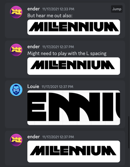
Near the end of 2021, Ender and I started to develop a plan to make the font. He said I’d send him my Illustrator docs, we’d discuss how many more characters we’d need (punctuation, numerals, symbols, ligatures, alternates), draw everything else, and that he’d build the font and kern it.
At the time, it was called Parsec, and this is all I had. I sent over this document and Ender had a few questions that he visualized in dark blue. This is when I knew he was the right partner for this project.
If you’re eagle-eyed you can see a lot of things “wrong” with my initial design. The K is too narrow, the N is too wide. the X and Y were clumsy. The numerals were not cohesive. But at the time, I thought this was pretty good. It took getting it all into an actual font file to realize what was wrong.
Any type designer will tell you this is why you have to design inside the font-creation tool: you need to design in the context of words.
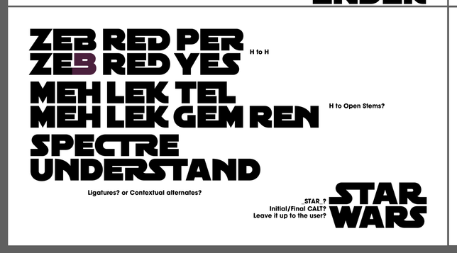
Ender sent over more questions. How would we handle ligatures that could happen more than one way? like EB, ED? Would we do ligatures that go from horizontal to vertical lines? What would a T look like if it were in the middle of a ligature? These were all things we’d continue discuss for over a year.
Another thing we were thinking about is how we would get “Star Wars” to render correctly in this font. The thing is, some of the letters (like S) would need to change for the logo version. Hm!
We started sharing samples of official logos, with this style in use, so we could try to figure out what characters we needed, what alts we needed, and how we’d like to develop rules. In fact, Ender shared the Russian Star Wars logo within the first couple days. And that’s probably why our font has more than just Latin characters. From the start, Cyrillic was on the table. (We also have Greek and Katakana.) I also sketched out a German sharp S.
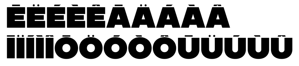
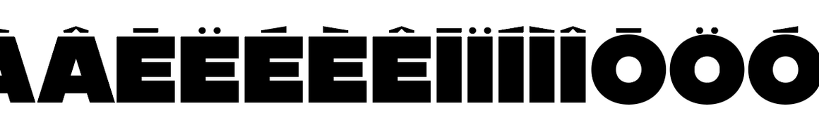
Diacritical marks were one of the toughest things we had to figure out. Most fonts make diacritics that feel like the same weight as the letters themselves. But we know from limited diacritical use in the real logos that they’re fairly minimal or extremely stylized. My first pass was... maybe a little embarrassing. What we needed was to make them really low profile, because part of the style is extremely-low-clearance leading (the space between lines of text).
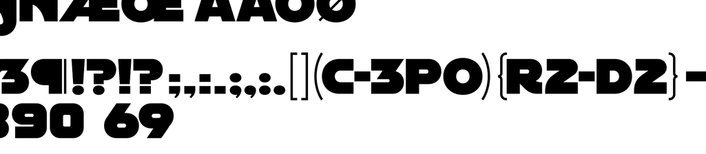
Within the first month, I made some weirdo round punctuation. We did keep the “hairline” parenthesis though. I think that’s important to maintaining the bold appearance of the font. Oh, and this alternate asterisk? This is an early version of it, but it was clear we’d need it.
I made the first pass on Greek and Cyrillic. This was only five or so days into the project. But I’m just going to say it now: almost every single character was completely redrawn between then and now. I don’t think I got much of anything right on the first go. Even though these characters looked good to me, they didn’t *work*.
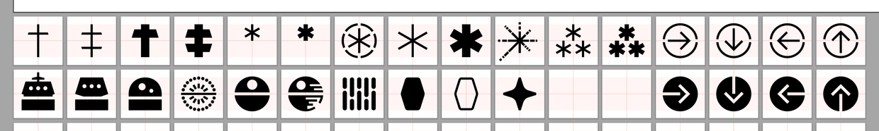
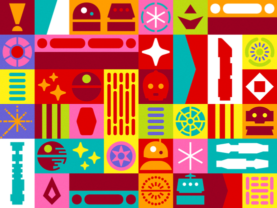
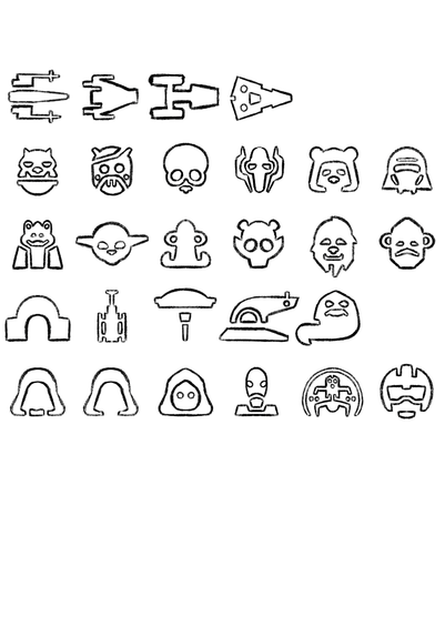
I started drawing some symbols. an “Empire” asterisk, and a sabacc card as a lozenge. Death Star lights, plans, etc. A better version of the Death Star blowing up. I made just a couple droids. I thought this was fine. This was “all we needed.” (We have over 400 icons in the shipping font now.)
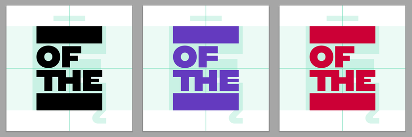
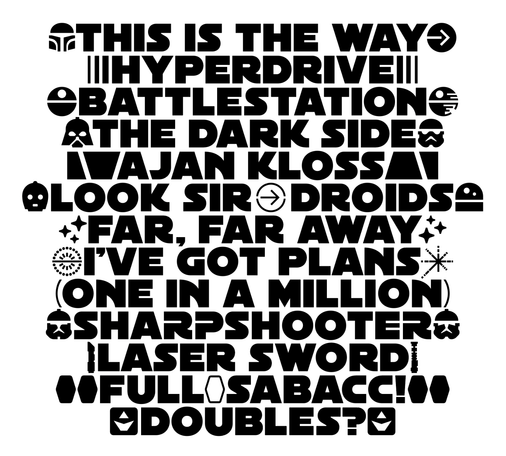
Another thing I knew we needed early on was “title blocks” or “catchwords,” like the one for Return of the Jedi. Thing is, they also use single-word versions for some roleplaying games. So we made those too. We had to make 3 for every set of words, for different stylistic sets.
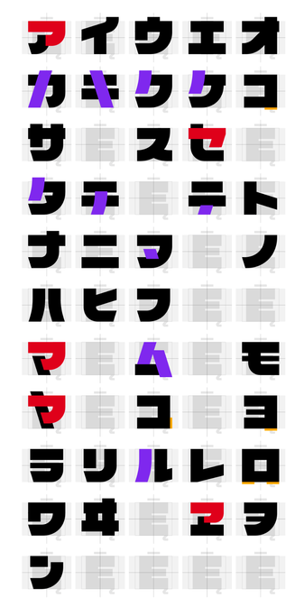
I started drawing Katakana, still all within the first month. This was hard. It is hard. Because Japanese characters don’t necessarily sit on a baseline. They are centered in a square box instead. But in this font, we’d need the top and bottom horizontals (if any) to be a certain thickness, to maintain the style of the font. I worked on this for a while, and didn’t arrive at a good solution I could be proud of for some time.
Some ideas survived. Others did not. lol
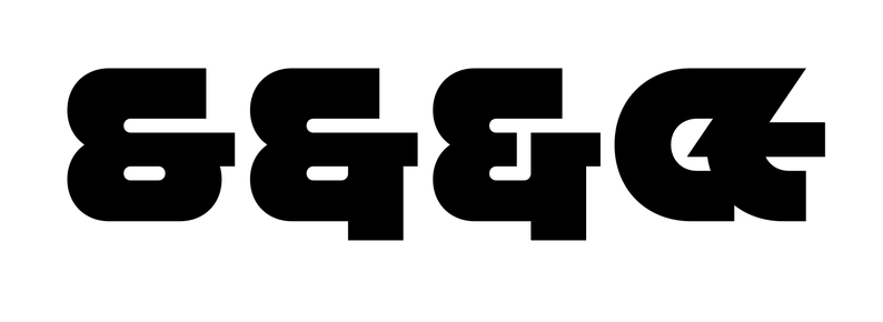
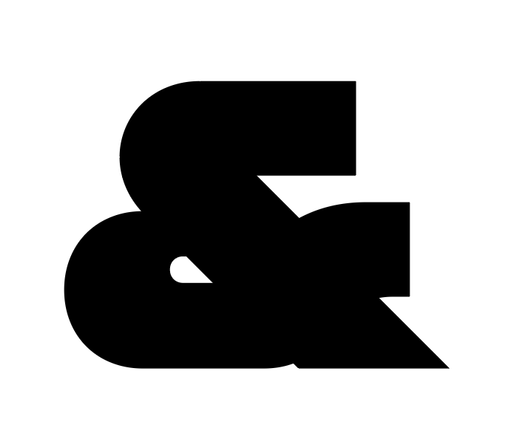
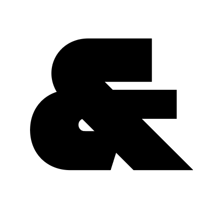
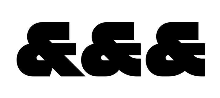
I never could get that style of ampersand to work.
I don’t know what prompted this, but I think this is when we decided to fold Avant Garde style ligatures into our font.
Oh, and I’m glad we decided not to do lowercase.
After I made a bunch of icons, I realized we could do some cute patterns. But here’s the thing about icons for this. It’s like making a list of people to invite to your wedding. I made other R-series droids because we had R2 and R5. If you have those, you need R1, R3, R4, R6, R7, R8, R9, and R0. At least. But probably also C1 and—
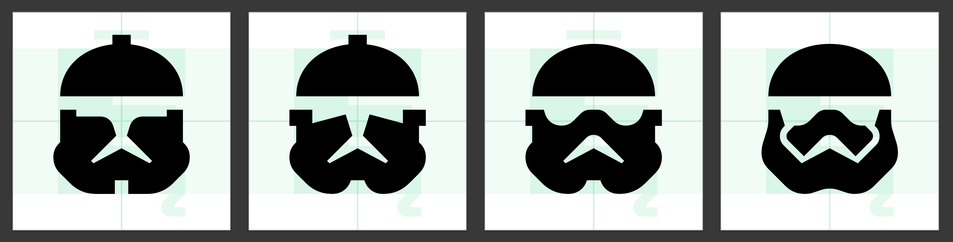
...and then what about troopers? This conundrum led me down a path of making over 400 icons for Womprat, including helmets introduced into canon just a few weeks ago.
Having icons that matched the font was a huge win. There’s a lot of ways to draw these things, but doing so in a way that was synonymous with the type made it so fun to incorporate with text. I really hope people use it like that.
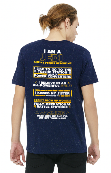
We made tons of samples like this during the creation of Womprat, and I will not apologize for this t-shirt design I made.
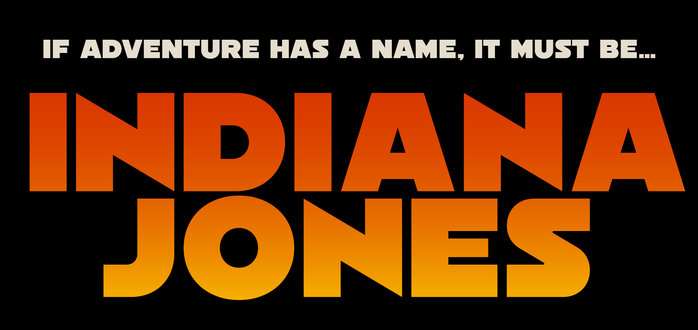
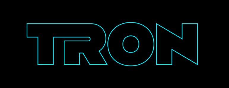
Having as many alternates as we were making made us realize we could do all sorts of fun things that weren’t Star Wars. By using the alternates, we could make other titles or posters too. And I stand by it! I think you could use Womprat for a variety of things if you turn on the right settings.
If you’ve been following along with this whole thread, you know there were a few instances of characters looking different. I just want you to know we certainly tried alternate Cs and Gs that were fully rounded to match real posters, but the implications of that really meant we’d have to do a lot of others, like S. And that felt like... it was another font. Another idea. That’s not what this is supposed to be. So some things we determined were... “not canon” despite appearing in official use.
Shoutout to Store Wars. I’ve you’ve never seen it, go look it up.
One day in December 2021, Ender thought to make a unicase version of the font. It was extremely charming, even if it didn’t fit into what we were building. Though a lot of this idea ended up re-materializing as a stylistic set called “Youngling” that rounds a lot of letters.
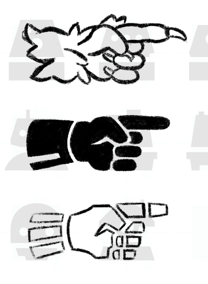
Gosh, looking through old images, I found this. An old sketch of manicules from December 2021.
I *did* end up doing a Wampa hand and Vader hand! But I honestly didn’t draw them in the font until a couple weeks ago.
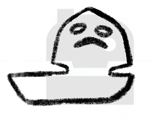
Here’s some other early sketches of icons. How about that Jabba? lol
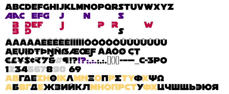
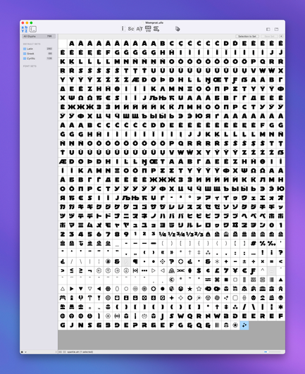
It’s charming to think of the time we had fewer than 1000 glyphs in the font.
...we shipped a font with almost 4000.
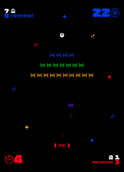
Could you make an entire video game only using a font?
I don’t see why not.
This was maybe the point when I realized making icons would never end.
Oh. Latin, Greek, Cyrillic, and Katakana wasn’t the whole plan, either.
In January 2022, I was starting to work on Hebrew. But let me tell you: trying to make a font that has Hebrew in it (being right-to-left) is incredibly difficult and makes kerning a worse problem than it already was for this font. I wish we could figure it out, and maybe we will make it as a separate font, because I still kinda want it.
I’ll continue more later! Thanks for reading along.
Whenever I showed friends this work-in-progress font, the first question was one of concern: doesn’t this have limited use cases? Only for Star Wars?
Over the last two years, I’ve collected all sorts of samples using “the Star Wars font” and— it’s not limited to Star Wars. I see it all the time. It makes me laugh because it’s so obvious to me. Either people have no idea what they’re using. Or they think it’s *cool*. Either way, it *does* get used a lot.
I’m gonna switch gears a little and show how easy it can be to make a logo with this font. With various programmed OpenType features, alternate characters, icons and symbols, you can have something really nice really fast.
Before I jump into some videos on how you can use the font, I just want to be clear in case it isn’t:
There is a *free* Aurebesh version of this font that we made, available here: https://crown.fontdue.com/fonts/womprat-aurebesh
Same style and weight, with diacritical marks to support lots of Latin-based languages. Even Vietnamese??? Aurebesh Vietnamese? Is that a thing? It is now!