Introducing Womprat, the font you’re looking for.
→ http://womprat.xyz
→ http://womprat.xyz
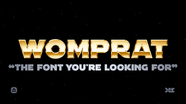
I can’t believe it. “The Font” is finally ready.
We (@AurekFonts and I) spent a year and a half making this, and I had a lot of fun doing it. It’s the most extensive font I’ll probably ever make
I’m really proud of what we made. I hope you enjoy it.
There’s a *lot* to talk about with regards to this font, so over the next week or so, I wanna do that.
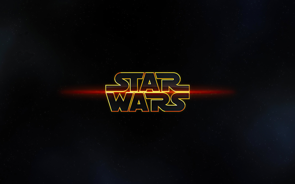
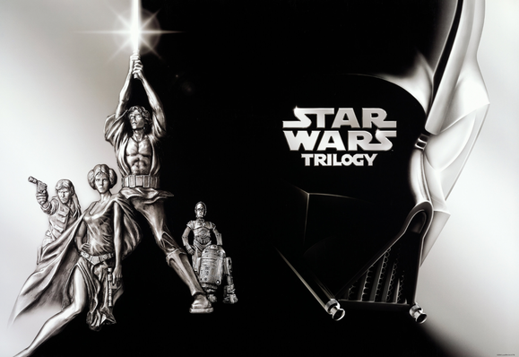
For as long as I’ve been making icons and wallpapers, I’ve been drawing Star Wars stuff. One of the wallpapers I made became more popular than it ever had the right to, ending up on so many fan-made and rumor-driven videos on YouTube. It’s even on Rotten Tomatoes for some reason as the actual logo for the Star Wars saga.
Maybe you’ve seen it. It’s a weirdo.
I made that almost 15 years ago.
I continued to construct various logos in the style of Star Wars, mostly using fonts that were available at the time. There’s a bunch, but the one that seemed the best to me was called “Astro” by an old friend, David Occhino. I used it a lot to “make” logos, stretching, squashing, elongating letters to make ligatures. You kind of have to with a font like this, because it’s never “just a font,” it’s a tool.
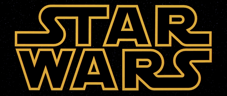
I won’t get into the detail but almost every font that exists for the logo style tries to emulate one aspect of the logo. Maybe one font focuses on the 1997 re-release. Or the 2017 “Solo” film. The truth is, over the years, every time this style was used officially, the letters used were clearly made for that release alone.
The shape of the S, the width of the letters. They’re never quite the same when you put them side by side. Take the original 1977 and put it against the prequels’ version.
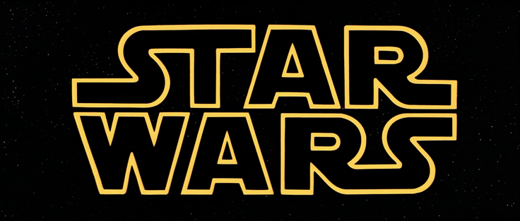
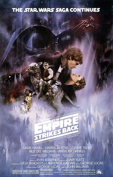
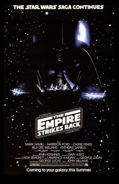
That’s only part of it. Star Wars only has 5 unique letters. For “The Empire Strikes Back” they added quite a few more: H,E,M,P,I,K,B,C. But the S was different, it’s squarer. Also, there were no ligatures. In the original logo, the ST and RS connect. But in ESB, nothing connects. Please try to ignore that incredible E, that’s another topic for another day.
Theatrical poster has a bottom bar in the logo, the teaser doesn’t. In the tagline on the top of each poster, the Ns and Cs are different.
So I started making some letter forms. To try it out. I used The Rise of Skywalker trailer cards as an example, and kicked out some logos for various movies to see how it played out. After I finished making the logos, I kinda felt it was done. I didn’t need a font, I just needed the ability to make my own logos.
After it sat dormant for a while, @AurekFonts contacted me. He asked if I was gonna make that into a font or not. And we talked about what would be needed to make it into one.
I was extremely naive, and thought all we needed was punctuation and “not that much kerning.”
I was extremely wrong. For the next year and a half, Ender and I worked sometimes every day of the week on this. Every letter was redrawn. And though we could’ve stopped at many points along the way, if this thread is any indication, we didn’t. Because in my head, I wanted to be able to emulate every version of this style that previously existed.
...and in multiple languages.
I’ll pick this up later, but that’s most of the “backstory.” In the meantime, go to https://crown.fontdue.com/fonts/womprat and check out the type testers. Open the “opentype features” drawer and click around as you type, trying out the different styles. And you’ll see exactly why this took the time it did.
I have so much more to say, so I’ll be back later.