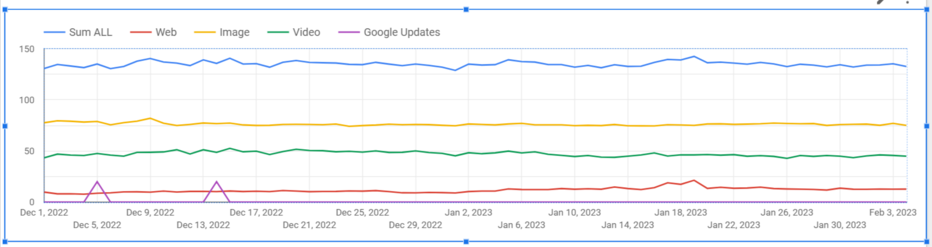
By popular demand, here's my tutorial on how to create a #Google Looker Studio chart with combined Search Console web, image and video search types, and Google update timeline, as shown in the image.
#GSC #SEO #guide #tutorial #tips
1/11
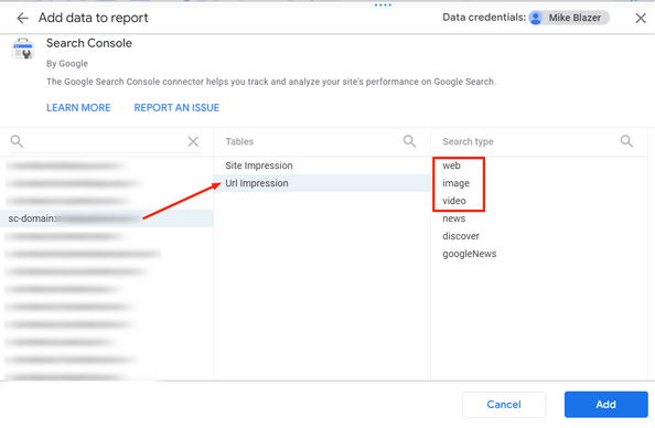
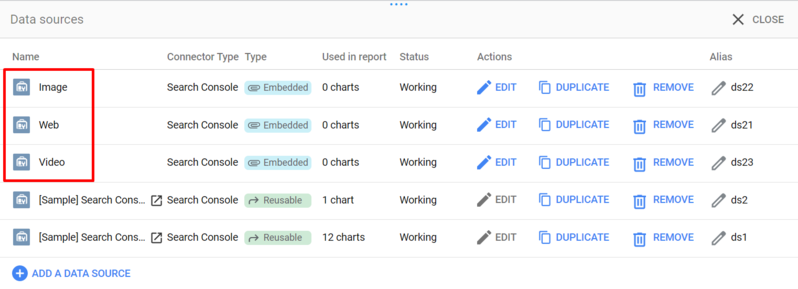
So the first thing you need to do is open your Google Looker Studio report and add your Google Console data for your domain, as shown in the screenshot:
- add web,
- then image,
- then video search types,
one by one.
2/11
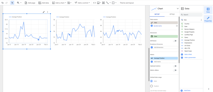
Once you have added them, I recommend that you rename them to match the search types. This will make them easier to manage later.
3/11
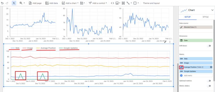
Then add a time series chart for each type. For this tutorial I have chosen the Average Position metric, but you will probably want to use Url Clicks (or Impressions).
4/11
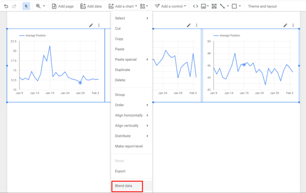
Next, select all 3 charts and click to blend the data, as shown in the screenshot.
5/11
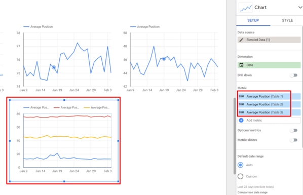
Now you need to add all 3 metrics to the chart:
Table 1 is web,
Table 2 - image,
Table 3 - video.
7/11
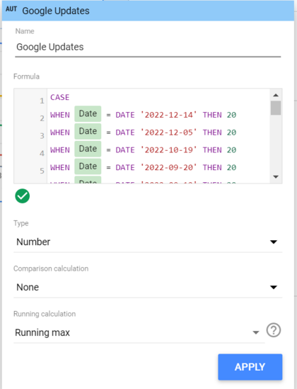
As for the Google updates line, you need to click to add a metric, then click on (+) Create field and insert the formula with Google update dates.
You can get all the dates from https://developers.google.com/search/updates/ranking
This is the formula with the most recent dates:
CASE
WHEN Date = DATE '2022-12-14' THEN 5
WHEN Date = DATE '2022-12-05' THEN 5
WHEN Date = DATE '2022-10-19' THEN 5
ELSE 0
END
You can play with the number (5) after the word 'THEN' to tweak the look of the spikes in your chart.
8/11
Now you'll need to add another custom metric (add metric and create field) as shown in the screenshot. A calculated metric.
The formula for URL clicks will look like this:
SUM(IFNULL(Url Clicks (Table 1), 0) + IFNULL(Url Clicks (Table 2), 0) + IFNULL(Url Clicks (Table 3), 0))
These are the main variables in it:
Url Clicks (Table 1)
Url Clicks (Table 2)
Url Clicks (Table 3)
10/11
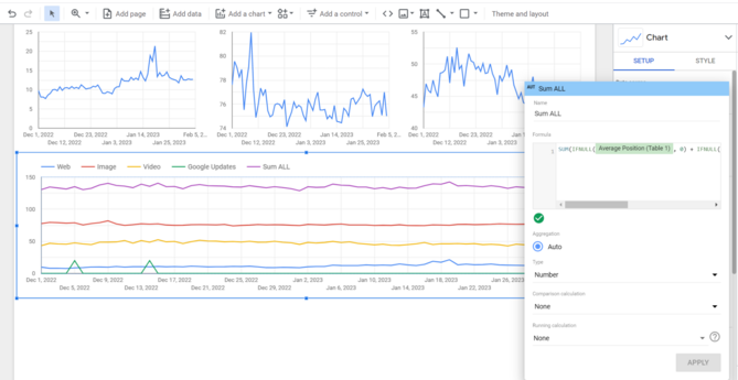
Voila! Your graph with combined Google Console data, data per search type and Google update markers is complete.
Liked this tutorial? Why not share it with others (1st post please), or maybe you'd like to follow me?
11/11 ❤️