Design Diary 17
https://www.david-smith.org/blog/2023/01/20/design-notes-17/
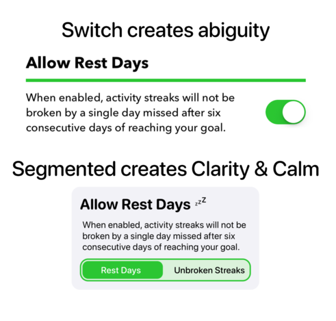
Today I found that I kept hitting on the theme of building "friendly" designs, which are kind and encouraging to my users.
Firstly, in realizing that coloring the goal lowering button red was a subtle attack of folks choosing to better match the app to their fitness goals.
Secondly, finding that UISwitches can be really anxiety producing and that a clearly worded segmented control can much more clearly communicate what will happen when pressed.