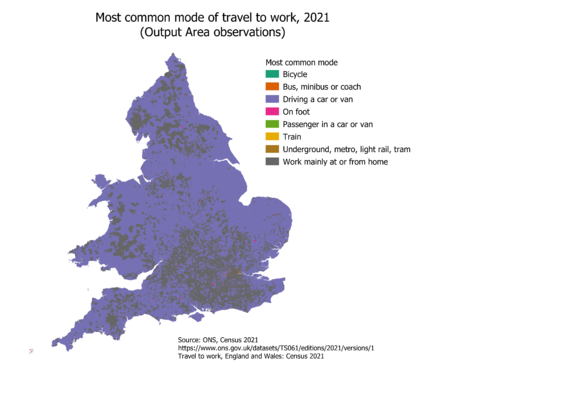
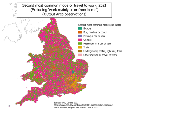
In previous threads on the Other Place, I've shared some maps of journey to work data for England and Wales, from the 2021 #census (eg map of London below)(@Richpereira @statsgeekclare and friends - are there any official ONS accounts to tag yet?)

The Output Area level data are quite large (as in, you can't load them into Excel to muck around with), so it's taken a little longer to do maps for the whole of England and Wales, but I now have some ready to go...

[1/n]

First up, map of England and Wales at OA level, showing most common mode of travel to work, 2021

Next a map of most common mode (largest share of all modes, not necessarily > 50% of relevant people), after we exclude working from home.

Why exclude WFH? The census was in March 2021, during (partial) lockdown, so WFH from home effect is very different to previous observations.

There's an awful lot of car driving going on!

OK, far more interestingly, lets look at the second most common mode of travel to work in 2021, again excluding working from home.

Loads of 'car passenger' and 'on foot' and we need to recall that this was during the pandemic - many people were furloughed etc, so patterns are odd to start with. London transport geography emerges very nicely

But one further treat for journey to work nerds: by using such detailed geography, and excluding WFH and most common, we see 'Other' for the first time!

'Other' on the map above actually covers three things - motorbike, taxi, and actual 'other'. None of them really have a pattern, although 'other' will be a composite of some very localised patterns - ferries in some places, transport to offshore facilities etc etc
@oliver_dw @Richpereira I haven't seen any official accounts on mastodon - it's one of the things that would accelerate people's transition off the birdsite I reckon!
@oliver_dw @Richpereira @statsgeekclare This is amazing, especially the pervasiveness of working at home as the plurality mode in so much a large (area) part of greater London.
How has the work at home share changed since the previous UK #census in what I’m guessing was 2011?
Questions from a nosy American. 😀

@charleypurvis @Richpereira @statsgeekclare

At a national level (that is, England & Wales), working at or from home was about 5% (of people in employment) in 2011; in 2021 it was about 31%.

Of course, the 2021 figure is very skewed - the census took place in March 2021, when we had a 'stay at home' policy

I think there is, and will continue to be, a shift to WFH, but is more likely a partial one (e.g. 2 days / week, or whatever), but won't be as pronounced as shown in the map for a while

@oliver_dw

Wow! 5% to 31% in 10 years! Amazing. I can see why the Scots delayed their #census to 2022.

The US American Community Survey #ACS gives us year-to-year trends. Attached is my table showing just 2019, 2020, 2021. The ACS goes back to 2005. The US Decennial Census data on journey-to-work goes back to 1960.

I'm using #IPUMS for most of my analyses. I need to update my work to include all of the 2021 data.

@charleypurvis it will be interesting to see the results for Scotland - how much will WFH have reverted back to 'normal'?
@oliver_dw @statsgeekclare I’ll find out our policy. No official accounts yet as far as I know. Watch this space!