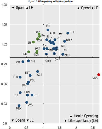
Here's a scatterplot of health spending per capita (x axis) and life expectancy (y axis) in OECD countries. The lines represent averages.

One country sits alone in the bottom right quadrant due to its much higher health spending and below-average life expectancy.

Source: https://www.oecd-ilibrary.org/sites/ae3016b9-en/1/3/1/index.html?itemId=/content/publication/ae3016b9-en&_csp_=ca413da5d44587bc56446341952c275e&itemIGO=oecd&itemContentType=book

Home

OECD's dissemination platform for all published content - books, podcasts, serials and statistics

Best health outcomes (based on wide range of data)
1 Iceland
2 Norway
3 Netherlands
4 Luxembourg
5 Australia
6 Finland
7 Switzerland
8 Sweden
9 Italy
10 Andorra
11 Ireland
12 Japan
13 Austria
14 Canada
16 NZ
18 Germany
23 UK
28 Czech Republic
29 US
48 China
55 Cuba
66 Iran
91 Mexico
127 S Africa
145 India
168 Haiti
194 Somalia
Source: https://www.thelancet.com/journals/lancet/article/PIIS0140-6736(18)30994-2/fulltext
@conradhackett they clearly didn't factor in all the freedom and amazing profitability that comes with the US system...