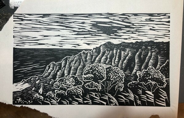
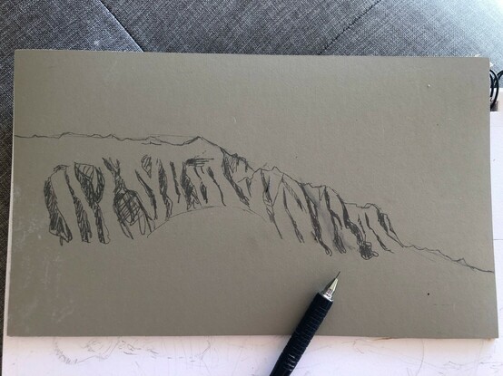
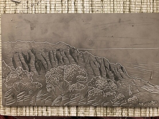
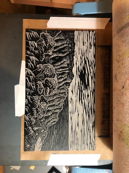
Getting underway on a linocut while I still have a day here. Sketch and some initial lining and foreground stuff.

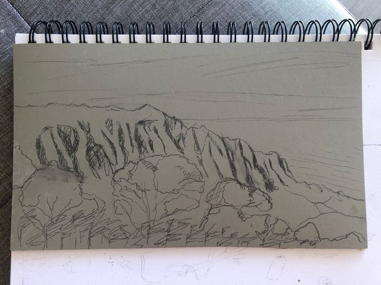
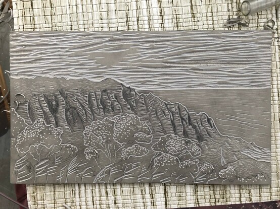
Adding primary line shading to the mountains; trees and the rest of the ground textures; ocean and sky.

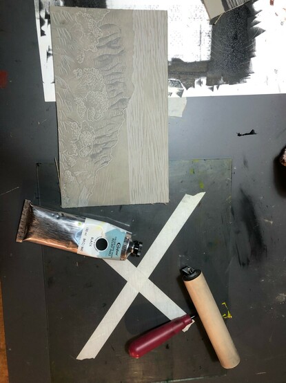
That’s it for this first pass, I’ll need to take a test print when I get home to see if it needs more work.

I suspect that on the whole it’s going to read darker than I want it to and I’ll need to go back and add or deepen lines to bring up the overall values. But I feel pretty good about the core composition and the mix of textures. My hand is also sore af so stopping is a good plan regardless.
Alright, back in Portland, back in my basement, time for a test print on sone cheap paper to really get a good look at this thing.

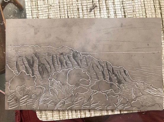
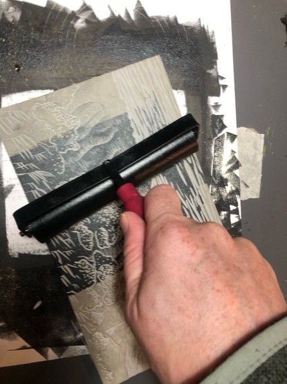
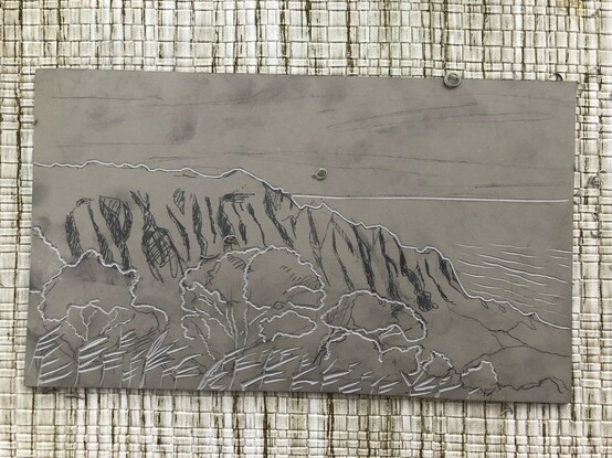
Which: not bad! The major compositional bits work how I wanted them too and most of my intended contrast regions feel about right. I might take a little more out of the sky, do sone more work on the trees. The foreground plants might want more filling in too. Mountain ridge work pretty well; not quite what I’d been imagining but better than I feared.

Will sit with it for a while and consider next steps.

Also pulling a couple rest prints of this little geometric scene I carved a few weeks back, since I’ve already got the ink out and the mess made. I like it, might make some nice postcards.
@joshmillard Loved your first scene but then your geometric little scene appeared and I gotta say it is so good! (I love small sizes print the most in general).
@moonovermarine Heh, yeah, geometric nonsense is my default mode. If I don't specifically set out to do something else, I'm doing something with parallels or orthogonals or fractals or all of the above.
@joshmillard that’s a great default mode imo.
@joshmillard Oh, that's realllly nice. I love that style. I love the motion. Everything.