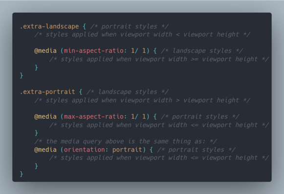
You've probably used orientation media queries. But have you ever wondered which styles apply when the viewport is square?

Is it the landscape or the portrait ones?🤔

Well, just wondered about that & had to test. All browsers apply the portrait ones when the viewport is square.

If you want the landscape orientation styles applied when the viewport is exactly square, you can use an aspect ratio media query (for example, `min-aspect-ratio: 1/ 1`) 😼

#css #tinyCodingTips

@anatudor For this use case, I think it’s a good idea to use custom media queries: https://codepen.io/meduzen/pen/JQmGrq

Then you don’t have to remember if the spec says that a square viewport is landscape or portrait. 

(I wrote an explainer for custom media queries back then: https://github.com/meduzen/--media.scss/blob/main/docs/custom-media-queries.md)

@meduz Dunno...

One the one hand... shiny new feature, yay!

On the other hand, that looks a lot more complicated to me. And more like the kind of thing I'll fail to use right and waste more time on trying to figure out.

Because here's the deal: there's not really such thing as "have to remember" - if I bump into something head first, it makes quite an impression and it just sticks, it's hard to forget. Even if I do forget it, I'll figure it out again the next time I bump into it head first.

@anatudor That is true, too! Actually I had to jump back into my library to verify the information ou posted about square being treated as portrait (as per spec) because I forgot since I wrote that SCSS library. 

On a daily basis, I use Custom MQs a lot because it prevents me to remember details or numbers, and they are also composable. I quickly get used to it, because I wanted to have something better than SCSS mixins or variables. And it turned out it exists. 🤯