 Ana Tudor 🐯
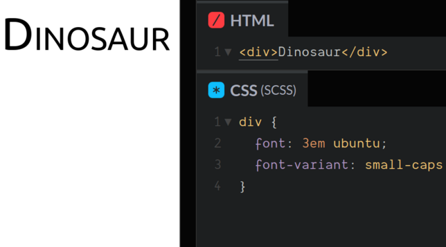
I was today years old when I learned this... want small caps?
Use `font-variant: small-caps`!
I was today years old when I learned this... want small caps?
Use `font-variant: small-caps`!
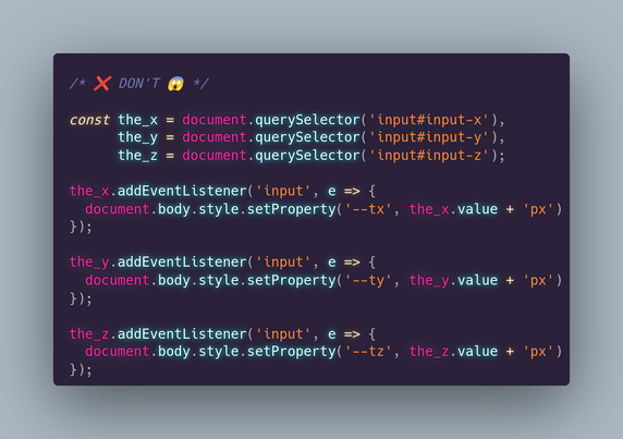
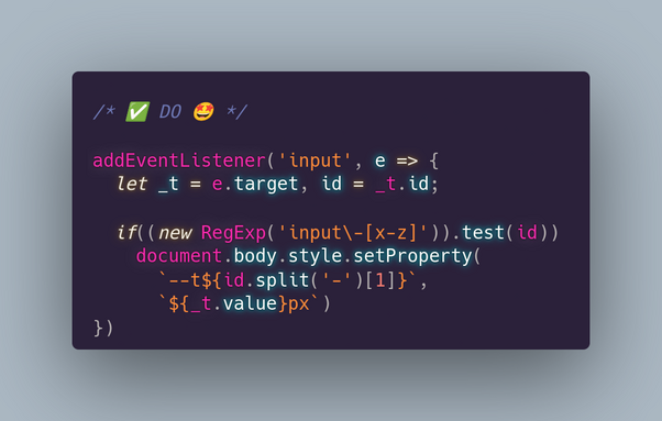
If you have 3 inputs for values of translation/ rotation/ scale along/ around the 3 axes and you want to update a CSS variable for each, here's how (not) to do it.*
*we assume we're using a translation:
transform:
translate3d(var(--x), var(--y), var(--z))
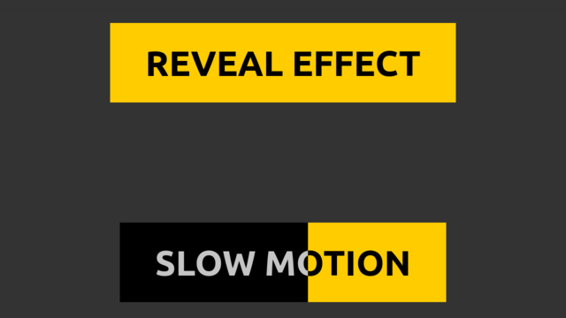
I got slapped with one of these and I thought I could make better button hover transitions than the one they use (which involve changing the button `color` and horizontally shrinking to nothing a span underneath the text).
So here it is, normal & slow motion with only 1 button element: https://codepen.io/thebabydino/pen/ExRqOGP?editors=0100
For the how behind the technique (+ more similar cool techniques), see my Taming Blend Modes: `difference` & `exclusion` article https://css-tricks.com/taming-blend-modes-difference-and-exclusion/
Because I saw a piece of #CSS used to illustrate the 1st principle of animation & almost screamed in horror...
❌ DON'T
.b { -webkit-animation: a 1s ease infinite alternate }
@-webkit-keyframes a {
0% { -webkit-transform: scaley(1.0) }
50% { -webkit-transform: translatey(-300%) scaley(1.2) }
100% { -webkit-transform: scale(1.0) }
}
✅ DO
.b { animation: a .5s ease-out infinite alternate }
@keyframes a {
to { transform: translatey(-300%) scale(.83, 1.2) }
}
Why? 👇
#tinyCodingTips #cssAnimation
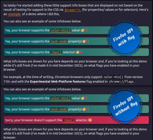
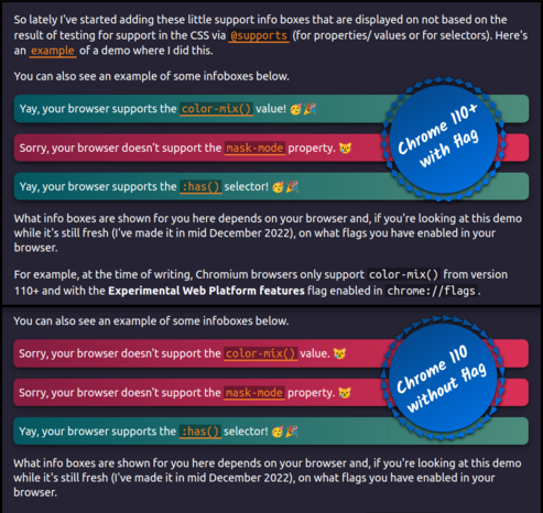
This is the little bit of #CSS code that does the magic of showing the "yay, supported!" box or the "sorry, not supported" one depending on whether the browser supports a particular feature (values, properties, selectors) or not.
Conditional display of info boxes depending on browser support and all in pure CSS, no JS needed.
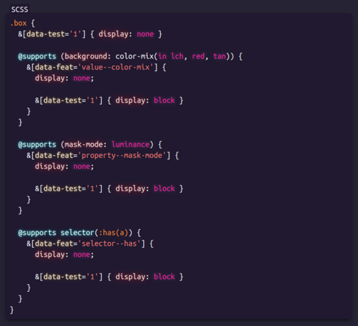
Something I've been including in my demos containing bleeding edge features lately: have two info boxes, one saying "yay, your browser supports [feature]!" and the other "sorry, your browser doesn't support [feature]." and toggle their display depending on support.
Live demo on #CodePen https://codepen.io/thebabydino/full/qBKvjKM
This is a pure #css support test, using `@supports` - no JS is required.
Another example of such info boxes in my partial `grayscale(1)` demo: https://mastodon.social/@anatudor/109445767480226285
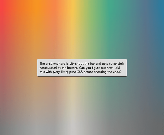
Bonus, this is also what helps solve a recent challenge (this one https://mastodon.social/@anatudor/109404963501056367): instead of a sharp gradient transition between transparent and grey, have a smooth one in order to progressively desaturate the top layer going from top (vibrant) to bottom (completely desaturated).
Live demos:
💫 https://codepen.io/thebabydino/pen/yLEjjWE
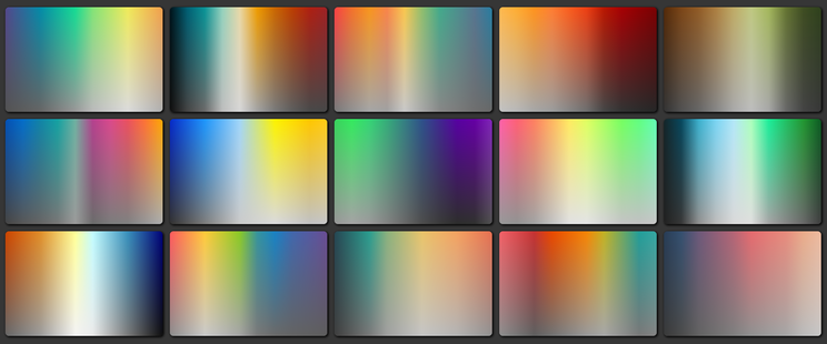
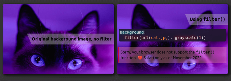
What if you wanted the filter: grayscale(1) effect to apply only to (a part of) the background?
There's filter() (https://www.w3.org/TR/filter-effects/#FilterCSSImageValue), but, while Safari has supported it since 2015, it's not in any other browser 😿
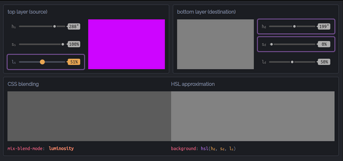
Better solution: blend with a grey (*any* grey works because all that matters is saturation being 0%) background-color or gradient layer underneath using luminosity! 🌟
Test https://codepen.io/thebabydino/full/qBKobME
Cool use case https://codepen.io/thebabydino/pen/KKgEqGZ
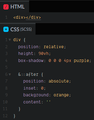
Want your absolutely positioned pseudo/ child to cover its entire parent?
❌DON'T
```
top: 0;
left: 0;
width: 100%;
height: 100%
```
or
```
top: 0;
right: 0;
bottom: 0;
left: 0
```
✅ DO
```
inset: 0
```
Live demo https://codepen.io/thebabydino/pen/xxXjBpO
`inset` is well supported and can take 1, 2, 3 or 4 values, just like `margin` or `padding`.
On MDN https://developer.mozilla.org/en-US/docs/Web/CSS/Inset
Saw https://getcssscan.com/css-shapes - the code for some of them (polygons, tooltips) is terribly outdated.
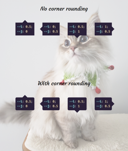
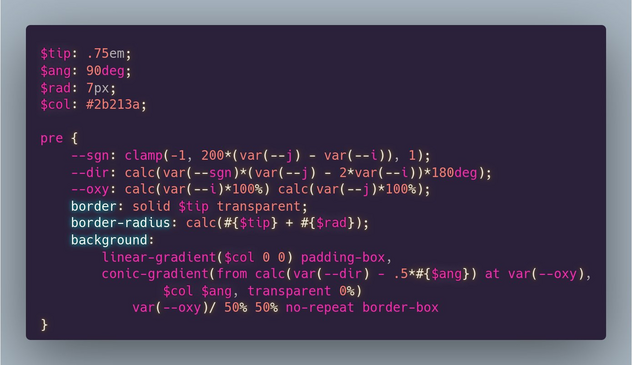
Here's how you make tooltips with *no pseudos* https://codepen.io/thebabydino/pen/dyKZRzy
`--i` & `--j` are all that differ between the four tooltip directions and indicate where the tooltip is along the horizontal & vertical axes respectively.
+more interesting ones
💫 gradient background https://codepen.io/thebabydino/pen/GRoxvOr
💫 border + text gradient & transparency https://codepen.io/thebabydino/pen/pogLXQP