pour one out for the tragic graphic designer hidden deep inside the Google megacorp maze who goes to bed every night knowing their employer will never let them make anything even a tenth as good as the Canadian Broadcasting Corporation logo
PERSONAL LOGOTYPE HOT TAKE: if your logo doesn't work in black and white, like black and white bitmap, maybe have a REEEEALLY good reason why it doesn't
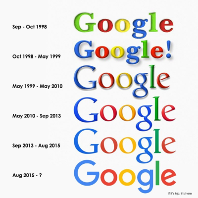
@hierarchon they were in need of some sort of revamp, but i feel like they're not so much harmonized as homogenized to the point of slight confusion. but i'm also i'm a big fan of color coding so Grain Of NaCl