À convite do @[email protected], participei de uma conversa super legal em um episódio do podcast deles junto com o Pedro Gemal, médico e CTO da @[email protected], sobre Data Science em saúde e acabamos falando um pouco sobre COVID19. https://medium.com/data-hackers/health-data-e-o-coronavírus-data-hackers-podcast-22-2b059d460cb1
Posteriormente, tive autorização da WIRED para traduzir um texto deles, do Prof. @[email protected], e acabei publicando a tradução, seguida de uma análise, no @[email protected], onde sou redator. Por que achatar a curva? Vem entender a matemática por trás disso. https://www.deviante.com.br/noticias/a-matematica-promissora-por-tras-do-achatamento-da-curva/
A matemática promissora por trás do 'achatamento da curva' - Deviante
O texto do Dr. Allain, Professor Associado da North Carolina State University, chamou minha atenção pela clareza com que ele explica o porquê do achatamento da curva sem deixar de lado a compreensão matemática do fenômeno. Não é uma questão de impedir que as pessoas sejam contaminadas, eventualmente elas serão, mas de empurrar o máximo possível de contaminações para o futuro onde teremos (a) infraestrutura de saúde adequada e em boas condições para receber e tratar o paciente e (b) mais informações sobre o vírus e a doença (mais clareza sobre os sintomas e a fisiopatologia da doença, taxa de letalidade, protocolos de tratamento, boas práticas). Inclusive, as recomendações de não tocar no rosto e lavar as mãos frequentemente funcionam de modo parecido, porque você está artificialmente reduzindo a taxa de contaminação do vírus. Você supostamente deveria estar sendo contaminado, pois sua mão está infectada, mas antes de levá-la ao rosto (e ser contaminado) você a lava.
Nesse meio tempo, começaram a explodir preprints sobre a hidroxicloroquina e a azitromicina. Ensaios não randomizados, dentre vários designs de estudos diferentes. Achei oportuno explicar a importância dos estudos randomizados controlados e o que são. https://www.deviante.com.br/podcasts/spin/spin-de-noticias-875/

O que são ensaios clínicos randomizados? - 8 Driadan (Spin #875 - 03/04/20) -
Sejam bem-vindos ao octingentésimo septuagésimo quinto Spin de Notícias, o seu giro diário de informações científicas... em escala sub-atômica. E nesse Spin de Notícias falaremos sobre... Saúde e Tecnologia! *Este episódio, assim como tantos outros projetos vindouros, só foi possível por conta do Patronato do SciCast. Se você quiser mais episódios assim, contribua conosco!*
Pouco tempo depois, algo tão importante quanto se fez óbvio: Explicar o q são preprints. A mídia e a população em geral, por falta de conhecimento sobre o modo como a ciência funciona, começaram a dar um valor exagerado aos preprints. Aqui explico o q são. https://www.deviante.com.br/podcasts/spin/spin-de-noticias-896/

O que são os Preprints e como estão sendo usados no contexto da Pandemia? - 1 Electran (Spin #896 - 24/04/20) -
Sejam bem-vindos ao octingentésimo nonagésimo sexto Spin de Notícias, o seu giro diário de informações científicas... em escala sub-atômica. E nesse Spin de Notícias falaremos sobre... Estudos Científicos! *Este episódio, assim como tantos outros projetos vindouros, só foi possível por conta do Patronato do SciCast. Se você quiser mais episódios assim, contribua conosco!*
Frente a constantes afirmações de q a COVID-19 é inofensiva, decidi fazer uma breve análise dos dados de SP e gerar um gráfico animado mostrando como a doença se posiciona entre as demais causas de morte no estado. Ensinei como gerar o gráfico você mesmo: https://mribeirodantas.xyz/blog/index.php/pt/2020/04/09/como-gerar-um-grafico-de-barras-animado-do-covid19-em-sp/
Como gerar um gráfico de barras animado do COVID19 em SP? - The Dataist Storyteller
Reading Time: 3 minutes Após ver um gráfico de barras animado comparando o número de óbitos diários de COVID19 com outras doenças em Nova Iorque postado pelo Chiavegatto no Twitter, fui tomado pela curiosidade de reproduzir o experimento no Brasil, em São Paulo (o estado). Claramente a situação lá está muito mais complicada, mas ainda assim quis saber como …
E aí q a Google, através dos seus Community Mobility Reports, divulga dados de mobilidade para 131 países no mundo. Fiz uma análise inicial, bastante superficial, respondendo a pergunta: "O Brasil parou?", enquanto que ensino as pessoas a fazerem o mesmo. https://mribeirodantas.xyz/blog/index.php/pt/2020/04/05/mobilidade-e-numero-de-casos-durante-covid19-no-brasil/
Esse texto com os dados da Google acabou me colocando em contato com outros cientistas brasileiros que me convidaram a participar de algumas iniciativas. Inicialmente fizemos uma análise sobre a desaceleração do distanciamento social no Brasil. https://jornalggn.com.br/a-grande-crise/tendencia-de-isolamento-social-desacelera-no-brasil/
Posteriormente, avançamos para um nível mais granular, analisando a nível de estado, começando pelo Rio Grande do Norte. Notas técnicas sobre outros estados foram solicitadas e estão sendo escritas nesse momento. https://demografiaufrn.net/2020/04/17/monitoramento-das-tendencias-de-isolamento-social-no-rn-a-partir-dos-dados-de-mobilidade-do-google/?fbclid=IwAR0Mh3kgEYUnxtS-MSExOkdlyVU4dL1V7l5--2DcT836SZ_xf9V0KEMjJdY
Avançamos ainda mais em nível de granularidade, dessa vez trabalhando com dados a nível de municípios do Rio Grande do Norte.
Junto a pesquisadores de Pernambuco, elaboramos mais uma nota técnica, dessa vez apresentando as tendências de isolamento social para o estado de Pernambuco e para a Região Metropolitana do Recife. https://jornalggn.com.br/a-grande-crise/fiqueemcasa-monitorando-as-tendencias-de-isolamento-social-em-pernambuco-e-na-regiao-metropolitana-do-recife-rmr/
#FiqueEmCasa: Monitorando as tendências de isolamento social em Pernambuco e na Região Metropolitana do Recife (RMR) - GGN
O Jornal De Todos os Brasis - O Jornalista Luís Nassif lidera equipe Do Jornal GGN. Com opiniões e conteúdo de qualidade o portal sempre traz as últimas noticias do cenário político nacional
Mais uma nota técnica avaliando o distanciamento social durante a #pandemia de #COVID19. Dessa vez, focando na cidade de #Caruaru, em #Pernambuco. #COVID19BR
Mais uma nota técnica avaliando o distanciamento social durante a #pandemia de #COVID19. "Tendências de distanciamento social na Região Nordeste e no estado da #Bahia utilizando dados da Google e da In Loco"
https://covid19br.org/main-site-covida/wp-content/uploads/2020/05/0105_BA_NE.pdf
Mais uma nota técnica avaliando o distanciamento social durante a #pandemia de #COVID19. "Tendências de distanciamento social na Região Nordeste e no estado da #Bahia utilizando dados da Google e da In Loco"
https://covid19br.org/2020/05/05/distanciamento-social-bahia-chegou-a-reduzir-circulacao-em-70-mas-adesao-diminuiu/
https://covid19br.org/2020/05/05/distanciamento-social-bahia-chegou-a-reduzir-circulacao-em-70-mas-adesao-diminuiu/
Atualização sobre o distanciamento social no #Brasil, #Nordeste e #RioGrandedoNorte #RN. #COVID19 #StayHome #StayHomeSaveLives
https://demografiaufrn.net/2020/05/06/distanciamento-social-declinio-br-ne-rn/
Paper (#COVID19) aceito p/ publicação :-). Agradeço à equipe q ficou responsável pela revisão/editor pela presteza e qualidade (@[email protected]). Parabéns aos demais autores do trabalho! E tem mais à caminho! Enquanto não sai o release, dados disponíveis em https://data.mendeley.com/datasets/tggrsbz3bb
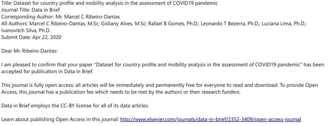
Dataset for country profile and mobility analysis in the assessment of COVID19 pandemic
Understanding the COVID-19 pandemic is a multidisciplinary effort that requires a significant number of variables. This dataset comprises sociodemographic characteristics compiled from 35 datasets obtained at UN Data [1], mobility metrics that can assist the analysis of social distancing from Google Community Mobility Reports [2], and daily counts of cases and deaths by COVID-19 from the European Centre for Disease Prevention and Control, and the Johns Hopkins University Center for Systems Science and Engineering [3,4]. This unified dataset ranges from February 15, 2020 to April 26, 2020, a total of 72 days, and is provided as a collection of time series for 131 countries with 192 variables. The whole pipeline to preprocess and generate the dataset, along with the dataset itself, is versioned with the Data Version Control tool (DVC) and thus it is easily reproducible.
A nota técnica sobre distanciamento social com maior granularidade que fizemos até agora. A nível de bairros do município de Natal, capital do RN. https://demografiaufrn.net/2020/05/08/adesao-ao-distanciamento-natal/
Já na nota técnica abaixo, fizemos uma análise para o RN e estados do Nordeste que adotaram medidas de lockdown. O que está acontecendo? https://demografiaufrn.net/2020/05/16/medidas-de-lockdown-ne/
Foi publicado hoje a versão final do artigo científico "Dataset for country profile and mobility analysis in the assessment of COVID-19 pandemic", que pode ser muito útil na análise da pandemia entre países. Resultado da iniciativa @[email protected]
https://www.sciencedirect.com/science/article/pii/S2352340920305928
https://www.sciencedirect.com/science/article/pii/S2352340920305928
Infelizmente, o distanciamento social nos municípios do Rio Grande do Norte continua baixo. Veja mais em mais uma nota técnica do grupo @[email protected]. https://demografiaufrn.net/2020/05/29/distanciamento-social-nos-municipios-do-rn-continua-baixo/
+1 artigo científico sobre a COVID-19 aceito p/ publicação. Desta vez na Revista da Sociedade Brasileira de Medicina Tropical. "#StayHome: Monitoring and benchmarking social isolation trends in Caruaru and the Região Metropolitana do Recife during the COVID-19 pandemic" @[email protected]

Está público o preprint "Medidas de distanciamento social e mobilidade na América do Sul durante a pandemia por COVID-19: Condições necessárias e suficientes?" q nós do @[email protected] submetemos p/ o arXiv . Vcs podem visualizar através do link abaixo. #COVID19
https://arxiv.org/abs/2006.04985
https://arxiv.org/abs/2006.04985
Medidas de distanciamento social e mobilidade na América do Sul durante a pandemia por COVID-19: Condições necessárias e suficientes?
In a scenario where there is no vaccine for COVID-19, non-pharmaceutical interventions are necessary to contain the spread of the virus and the collapse of the health system in the affected regions. One of these measures is social distancing, which aims to reduce interactions in the community by closing public and private establishments that involve crowds of people. The lockdown presupposes a drastic reduction in community interactions, representing a more extreme measure of social distancing. Based on geolocation data provided by Google for six categories of physical spaces, this article identifies the variations in the circulation of people in South America for different types of social distancing measures adopted during the COVID-19 pandemic. In this study, population mobility trends for a group of countries between February 15, 2020 and May 16, 2020 were analyzed. To summarize these trends in a single metric, a general circulation index was created, and to identify regional mobility patterns, descriptive analyzes of spatial autocorrelation (global and local Moran index) were used. The first hypothesis of this study is that countries with a lockdown decree can achieve greater success in reducing the mobility of the population, and the second hypothesis is that Argentina, Brazil and Colombia have regional mobility patterns. The first hypothesis was partially confirmed (considering 10 countries in South America), and the results obtained in the spatial analyzes confirmed the second hypothesis. In general, the observed data shows that less rigid lockdown or social distancing measures are necessary, however, they are not sufficient to achieve a significant reduction in the circulation of people during the pandemic.
Junto a uma equipe maravilhosa, gravei um episódio sobre a ciência em torno dos estudos da pandemia da #COVID19 onde, dentre vários tópicos, expliquei questões relacionadas a #causalidade e designs de estudos. Foi muito legal gravar, e adorei ouvir agora!
https://twitter.com/PortalDeviante/status/1271277341218668544
https://twitter.com/PortalDeviante/status/1271277341218668544
Technical Report publicado na Revista da Sociedade Brasileira de Medicina Tropical. #StayHome: Monitoring and benchmarking social isolation
trends in Caruaru and the Região Metropolitana
do Recife during the COVID-19 pandemic
https://www.scielo.br/pdf/rsbmt/v53/1678-9849-rsbmt-53-e20200271.pdf @[email protected] #COVID19
Concentração bancária e o avanço da Covid-19: um estudo de caso para o município de Currais Novos (RN) https://demografiaufrn.net/2020/07/01/bancos-currais/

Reabertura econômica e mobilidade da população: um retorno gradual?
https://twitter.com/isola_ai/status/1279054729859997696
https://twitter.com/isola_ai/status/1279054729859997696
#Lockdown e distanciamento social no Agreste Pernambucano: o que aconteceu em Caruaru e Bezerros? #COVID19 https://twitter.com/isola_ai/status/1283148541515489280

Adesão ao distanciamento social no #RN e em #Natal: respostas à reabertura econômica e à interiorização da #COVID19 https://twitter.com/isola_ai/status/1283173935392215041

Mais um paper aceito para publicação :-). Dessa vez na Horizontes da Sociedade Brasileira de Computação com o título "A Universidade enfrentando a pandemia da #COVID19: uma ação baseada em colaborações, multidisciplinaridade e internacionalização".