A Brand Portfolio Presentation Template for Adobe InDesign That Changes How Creatives Pitch
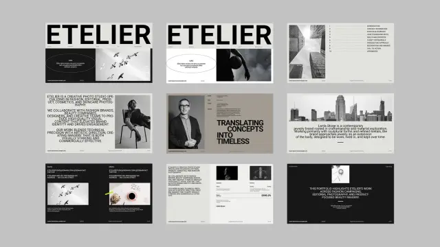
Clients decide in seconds. Before you say a word in any pitch meeting, your presentation has already made a first impression—and that impression either opens doors or closes them. A brand portfolio presentation template built for Adobe InDesign gives you a structural and visual advantage that raw talent alone rarely delivers. This particular template by Adobe Stock contributor GraphicArtist takes that premise seriously, and it shows in every one of its 30 meticulously designed pages.
The design world has a presentation problem. Most creative professionals spend years refining their craft, then rush a portfolio together the night before a pitch. The result is a mismatch between the quality of the work and the quality of its presentation. That mismatch costs contracts. Furthermore, it shapes perception in ways that are difficult to reverse. This template exists to close that gap.
Download the template at Adobe StockPlease note that this template requires Adobe InDesign installed on your computer. Whether you use Mac or PC, the latest version is available on the Adobe Creative Cloud website—take a look here.
Brand Portfolio Presentation Template for Adobe InDesign by GraphicArtist. Download the template at Adobe StockWhat Makes a Brand Portfolio Presentation Template Worth Using in Adobe InDesign?
Not all presentation templates are equal. Some give you slides. Others give you a system. The best ones give you a visual language—a consistent framework that communicates who you are before the content even loads. This Adobe InDesign template lands firmly in the third category.
Built at 1920×1080 pixels, it targets screen presentations from the start. That means every proportion, every margin, every typographic choice is calibrated for display—not print. The result is a layout that looks sharp on a projector, a client’s monitor, or a shared PDF link. Consequently, it works across the full range of modern creative pitching scenarios.
The visual identity of the template is built around editorial restraint. Black, white, and neutral tones dominate. Typography is large, confident, and structurally anchored. The grid is strict but not rigid—it guides without suffocating. This is what good design systems do. They create order while leaving room for your content to breathe.
Moreover, the layout vocabulary is unmistakably modern. Full-bleed image zones sit beside text columns. Section dividers use typographic weight rather than decorative elements. White space is used generously and intentionally. Every page communicates: this studio has taste, and it controls it.
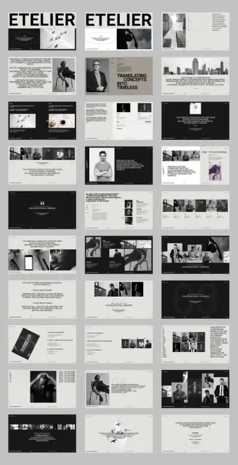
The Architecture of Persuasion: Breaking Down the 30-Page Structure
Thirty pages might sound like a lot. In practice, it gives you exactly the right amount of room to build a complete narrative arc. A creative portfolio pitch needs more than work samples. It needs context, process, credibility, and a clear call to action. This template accounts for all of it.
Opening Sections: Identity and Positioning
The template opens with strong identity slides—studio name, positioning statement, and visual anchor. These early pages do something strategically important: they establish the studio’s personality before any work appears. Clients need to know who they’re evaluating before they can evaluate the work fairly. The opening pages answer that question with typographic authority.
Notice how the preview shows large, editorial-style headlines paired with clean body text. The contrast is deliberate. It signals that this studio understands hierarchy—that some information deserves weight and some deserves space. That alone communicates design intelligence to any client paying attention.
Portfolio Spread Pages: Showing Work Without Noise
The core portfolio pages use a grid-based multi-image layout that organizes work without competing with it. Images are given priority. Text supports them rather than fighting for attention. Additionally, the layout system is flexible enough to accommodate different types of visual work—from editorial photography to product design to brand campaigns.
This matters more than most people realize. A presentation layout that imposes visual personality on top of the work confuses the audience. The template here gets out of the way and lets the work speak. That’s a design decision, not a default.
Process and Methodology Pages
One of the most underused sections in any creative portfolio is the process section. Clients often care deeply about how work gets made, not just what it looks like at the end. The template includes dedicated process pages structured around phases like Discovery & Research, Creative Direction & Production, and Final Deliverables.
Structuring process content this way introduces what I call the Proof-of-Method Framework: the idea that demonstrating a repeatable, professional process is itself a form of portfolio evidence. It tells clients that results aren’t accidental. They’re engineered. That shift in perception is often the difference between being hired once and being retained long-term.
Why the Brand Portfolio Presentation Template Uses an Editorial Black-and-White System
The monochromatic palette in this template is a deliberate editorial choice, and it deserves attention. Color is often used in presentations to compensate for weak design structure. When the layout is strong, color becomes optional. When the typography is doing its job, black and white is enough.
This template demonstrates that clearly. The design system leans on contrast, scale, and white space to create visual interest. Accent tones—subtle greys and warm neutrals—add depth without distraction. The result feels closer to a high-end fashion editorial than a standard creative agency deck. Furthermore, it positions the studio in a specific aesthetic territory: precise, refined, and intentional.
There’s also a practical dimension to the monochromatic system. A brand portfolio presentation template built around a neutral palette adapts to any client’s brand color without visual conflict. You can introduce a client’s primary color as a single accent element, and the whole presentation shifts accordingly. That kind of adaptability is rare in pre-designed templates.
Adobe InDesign as a Presentation Platform: Capabilities Most Creatives Ignore
Adobe InDesign is not the obvious choice for presentations. Most creatives default to PowerPoint or Keynote. That default costs them something. InDesign’s typographic control, precise layout system, and PDF export quality are significantly ahead of either alternative. Using it for a brand portfolio presentation gives you capabilities that slide software simply cannot match.
Typographic Precision at Scale
InDesign’s paragraph and character style system allows you to build a presentation where every typographic decision—tracking, leading, optical alignment, and baseline grid—is controlled and consistent. When you’re presenting at a large scale, the difference between careful and careless typography is visible to everyone in the room. This template’s typographic system is built for that level of scrutiny.
Interactive PDF Export
InDesign allows you to export interactive PDFs with internal hyperlinks, page transitions, and embedded navigation. A brand portfolio presentation template exported this way becomes a self-contained, interactive document that clients can navigate independently. That turns your pitch into a leave-behind artifact, not just a meeting prop.
Customization Without Breaking the System
Because the template is fully customizable, every element—text, layout, image frames, colors—can be adapted inside InDesign’s master page and style sheet system. That means you can rebrand the entire presentation for a new client pitch by changing a handful of style definitions. Efficiency like that compounds quickly across a busy studio calendar.
The Presentation-Identity Gap: A Framework for Evaluating Your Current Portfolio
Here’s a question worth sitting with: Does your current portfolio presentation reflect the same level of craft as the work inside it? Most creatives would answer honestly that it doesn’t. That disconnect has a name. Call it the Presentation-Identity Gap—the measurable difference between how good your work actually is and how good it appears to be based on how it’s packaged.
The Presentation-Identity Gap is not a minor issue. It directly affects conversion rates in new business pitches, client perception during ongoing relationships, and the types of briefs clients feel comfortable bringing to you. A studio presenting at a premium level attracts premium briefs. The inverse is equally true.
This brand portfolio presentation template functions as a Presentation-Identity Gap correction tool. It brings the visual quality of the pitch environment up to match the visual quality of the work. That alignment is, in practice, what wins accounts.
Who Should Use This Brand Portfolio Presentation Template
The template is designed for creative professionals who present brand work to clients. That covers a wide range of practitioners—independent brand designers, creative directors at boutique agencies, photographers, editorial studios, and multidisciplinary creative consultancies. If you present visual work to decision-makers, this template is relevant to you.
It’s particularly well-suited for studios working in fashion, editorial, beauty, and high-end commercial photography—contexts where visual sophistication is itself a competitive signal. The aesthetic language of the template maps directly onto how those industries communicate quality. Clients in those sectors will recognize and respond to the design choices instinctively.
Additionally, the template works well for designers building a portfolio for employment rather than client pitches. A job application portfolio presented with this level of structure and visual quality stands out immediately in a review stack. That matters when hiring managers are evaluating dozens of submissions.
Structural Hierarchy in Presentation Design: Why It Determines Attention
Visual hierarchy is how presentations guide attention. Without it, every element competes for the viewer’s focus simultaneously—and attention collapses. With it, the viewer’s eye moves through the page in a controlled sequence, receiving information in the order you intend.
This template’s hierarchy system is built around three levels. The primary hierarchy uses a large typographic scale and full-bleed imagery. Secondary hierarchy uses medium-weight text blocks and structured image grids. Tertiary hierarchy uses captions, metadata, and supporting type at a small scale. Together, they create a reading sequence that feels natural and effortless.
That effortlessness is the goal. When a client can absorb a complex slide in three seconds without confusion, the presentation is doing its job. When they have to work to understand what they’re looking at, the design has failed—regardless of how strong the underlying work is.
Client Testimonial Pages and Social Proof Architecture
The template includes dedicated testimonial pages, and their design is worth examining closely. Pull quotes are typographically scaled and spatially isolated. Attribution lines are set in a smaller, lighter weight. The result is a page that communicates credibility without feeling promotional.
This design approach reflects what I’d call Ambient Credibility Architecture—the principle that trust signals work best when they’re structurally integrated into the presentation, rather than added as an afterthought. A testimonial that feels like a design element rather than a sales tool is far more persuasive than one that interrupts the narrative.
Furthermore, placing testimonials strategically within the deck’s flow—after portfolio work, before process or pricing—creates a reinforcing sequence. The viewer sees the work, then immediately encounters client validation, then understands the method behind both. That sequence builds confidence in a way that no single slide could achieve alone.
Practical Customization Guide for the InDesign Brand Portfolio Presentation Template
Getting the most from a pre-designed InDesign template requires a clear customization workflow. Here’s how to approach it efficiently.
Step 1: Set Up Paragraph and Character Styles
Before replacing any content, review the existing paragraph styles in the template. Understand which styles control which elements. Then update the style definitions to match your studio’s typography system. Every text instance using those styles will update automatically—saving significant time across 30 pages.
Step 2: Replace Images Using Linked Frames
Note that photos and design elements shown in the template preview are for display purposes only and are not included in the downloaded file. Replace placeholder image frames with your own work using InDesign’s Place command. The linked file system keeps the document lightweight and allows easy swapping between project variants.
Step 3: Adjust the Color System
Update the color swatches to reflect your brand palette. Apply them systematically using InDesign’s Find/Change Color function to ensure no elements are missed. The neutral base of the template makes it easy to introduce accent colors without disrupting the overall hierarchy.
Step 4: Build Master Page Variations
Use InDesign’s master page system to create section-specific variations—one master for portfolio spreads, one for process pages, one for contact and CTA sections. This approach keeps the document organized and allows rapid reconfigurations for different pitch scenarios.
The Future of Brand Portfolio Presentation: Where Screen-First Templates Lead
The shift toward screen-first presentations is not reversing. Client meetings increasingly happen remotely. Presentations are shared as links, not printed as leave-behinds. Work is reviewed asynchronously on monitors, not in conference rooms. A brand portfolio presentation template built at 1920×1080 pixels is already aligned with that reality.
Looking ahead, the most competitive creative presentations will combine strong static layout design with interactive navigation and embedded multimedia. Adobe InDesign’s export capabilities position it well for that future. Templates built with this level of structural sophistication will serve as the foundation for increasingly interactive pitch formats.
My prediction: within three years, the distinction between a portfolio presentation and a portfolio website will largely disappear. Interactive PDF and digital publishing formats will blur the line between a static pitch deck and live web presence. Studios that build their presentation infrastructure on Adobe InDesign are now positioning themselves well for that convergence.
Download the template at Adobe StockFrequently Asked Questions About the Brand Portfolio Presentation Template for Adobe InDesign
What software do I need to use this brand portfolio presentation template?
You need Adobe InDesign to open, edit, and export this template. It is not compatible with PowerPoint, Keynote, or other presentation tools without conversion.
Does the template include the photos shown in the preview?
No. The photos and design elements shown in the preview are for display purposes only. They illustrate how the layout looks with content in place, but they are not included in the downloaded file. You need to supply your own images.
How many pages does the template include?
The template includes 30 predesigned, fully customizable pages optimized for screen presentation at 1920×1080 pixels.
Can I use this brand portfolio presentation template for client pitches?
Yes. The template is designed specifically for professional brand portfolio presentations. It is suitable for agency pitches, freelance client meetings, and internal creative reviews.
Is the layout customizable for different brand color palettes?
Yes. Every element in the template is fully customizable inside Adobe InDesign. The neutral black-and-white base makes it straightforward to introduce brand-specific accent colors without disrupting the overall design system.
What types of creative professionals benefit most from this template?
Brand designers, creative directors, photographers, editorial studios, and creative consultancies working in fashion, beauty, and high-end commercial sectors benefit most. The aesthetic language aligns closely with those industries’ visual standards.
Can I export the presentation as an interactive PDF from Adobe InDesign?
Yes. Adobe InDesign supports interactive PDF export with internal links, page transitions, and navigation elements. This turns the presentation into a self-contained document clients can explore independently.
Is this template suitable for job application portfolios?
Yes. The structure and visual quality of the template make it highly effective for employment portfolio presentations, in addition to client-facing pitch decks.
Who created this brand portfolio presentation template?
The template was created by GraphicArtist, a contributor to Adobe Stock. It is available for licensing through Adobe Stock.
What is the pixel dimension of the template?
The template is built at 1920×1080 pixels, which is the standard widescreen HD format optimized for digital screen presentations.
Take a look at WE AND THE COLOR’s Templates category to find other premium graphic design assets for creative professionals.
#AdobeInDesign #branding #design #graphicDesign #indesignPresentation #portfolio #portfolioPresentation #presentation