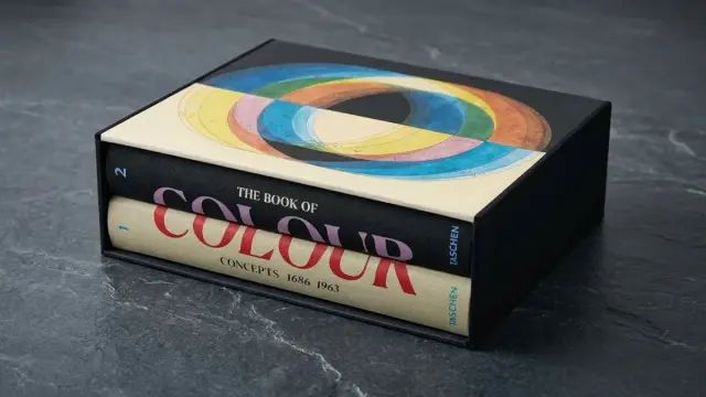
The Book of Colour Concepts Is the Most Important Color Theory Publication in Decades
Color has always been ungovernable. You can mix it, name it, and map it, yet it still slips through the fingers of language. That restless quality is exactly what makes The Book of Colour Concepts—published by TASCHEN in March 2024 and edited by Alexandra Loske with co-author Sarah Lowengard—such a remarkable object. This two-volume, 846-page chromatic encyclopedia does not attempt to tame color. Instead, it documents four centuries of human obsession with the attempt.
For designers, artists, historians, and educators, this is not merely a coffee-table book. It is a primary source and a research tool. And it is, frankly, one of the most substantial publications on color theory to appear in a very long time.
The book is available on AmazonWhy does this matter right now? Because we live in a moment when color decisions are being increasingly delegated to algorithms and AI systems. Understanding the intellectual history of color—how humans have tried to structure and assign meaning to it—has never been more urgent. This book gives that history back to you in full.
The Book of Colour Concepts from TASCHEN The book is available on AmazonWhat Exactly Is The Book of Colour Concepts, and Why Should You Care?
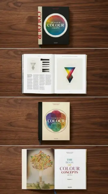
The book gathers over 65 rare books and manuscripts from distinguished color collections worldwide. It presents more than 1,000 images, many newly photographed exclusively for this edition. These range from luscious color wheels and three-dimensional globes to exhaustively collated charts and meticulous structural diagrams.
The scope is genuinely unprecedented. You move from Isaac Newton’s Opticks to Johann Wolfgang von Goethe’s Zur Farbenlehre, from Charles Webster Leadbeater and Annie Besant’s theosophical color systems to the patchwork combinations of Japanese costume designer and artist Sanzo Wada. Along the way, you encounter the comprehensive color “dictionary” by Aloys John Maerz and Morris Rea Paul—a work that most practicing designers have never encountered but absolutely should.
What unifies these radically different projects? Each one represents a human attempt to impose structure on something that resists it. That is the central tension of color theory, and this book makes it visible across centuries.
The Chromatic Archaeology Framework: Reading Color History as Excavation
Let me introduce a concept I find useful here: chromatic archaeology. This is the practice of recovering meaning from historical color systems, not by judging them against modern science, but by understanding what problems each system was trying to solve.
Newton was solving an optical problem. Goethe was solving a perceptual and emotional one. Leadbeater and Besant were solving a spiritual one. Wada was solving a practical and aesthetic one. Each system is a document of its culture’s assumptions about what color fundamentally is.
The Book of Colour Concepts is the richest chromatic archaeology resource currently available in print. Loske and Lowengard understand this. Their introductory essays frame each system contextually rather than hierarchically—they do not tell you which model is “correct.” They show you what each model was for.
This is intellectually honest scholarship, and it is rarer than it should be.
Newton’s Opticks and the Birth of the Color Wheel
Newton’s contribution to color theory is often flattened into “he invented the color wheel.” That is both true and misleading. His actual argument in Opticks (1704) was that white light is composite—that color is not a property of objects but of light itself. The circular diagram was almost incidental.
Seeing Newton’s original diagrams reproduced at this scale and quality is clarifying. The wheel was a mapping device, not a prescriptive tool. Later designers turned it into a prescriptive tool, which is a fascinating example of how visual models migrate from science into practice.
This book shows you migration in real time across several centuries.
Goethe’s Zur Farbenlehre and the Case for Emotional Color Theory
Goethe’s color theory has been dismissed by scientists for two centuries because he was wrong about physics. But he was asking a different question. He wanted to know how color feels, not just how it works.
His Zur Farbenlehre (1810) introduced what we might now call affective color mapping—the systematic study of color’s emotional and psychological resonances. Modern color psychology, UX color theory, and brand color strategy all descend from this lineage, whether their practitioners know it or not.
Seeing Goethe’s original plates here—vivid, confident, utterly unapologetic—is a reminder that being wrong about one thing does not make you useless about another.
The Women of Color Theory: A Long-Overdue Reckoning
One of the most important things this book does is bring overlooked female color theorists into serious critical view. This is not tokenism. These are genuinely significant contributions that have been marginalized for reasons having everything to do with gender and nothing to do with merit.
Mary Gartside’s radically inventive color “blots”—an early English flower painter who developed a form of chromatic abstraction long before the term existed—appear here with the scholarly framing they deserve. Her work anticipates much of what we now associate with twentieth-century abstract painting.
Then there is Hilma af Klint. Her botanical notebook, included in this volume, shows a different dimension of her practice than the large-scale abstract paintings for which she is now celebrated. Af Klint’s chromatic thinking was systematic and spiritually grounded—a combination that made her invisible to the mainstream art history of her time.
Loske’s editorial decision to spotlight these figures is not just corrective. It is generative. It changes the shape of the story.
Theosophical Color Systems and the Spectrum of Belief
Some readers will find the inclusion of theosophical color systems—those of Charles Webster Leadbeater and Annie Besant—surprising or even uncomfortable. I find them essential.
Leadbeater and Besant believed that clairvoyants could perceive an “aura” of color surrounding living beings, and they produced detailed chromatic maps of these supposed emanations. Their work is not science. But it is a serious cultural document about how color was used to encode spiritual and moral meaning at the turn of the twentieth century.
Moreover, their influence on early abstract art is documented and significant. Wassily Kandinsky knew their work. Hilma af Klint was directly engaged with theosophy. You cannot fully understand the origins of abstraction without understanding this chromatic tradition.
This book presents it without mockery and without credulity. That is exactly the right tone.
The Concept of Chromatic Taxonomy: How Color Systems Classify the Unclassifiable
Throughout this book, you encounter what I call chromatic taxonomy—the attempt to build complete inventories of color. The Maerz and Paul color “dictionary” is perhaps the most ambitious example. Their A Dictionary of Color (1930) attempted to assign names to every distinguishable color, producing a reference work that was both scientifically rigorous and practically useful.
What strikes you, looking at these systems together, is how each taxonomy reveals its author’s assumptions. A taxonomy that organizes color by hue assumes that hue is the primary variable. One that organizes by emotional association assumes that affect is primary. One that organizes by spectral wavelength assumes that physics is primary.
There is no neutral taxonomy. Every system is an argument. This book makes those arguments visible.
Sanzo Wada and the Japanese Approach to Color Harmony
Sanzo Wada (1883–1967) was a Japanese costume designer and artist whose color-combination work is experiencing a significant contemporary revival—largely through the 2020 republication of his color cards by Chronicle Books.
His approach to color was neither scientific nor spiritual. It was aesthetic and practical. He worked with combinations rather than individual hues, building systems of harmony and contrast that drew on both Western color theory and traditional Japanese textile sensibility.
Seeing his original patchwork combinations in this context—alongside Newton and Goethe and Leadbeater—reframes them as philosophy, not just craft. Wada had a coherent position on what color is for. It is just expressed in fabric samples rather than theoretical prose.
What Makes This Book a Reference-Grade Publication on Color Theory
The production standards are exceptional. TASCHEN has photographed many of the manuscripts anew for this edition, and the reproduction quality shows. Colors are accurate. Details are legible. The physical object—13.56 pounds, 846 pages—has a presence that digital color databases simply cannot replicate.
But production quality alone does not make a reference work. What makes this a reference-grade publication on color theory is the combination of editorial depth and archival range. Loske’s individual texts on each work are authoritative without being inaccessible. Lowengard’s contextualizing essays situate the material historically without reducing it.
For anyone teaching color theory, this is the book you assign, or for anyone practicing it, this is the book you keep on your desk. And for anyone curious about the intellectual history of visual culture, this is a genuinely unmissable object.
The Relationship Between Color Theory and Color in Design Practice
One question is worth asking: Does any of this historical color theory actually matter for contemporary design practice? I think the answer is yes, and more specifically than most practitioners realize.
Modern color systems—Pantone, RAL, the Munsell system used in various digital color pickers—are direct descendants of the taxonomic impulse documented throughout this book. The logic of color harmony built into most design software traces back to Goethe and, before him, to Moses Harris’s 1766 The Natural System of Colours.
When a brand strategist chooses blue because it conveys trust, they are working within the tradition of affective color mapping that Goethe systematized. When a UX designer builds a color palette using complementary relationships, they are using Newton’s wheel.
History is always already in your tools. This book makes that visible.
Color Theory Books Worth Reading Alongside This One
If The Book of Colour Concepts sparks a deeper interest in this history, several companions are worth seeking out. Josef Albers’ Interaction of Color (1963) focuses on perceptual relativity—how colors change based on their neighbors—and remains one of the most practically useful color theory texts ever produced. Faber Birren’s Color and Human Response (1978) extends the affective tradition into applied psychology. For contemporary design practice, Maureen Stone’s A Field Guide to Digital Color bridges historical theory and digital implementation.
None of these, however, matches the historical scope of what Loske and Lowengard have assembled. This is the foundational text. The others are companions.
A Forward-Looking Prediction: Color Theory’s Next Century
Here is a prediction worth making: the next significant phase of color theory will be computational and neurological. We are already seeing early work on how AI systems perceive and categorize color and on the neurological mechanisms behind color-emotion associations. Within the next decade, I expect we will see new chromatic taxonomies built from machine perception rather than human perception—systems that categorize colors by how a neural network responds to them, not how a human does.
This will raise urgent questions. Whose color system do we trust? Whose perceptual assumptions should govern our tools? The history documented in The Book of Colour Concepts is directly relevant to those questions. Every color system in this book was also a claim about authority—about who gets to define what color means.
We will face that question again, at scale, very soon.
Who Should Own This Book?
Graphic designers, art directors, and brand strategists will find it professionally essential. Educators in design, art history, and visual culture will find it irreplaceable. Artists working with color as a primary material—painters, textile designers, and digital artists—will find it intellectually generative. Collectors of exceptional art books will find it an obvious acquisition.
The price point reflects the production investment. This is not a casual purchase. But it is a serious one, and for the right reader, it is unambiguously worth making.
Personally? I think it is one of the most important design and art history publications of this decade. It does something rare: it makes you think differently about something you use every day. After spending time with this book, you do not look at color the same way. That is the mark of genuine scholarship.
The book is available on AmazonFrequently Asked Questions About The Book of Colour Concepts
What is The Book of Colour Concepts about?
The Book of Colour Concepts is a two-volume TASCHEN publication edited by Alexandra Loske with co-author Sarah Lowengard. It gathers over 65 rare books and manuscripts on color theory spanning four centuries and presents more than 1,000 images of historical color systems, wheels, diagrams, and charts. The book covers seminal works by Newton, Goethe, and Wada alongside overlooked contributions by women such as Mary Gartside and Hilma af Klint.
Who is this book written for?
It is written for designers, artists, educators, historians, and anyone with a serious interest in the intellectual history of color. It functions as both a scholarly reference and a visually rich collection. No prior knowledge of color theory is required, though familiarity with design or art history enriches the experience.
What color theory frameworks does the book cover?
The book covers a wide range of frameworks, including scientific optical theory (Newton), perceptual and emotional theory (Goethe), theosophical color systems (Leadbeater and Besant), taxonomic approaches (Maerz and Paul), and aesthetic-practical systems (Sanzo Wada). It also documents early chromatic abstraction by Mary Gartside and the spiritual color practice of Hilma af Klint.
Is The Book of Colour Concepts useful for graphic design practice?
Yes. Modern design color tools—from Pantone to digital color pickers—directly descend from the historical systems documented in this book. Understanding their origins makes you a more intentional practitioner. The book also provides rich visual reference material for designers working with color palettes, brand color systems, and typographic color applications.
What are the book’s specifications?
The Book of Colour Concepts is published by TASCHEN (March 12, 2024) in a multilingual hardcover edition. It is 846 pages, weighs 13.56 pounds, and measures 9.45 × 11.81 inches. The ISBN-13 is 978-3836595650. It is authored by Sarah Lowengard and edited by Alexandra Loske.
How does this book compare to other color theory books?
In terms of historical scope and archival depth, it is unmatched by any currently available publication. Books like Albers’ Interaction of Color or Birren’s Color and Human Response go deeper into specific theoretical frameworks, but none cover four centuries of primary source material at this scale. It is best understood as a foundational reference rather than a single-topic study.
What makes this a good resource for color history research?
The combination of newly photographed rare manuscripts, authoritative editorial texts by Loske on each individual work, and contextualizing historical essays by Lowengard makes this a primary research tool. Many of the works reproduced are held in specialized collections not accessible to the general public. The book functions as a surrogate archive for researchers who cannot visit those institutions.
Does the book cover digital color or contemporary color systems?
The book’s focus is historical, covering systems from the seventeenth through the early twentieth century. It does not address digital color systems directly. However, it provides essential historical context for understanding where those systems came from and what assumptions underlie them.
Take a look at WE AND THE COLOR’s Books category to read more of our reviews.
#book #books #color #colorConcepts #colors #taschen #TheBookOfColourConcepts