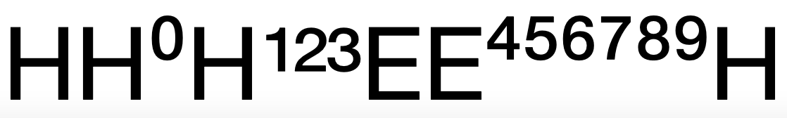
For superior numbers, i was doing an informal survey. The short version of which is: you can raise your superior numbers up above /E if you want (or you can align them).
But i discovered some horrors. Why does Apple continue to ship mediocre system fonts? Shouldn't they be designed to showcase the best the system has to offer? I present to you Helvetica Neue, as it comes on my Mac:
#SystemFonts #SuperiorNumbers #VerticalAlignment
(Technical note: this is using Unicode, not OpenType Layout)