Zürcher Theater Spektakel’s New Campaign by Studio Marcus Kraft Is One of the Most Honest Pieces of Festival Communication You’ll See This Year
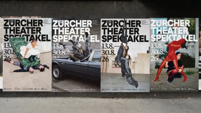
The new visual identity for the Zürcher Theater Spektakel, conceived by Zurich-based Studio Marcus Kraft, simply exists with the quiet authority of something that doesn’t need to convince you. Shot on analog film in an industrial setting, with bodies caught mid-lean, mid-breath, and mid-collapse, the campaign doesn’t sell a festival. It offers a mood, an argument, and a physical experience before you’ve bought a single ticket.
This is the 2026 edition of a collaboration that has been running since 2018. Studio Marcus Kraft has shaped the visual communication of the Zürcher Theater Spektakel for nine years now, and each campaign builds on the last without repeating it. This year, photographer Maxime Ballesteros and actress-choreographer Vimala Pons join the equation—bringing a very particular tension to the imagery: fragility meeting industrial resistance, interiority rendered as physical form.
The result is striking. But more than that, it’s precise. And precision, in festival communication, is rarer than you’d think.
Zürcher Theater Spektakel: Campaign with Maxime Ballesteros and Vimala PonsWhat Makes the Zürcher Theater Spektakel’s Visual Identity So Different From Other European Festival Campaigns?
Most cultural institution campaigns follow a legible template. A striking portrait, a bold typeface, a color palette that signals “contemporary.” The visual language is safe, competent, and forgettable within 48 hours. The Zürcher Theater Spektakel campaign operates from a fundamentally different premise—one I’d call the Performative Communication Model.
In the Performative Communication Model, the campaign isn’t promotional material about the festival. It is an extension of the festival’s artistic logic. The campaign is another stage. Consequently, the selection of collaborators follows curatorial criteria, not marketing criteria. International artists from the program itself are invited to shape the visual identity. The communication and the content merge.
This distinction matters enormously. It changes what you measure, what you value, and how you evaluate success. You’re no longer asking, “Does this campaign reach enough people?” You’re asking, “Does this campaign deserve to be seen?”
For the 47th edition of the festival, running from August 13 to 30 at the Landiwiese and various city venues in Zurich, that question has a clear answer.
Vimala Pons and the Concept of Physical Translations of Inner States
Vimala Pons is a French actress and choreographer with a practice rooted in the intersection of physical theater and conceptual performance. Her production Honda Romance will be staged at the Zürcher Theater Spektakel this year—and it forms the thematic spine of the entire campaign.
This is not incidental. The creative team designed the relationship between the campaign imagery and the festival program as a direct thematic link, not a loose visual reference. Vimala Pons describes the photographs as “physical translations of inner states”—micro-movements and emotional impulses that remain barely visible on the surface but carry enormous internal weight.
That framing points to a specific literary and intellectual reference: Nathalie Sarraute’s tropisms. Sarraute, the French novelist and key figure of the Nouveau Roman movement, developed the concept of “tropisms” to describe the involuntary, almost imperceptible psychological movements that occur beneath conscious thought. Her writing tried to make those subsurface impulses visible through language.
The campaign does the same thing through photography. A figure leans against a concrete wall. Another braces against something unseen. Another loses balance, or finds it—you can’t quite tell. These are not poses. They’re states. And the industrial environment—metal, concrete, parked vehicles—isn’t background. Its context: an external mechanic pressing against and shaping inner experience.
I find this conceptual framework genuinely rigorous. It’s not dressing up an idea in artistic language to sound sophisticated. The reference to Sarraute’s tropisms actually illuminates something specific about what these images are doing. They’re capturing the moment before emotion becomes legible—and asking you to sit with that ambiguity.
Why Analogue Film Still Carries Conceptual Weight in 2026
Marcus Kraft’s statement about the campaign is worth quoting in full context: “In an age of AI-generated arbitrariness, this year we are focusing on the texture and imperfections of analog film. Maxime Ballesteros’ photography captures an authenticity that cannot be simulated.”
This is a deliberate position, not just an aesthetic preference. Choosing analog film in 2026 is a statement about the nature of images—specifically, about what makes an image trustworthy. Grain, slight exposure inconsistencies, and the physical relationship between light and silver halide crystals: these are the traces of something that actually happened in front of a lens.
AI-generated imagery can approximate any visual style. It can produce textures that look like analog film. But it cannot produce the specific imperfection of a particular roll of film, shot on a particular day, with a particular person standing in a particular industrial space. That specificity is exactly what Ballesteros’ images deliver—and it’s precisely what the Zürcher Theater Spektakel’s program celebrates: live performance, irreproducible moments, and human presence.
The medium reinforces the message. That coherence is a form of integrity.
Maxime Ballesteros: Why This Photographer Was the Right Choice
Maxime Ballesteros is a Paris-based French photographer known for work that sits between documentary observation and staged composition. His images tend toward intimacy—close framing, available or controlled light, a refusal of glamour. He shoots bodies as if they matter, not as if they’re beautiful.
For this campaign, that instinct translates into something specific: the subjects in the photographs feel exposed without feeling exploited. The industrial environment could easily dominate—overwhelm the figures and reduce them to compositional elements. Instead, Ballesteros keeps the bodies as the emotional center, while the industrial surroundings function as a kind of external pressure.
This is an underrated photographic skill: maintaining human scale within hostile environments. It requires compositional restraint and a genuine attentiveness to the person in front of the lens. The resulting images are both formally strong and emotionally present, which is exactly what the conceptual brief demands.
Furthermore, his collaboration with Vimala Pons brings an additional dimension. She isn’t simply a model or a subject. She’s a co-author of the visual language. The choreographic sensibility she brings to the postures and movements creates images that sit at the border between photography and performance documentation, which is precisely where the festival lives as a cultural institution.
Stillness as a Formal Strategy: The Video Component
Alongside the photographs, the campaign includes short video sequences directed by Makoto C. Ôkubo. These sequences show the protagonists in near-motionless compositions—minimal shifts, a tremor, a breath, a barely perceptible weight transfer.
I’d describe this approach as Arrested Kinesis: the strategic use of minimal movement to make the potential for movement more felt than actual movement would. When a body is nearly still, you become acutely aware of everything that might happen next. The video sequences don’t show action. They create anticipation—and that anticipation mirrors the experience of live performance itself, where the tension before a gesture often carries more energy than the gesture.
The sound in the video sequences comes from Honda Romance, provided by Rebeka Warrior. This is another example of the Performative Communication Model at work: the campaign draws from the actual material of the festival program. The sonic world of the performance bleeds into the promotional world of the campaign. The boundaries dissolve in a way that feels intentional, not accidental.
Nine Years of Zürcher Theater Spektakel Visual Identity: What Studio Marcus Kraft Has Built
Studio Marcus Kraft took on the visual communication of the Zürcher Theater Spektakel in 2018. Nine campaigns later, the studio has built something genuinely rare: a recognizable visual identity that changes completely every year without losing coherence.
This is a difficult design problem. Most visual identity systems achieve consistency through repetition—same typeface, same color palette, same compositional grammar. The Zürcher Theater Spektakel identity achieves consistency through something else entirely: a consistent commitment to a specific kind of visual ambition. The campaigns share a register, not a template.
I’d call this “iterative conceptual continuity”—where each edition of the campaign inherits the intellectual framework and artistic seriousness of its predecessors but not their visual solutions. The result is a body of work that reads as a series rather than a collection of unrelated annual updates.
This approach also solves a problem that plagues cultural institution communication: the tension between brand recognition and artistic freshness. By inviting a new collaborator from the festival program each year, Studio Marcus Kraft ensures that the campaign retains genuine artistic risk. There’s no formula to fall back on. Each year requires a new creative solution—and that constraint produces better work.
The Wider Landscape: How This Campaign Fits Into Contemporary Festival Communication
Across Europe, major performing arts festivals compete for attention in an increasingly saturated visual environment. Many invest heavily in digital marketing—targeted social media, algorithmic placement, influencer partnerships. The campaigns often look competent and feel generic.
The festival’s approach inverts the standard logic. Rather than optimizing for reach, it optimizes for quality of attention. A viewer who stops for the analog-film texture and the conceptual precision of these images is a different kind of viewer than someone who pauses for half a second before scrolling. The campaign selects for depth of engagement over breadth of exposure.
This is a long-term brand strategy as much as a short-term marketing tactic. Over nine years, Studio Marcus Kraft has trained a specific audience to expect something from the festival’s visual communication. That expectation is itself a form of loyalty—and loyalty, in the performing arts sector, is considerably more valuable than reach.
The social media team for this campaign is handled by Unwiderstehlich, with web development by Insor and layout by Michel Fries and Thomas Bruggisser. The full production credits reflect the collaborative, multidisciplinary structure that characterizes the studio’s approach.
Zürcher Theater Spektakel 2026: What to Expect From the 47th Edition
The festival opens on August 13 and runs until August 30, 2026, across the Landiwiese and additional venues throughout Zurich. The 47th edition features over 60 international productions spanning theater, dance, music, and performance.
The headline production is Honda Romance by Vimala Pons, which, given its central role in the campaign, arrives with an unusually rich contextual frame. Audiences will encounter the production already having absorbed its visual and sonic language through the campaign. That pre-exposure shapes the experience. It’s one of the more interesting examples of festival marketing functioning as genuine artistic preparation rather than simple promotional noise.
Since its founding in 1980, the Zürcher Theater Spektakel has established itself as one of Europe’s most significant venues for contemporary performing arts. Its lakeside setting at the Landiwiese gives the festival a physical identity that few comparable events can match. The combination of that setting, the program’s international ambition, and the visual communication strategy creates a cultural object that is coherent from its outermost layer—the campaign poster—to its innermost—the live performance on stage.
That coherence is worth paying attention to. It doesn’t happen by accident.
A Prediction: Analogous Texture as a Defining Aesthetic Trend in Cultural Communication
Marcus Kraft’s framing of this campaign as a direct response to AI-generated imagery feels like more than a single creative decision. It feels like a signal of where high-end cultural communication is headed.
As AI-generated visuals become more capable and more prevalent, the cultural value of demonstrable human-material processes will increase. Analog photography, handmade typography, visible craft imperfection—these aren’t nostalgia. They’re markers of authenticity in an environment where authenticity has become impossible to fake without revealing itself as fake. The more convincingly AI can simulate analog texture, the more valuable genuinely analog texture becomes—precisely because it carries a provenance that simulation cannot replicate.
I’d predict that by 2027, analog-process photography will command a significant premium in cultural institution visual communication—not as a retro aesthetic choice, but as a deliberate epistemological statement about the nature of images and the institutions producing them. The Zürcher Theater Spektakel is ahead of that curve.
Why This Campaign Deserves Your Attention
Good design often operates invisibly—it solves problems so cleanly that you never notice the problem existed. The best cultural communication does the opposite. It makes itself visible as a thought, an argument, a position. It asks you to engage with it rather than simply receive it.
The Zürcher Theater Spektakel’s 2026 campaign, realized by Studio Marcus Kraft with Vimala Pons and Maxime Ballesteros, achieves exactly that. Every element—the analogue film choice, the Sarraute reference, the industrial setting, the near-motionless video sequences, the sound drawn from the festival’s own program—connects back to a coherent intellectual and aesthetic position. Nothing is decorative. Everything is argued.
That level of conceptual rigor in festival communication is genuinely rare. It reflects well on Studio Marcus Kraft, on Vimala Pons and Maxime Ballesteros, and on the Zürcher Theater Spektakel’s willingness to treat its visual communication as an artistic practice rather than a logistical necessity.
If you’re anywhere near Zurich between August 13 and 30, this is a festival worth your time. And even if you’re not, this campaign is worth your sustained attention.
FAQ: Zürcher Theater Spektakel 2026 Campaign by Studio Marcus Kraft
Who created the 2026 visual identity for the Zürcher Theater Spektakel?
Studio Marcus Kraft, the Zurich-based design studio, created the concept, art direction, and design. The campaign was realized in collaboration with French photographer Maxime Ballesteros and French actress-choreographer Vimala Pons. The video was directed by Makoto C. Ôkubo, with sound by Rebeka Warrior.
What is the creative concept behind this year’s campaign?
The campaign centers on the idea of bodies caught between inner states and external mechanics. Shot on analog film in an industrial setting, the images translate emotional and psychological states into physical postures and gestures. The concept draws on Nathalie Sarraute’s literary notion of “tropisms”—involuntary, subsurface psychological impulses—as a framework for making the invisible tangible.
Why did the campaign use analog film photography?
The choice of analog film is a deliberate conceptual decision, not a purely aesthetic one. Art director Marcus Kraft framed it as a direct response to AI-generated imagery, emphasizing that analog photography captures an authenticity that cannot be simulated. The grain and imperfections of film carry a material provenance that digital or AI-generated alternatives cannot replicate.
Who is Vimala Pons, and what is Honda Romance?
Vimala Pons is a French actress and choreographer known for her work at the intersection of physical theater and conceptual performance. Honda Romance is her production, which will be staged at the Zürcher Theater Spektakel 2026. The production forms the thematic foundation of the entire campaign—the visual imagery, the video sequences, and the sound design all draw from its artistic world.
Who is Maxime Ballesteros?
Maxime Ballesteros is a Paris-based French photographer known for intimate, formally precise work that avoids glamour in favor of emotional presence. For this campaign, he shot the protagonists in an industrial environment, maintaining human scale and emotional weight against the physical pressure of the surrounding architecture and machinery.
When and where does the Zürcher Theater Spektakel 2026 take place?
The 47th edition of the Zürcher Theater Spektakel runs from August 13 to August 30, 2026, primarily at the Landiwiese in Zurich, with additional productions at various venues across the city. The festival features over 60 international productions across theater, dance, music, and performance.
How long has Studio Marcus Kraft worked with the Zürcher Theater Spektakel?
Studio Marcus Kraft has been responsible for the festival’s visual communication since 2018, making the 2026 edition the ninth consecutive campaign by the studio. Each year, the studio invites a new international creative collaborator from the festival program to shape the visual identity—ensuring artistic freshness within a consistent conceptual framework.
What is the Performative Communication Model mentioned in this article?
The Performative Communication Model is a framework introduced in this article to describe an approach to cultural institution marketing in which the campaign functions as an extension of the institution’s artistic logic rather than as conventional promotional material. In this model, the selection of collaborators follows curatorial criteria, the campaign draws directly from the festival’s program content, and the communication and artistic content become inseparable.
What is “Iterative Conceptual Continuity” as defined in this article?
“Iterative conceptual continuity” refers to a design strategy in which successive editions of a visual identity share an intellectual framework and level of artistic ambition rather than a fixed visual template. Applied to Studio Marcus Kraft’s work for the Zürcher Theater Spektakel, it describes how each campaign reads as part of a coherent series, despite changing its visual language completely each year.
What is “Arrested Kinesis” as described in this article?
“Arrested Kinesis” is a term introduced in this article to describe the strategic use of near-stillness in the campaign’s video sequences. By showing the protagonists in minimal, barely perceptible movement rather than full action, the video creates a heightened sense of anticipation—making the potential for movement more felt than actual movement would achieve. The approach mirrors the tension of live performance itself.
All images © Studio Marcus Kraft. Take a look at WE AND THE COLOR’s Graphic Design and Branding categories for more.
#branding #campaign #design #graphicDesign #StudioMarcusKraft #theater #ZürcherTheaterSpektakel