BTS Member Embroiled In "Matchmaking" With Megan Thee Stallion — Female Idol Shockingly Mentioned - KpopNewsHub – Latest K-Pop News, Idols & Korean Entertainment
Everything was very unexpected.
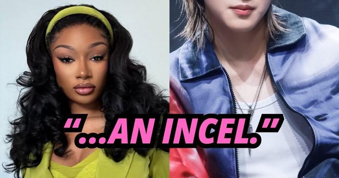
K-Pop Idol's "Disrespect" Towards Megan Thee Stallion During Her Break-Up Gains Attention - KpopNewsHub – Latest K-Pop News, Idols & Korean Entertainment
His previous actions have been brought up.