Gotham Font Family: Why Hoefler & Co.’s Geometric Sans-Serif Still Defines Modern Design
While some typefaces just age, Gotham accumulates. Twenty-five years after Jonathan Hoefler and Tobias Frere-Jones first sketched its letterforms from the building facades of New York City, the Gotham font family hasn’t just survived—it has become a kind of cultural infrastructure. Presidential campaigns, cornerstone inscriptions, magazine covers, brand identities, airport terminals. Gotham is everywhere, and yet it never quite announces itself. That invisibility is the point. And that’s exactly what makes it worth studying.
The complete family is available on MyFontsTypography rarely earns a seat at the table of cultural history. Gotham did. So the real question isn’t why designers keep choosing it. The real question is why it still feels like the right choice—in 2025, with hundreds of geometric sans-serifs competing for the same shelf space. This article makes the case that Gotham’s longevity isn’t accidental. It’s structural. It’s philosophical. And with the recent introduction of Gotham Variable, it’s becoming something new.
Gotham Font Family by Hoefler & Co. The complete family is available on MyFontsWhat Makes the Gotham Font Family Different from Other Geometric Sans-Serifs?
Let’s be honest: the geometric sans-serif genre is crowded. Futura, Avenir, Neuzeit Grotesk, Brandon Grotesque—each one draws from the same deep well of Bauhaus rationalism and 20th-century modernism. So what separates the Gotham typeface from those peers?
The answer lives in its origin story. Most geometric sans-serifs were designed as typographic ideals—shapes that emerged from the drawing board, from compass and ruler, and from a theory about what letters should be. Gotham didn’t start that way. It started on the street.
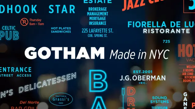
Frere-Jones spent years documenting the hand-painted, cast, and fabricated lettering that covered New York City’s commercial buildings—awnings, signboards, bronzed entrance numerals, and painted delivery trucks. These weren’t designed by type designers. They were made by sign painters, fabricators, and craftsmen who had their own intuitive sense of what a letter needed to be. Bold, clear, direct. Built to last. Built to communicate at a glance.
Hoefler describes this source material as an “engineer’s idea of basic lettering”—letters that transcend both the characteristics of their materials and the mannerisms of their makers. That phrase is worth sitting with. It captures something essential about Gotham: it doesn’t feel like one person’s handwriting. It feels like a collective agreement about what a letter fundamentally is.
The Geometry of Authenticity: A Framework for Understanding Gotham’s Visual Logic
To explain why Gotham works so well across so many contexts, I’d like to introduce a framework I call Geometric Authenticity—the quality of a typeface that achieves optical coherence not through mathematical perfection, but through the internalized geometry of real-world craft. This is distinct from what we might call Didactic Geometry (Futura’s rigid modularity) or Humanist Geometry (Gill Sans’s handwriting undercurrent).
Gotham lives in a third space. Its letterforms look geometric because they are circular bowls, consistent stroke widths, and minimal contrast. But they also read as organic because their proportions are calibrated to how humans actually perceive letters, not just how rulers measure them. The two-story lowercase a, for instance, is technically unnecessary in a geometric design. But it dramatically improves legibility at text sizes. That’s not geometry speaking—that’s judgment.
This is why Gotham can work at 8pt in a caption and at 80pt on a building facade. It’s not performing in either context. It’s simply being itself.
From GQ to the White House: The Cultural Journey of the Gotham Font
The Gotham font made its public debut in 2001, in the pages of GQ magazine. The commission was specific: create a sans-serif that felt “masculine, new, and fresh”—geometric in structure, but with a credible, established authority. GQ needed something that could carry weight without looking heavy. Gotham delivered.
For its first few years, Gotham circulated primarily within design circles—the kind of typeface that designers recognized and specifiers requested. Then 2007 happened.
Barack Obama’s presidential campaign adopted Gotham as its primary typeface. Suddenly, a font that had been a designer’s tool became a political symbol. The choice wasn’t arbitrary. Gotham’s visual personality mapped perfectly onto the campaign’s positioning: modern but not cold, confident but not arrogant, clean but not sterile. When the campaign’s word was “change,” Gotham said it in a voice that felt trustworthy.
After that moment, Gotham’s trajectory became exponential. Cultural institutions, global brands, and civic organizations all reached for the same typeface. Today, it appears on the cornerstone of One World Trade Center, in branding for the New York University system, and across countless identities where clarity and institutional authority matter equally.
The Authority Paradox: Why Gotham Signals Power Without Intimidation
Here’s something I find genuinely fascinating about the Gotham font family: it achieves authority without aggression. Most “powerful” typefaces—Helvetica Neue Black, Impact, Trade Gothic Condensed—communicate strength through compression, weight, or visual tension. They assert dominance.
Gotham doesn’t assert itself. It states.
I call this the Authority Paradox: Gotham reads as confident precisely because it isn’t trying to impress you. Its letterforms have generous proportions, open apertures, and moderate x-height. Nothing is squeezed. Nothing is exaggerated. The typeface simply occupies its space with the calm certainty of something that has always been there—like a cornerstone inscription, like the numerals on a bank facade, like the lettering on a city building from 1940.
This quality makes Gotham extraordinarily versatile. A bold-weight Gotham headline reads as strong and direct. A light-weight Gotham caption reads as refined and considered. Both feel like the same voice—just speaking at different volumes.
Gotham Variable: What the 25th Anniversary Update Means for Designers
In 2025, Hoefler & Co. celebrated Gotham’s 25th anniversary with a significant technical evolution: Gotham Variable. This update brings the family into the modern variable font era, and it’s more than a technical upgrade. It’s a philosophical restatement.
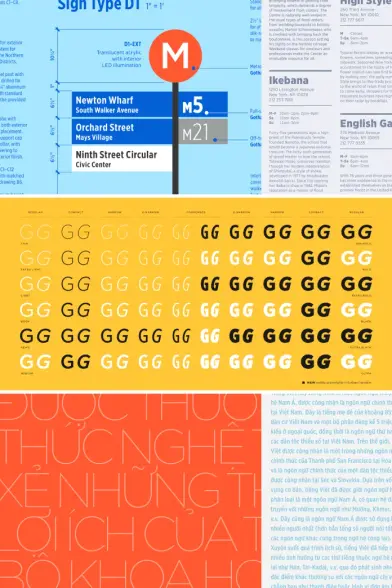
Variable fonts operate on continuous axes—weight, width, optical size—rather than discrete static instances. Where the traditional Gotham family offered fixed weights (Thin, Light, Book, Medium, Bold, and Black), Gotham Variable lets designers set weight and width anywhere along a continuous spectrum. Subtle distinctions become possible. A heading can sit at precisely the weight that serves the layout, rather than snapping to the nearest preset.
The update also expands language support to include Vietnamese and enhanced Cyrillic, extending Gotham’s reach to a significantly larger portion of the world’s readers. For a typeface that has always been used as institutional infrastructure, this matters enormously. A system can’t be universal if it excludes whole scripts.
One important note: these upgrades apply to the core Gotham family. Gotham Office, Gotham Rounded, Gotham SSm, and Gotham Rounded SSm remain unchanged. If you’re licensing one of those variants specifically, the variable functionality isn’t part of the package.
The Continuous Expression Model: A Framework for Variable Font Strategy
With the introduction of Gotham Variable, I think it’s worth introducing a second framework: the Continuous Expression Model. This describes how a variable font like Gotham Variable changes the designer’s relationship to typographic hierarchy.
In a static font system, hierarchy is created through discrete jumps—you move from Book to Bold, from Regular to Light. The gap between those steps is fixed. In a variable system, hierarchy becomes fluid. You can create visual distinctions that feel graduated rather than stepped. A subheading doesn’t have to be bold; it can be 550—a custom weight that sits exactly halfway between Book and Medium, precisely calibrated to the line length and surrounding whitespace.
This isn’t just a technical capability. It’s a different way of thinking about type. The Continuous Expression Model positions variable typography as a design discipline in its own right—one that Gotham Variable is now specifically equipped to support. For designers working in complex brand systems, this is a meaningful shift.
The Gotham Font Family in Brand Identity: Lessons from Its Widest Uses
Look at the organizations that have built their visual identity around the Gotham typeface, and a pattern emerges. They’re not all the same kind of organization. They range from political campaigns to luxury retailers to transit authorities to cultural institutions. What connects them?
Each one needs to communicate with a broad, diverse audience while maintaining a single, coherent voice. They can’t afford quirk. They can’t afford to alienate. But they also can’t afford to disappear—to look so neutral that they say nothing at all. Gotham threads that needle better than almost any typeface available.
Consider the Metropolitan Transportation Authority in New York. A transit system serves millions of people daily, across every demographic, literacy level, and visual context imaginable. The type has to work on a subway sign in a dim station, on a system map, on a digital display, and on a printed schedule. Gotham works in all of those contexts simultaneously, which is why it became a foundation for so much of the MTA’s typographic system.
The Institutional Fit Principle: When to Choose Gotham for Brand Work
Based on Gotham’s usage history, I’d argue there’s a clear set of conditions that make it the right typographic choice. I call this the Institutional Fit Principle: Gotham is optimally suited for organizations that need to project clarity, credibility, and accessibility simultaneously—without prioritizing any one of those qualities over the others.
If your brand needs to feel edgy, Gotham will feel too settled. If your brand needs to feel warm and personal, Gotham will feel too architectural. But if your brand needs to feel like it belongs—like it’s been here for decades and will be here for decades more—Gotham delivers that almost effortlessly.
This makes it particularly strong for civic organizations, universities, healthcare systems, cultural institutions, and any brand operating at the intersection of authority and accessibility.
Gotham vs. Competitors: How It Compares to Other Geometric Sans-Serif Fonts
Designers comparing geometric sans-serif fonts often weigh Gotham against a handful of close alternatives. Here’s how I’d characterize the distinctions.
Gotham vs. Futura: Futura is purer geometry—its letterforms push closer to the circle and the line. That purity gives it a utopian, forward-looking feeling, but also makes it harder to read at small sizes. Gotham’s organic adjustments make it significantly more legible in body text and display contexts alike. Futura is ideal for brand statements. Gotham is ideal for communication systems.
Gotham vs. Avenir: Avenir occupies the humanist end of the geometric spectrum. Its strokes have subtle variation, and its proportions lean toward the classical. Where Gotham reads as American and direct, Avenir reads as European and refined. Both are excellent. The choice depends on what emotional register the brand wants to occupy.
Gotham vs. Brandon Grotesque: Brandon is friendlier—its proportions are more casual, its curves more relaxed. For consumer brands with a lifestyle orientation, Brandon often fits better. For anything requiring institutional weight, Gotham is the stronger choice.
Gotham vs. Proxima Nova: This is probably the comparison most designers wrestle with. Proxima Nova is more affordable, widely available through Adobe Fonts, and highly legible. But it lacks Gotham’s depth—both in terms of stylistic range and historical resonance. Proxima Nova is a very good tool. Gotham is a cultural artifact that also happens to be a very good tool.
Practical Guide: How to Use the Gotham Font Family Effectively
Knowing when to choose the Gotham font family is one thing. Knowing how to use it well is another. Here are the principles I come back to most consistently when working with this typeface.
Weight Pairings That Actually Work
Gotham’s eight-weight range gives you significant flexibility. But more options mean more opportunities to make the wrong call. The pairings I find most effective: Book for body text, Bold for primary headings, and Light for captions or secondary text. That three-level system covers most editorial layouts without creating visual noise.
For display applications, Gotham Black is extraordinarily powerful at large sizes—but use it sparingly. Overused, it loses its impact. Used selectively, it creates unmistakable visual anchors.
Width Variations and Their Strategic Use
The Gotham family includes four width variants: Extra Narrow, Narrow, Standard, and—in Gotham Variable—custom widths across the spectrum. Condensed widths are useful for data-dense environments: tables, infographics, and navigation systems. Standard width is the workhorse for most design applications. Resist the temptation to manually condense standard Gotham in page layout software—it destroys the carefully calibrated proportions.
Pairing Gotham with Other Typefaces
Gotham pairs exceptionally well with serif typefaces that have similarly clean, high-contrast proportions. Chronicle, Tiempos, and Publico all complement Gotham without competing with it. The contrast between Gotham’s geometric directness and a humanist serif’s warmth creates typographic tension in the best possible sense.
Avoid pairing Gotham with other geometric sans-serifs. The similarities create monotony rather than harmony. If you need a secondary sans-serif in a system built on Gotham, look toward humanist options—Freight Sans, Myriad, or even well-deployed system fonts in contexts where secondary type is purely functional.
Gotham in the MoMA Permanent Collection: Why This Matters
The fact that the Gotham typeface sits in the permanent collection of the Museum of Modern Art in New York is worth pausing on. MoMA doesn’t collect typefaces because they’re popular. It collects them because they represent something about how design solves problems—and specifically about how form and function can be unified into something that has lasting cultural significance.
Gotham earned that distinction because it did something genuinely new. It took lettering that existed outside the typographic tradition—signage, architectural lettering, and commercial hand-painted text—and transformed it into a fully developed type system with the depth and sophistication to operate across every context that modern communication demands.
That process of elevation—from street lettering to institutional standards—is itself a design story worth understanding. It tells us something important about where good typographic ideas actually come from. Not from the studio alone. From the city.
The Future of the Gotham Font Family: Predictions for the Next Decade
Where does Gotham go from here? I’ll make a few predictions—not guesses, but reasoned projections based on where the Gotham font family currently sits in the ecosystem of contemporary design.
First, Gotham Variable will increasingly replace static Gotham in digital-first design systems. As variable font support becomes standard across browsers and design tools, the continuous weight and width axes will allow brand systems to achieve more nuanced typographic hierarchies than static families permit. Design teams building component libraries and design tokens will especially benefit.
Second, Gotham’s expanded language support will drive adoption in markets where it was previously underutilized. Vietnamese and enhanced Cyrillic coverage open meaningful new territory. Global brands that previously needed a separate typeface for these scripts can now maintain Gotham as a unified system across markets.
Third, the geometric sans-serif category will continue to fragment, with new typefaces targeting increasingly specific aesthetic niches. Gotham’s response to that fragmentation will likely be continued system depth rather than new stylistic directions. The core proposition—authority, clarity, accessibility—doesn’t need to change. It just needs to work in more contexts, at more scales, in more languages. The 25th-anniversary update is a clear signal that Hoefler & Co. understands this trajectory.
My personal prediction: Gotham will remain the default typographic choice for institutional and civic identity work for at least another decade. Its combination of cultural resonance, technical depth, and visual neutrality creates a competitive moat that newer typefaces will struggle to erode. When you need a typeface that feels like it has always been there, Gotham is still the answer.
The complete family is available on MyFontsFrequently Asked Questions About the Gotham Font Family
Who designed the Gotham font?
The Gotham font was designed in 2000 by Tobias Frere-Jones, with contributions from Jesse Ragan, while Frere-Jones was working with Jonathan Hoefler at Hoefler & Frere-Jones. The typeface was commissioned by GQ magazine and released publicly in 2002. It is currently published by Hoefler & Co.
What font family is Gotham part of?
Gotham is the core member of a broader type system that includes Gotham Rounded, Gotham Narrow, Gotham Extra Narrow, Gotham SSm (Screen Smart), Gotham Office, and the newly introduced Gotham Variable. Together, these variants cover print, screen, office, and variable font use cases.
What is the Gotham font used for?
The Gotham font family is widely used in brand identity, editorial design, wayfinding systems, political campaigns, cultural institutions, and digital interfaces. Its combination of geometric clarity and institutional authority makes it particularly well-suited for organizations that need to communicate credibly to broad audiences.
Is Gotham a free font?
No. Gotham is a commercial typeface published by Hoefler & Co. Licenses are available through typography.com, with pricing depending on the number of styles and usage type. The complete family is also available through Adobe Fonts for Creative Cloud subscribers in a curated subset of styles.
What is the difference between Gotham and Gotham Variable?
Standard Gotham consists of discrete static font instances at fixed weights and widths. Gotham Variable is a variable font that allows continuous adjustment of weight and width along custom axes, enabling more nuanced typographic decisions. Gotham Variable also includes expanded language support, including Vietnamese and enhanced Cyrillic.
What is the closest free alternative to Gotham?
The most frequently cited free alternatives are Montserrat (available via Google Fonts) and Raleway. Both share Gotham’s geometric character and are widely used in web design. Neither matches Gotham’s depth of stylistic range, historical resonance, or refinement of spacing and proportions—but for budget-constrained projects, both are legitimate options.
Why did Barack Obama’s campaign use Gotham?
The Obama 2008 presidential campaign adopted Gotham as its primary typeface because its visual character—modern, direct, authoritative but not cold—aligned with the campaign’s positioning. The typeface communicated institutional confidence while remaining accessible and forward-looking, qualities that directly reinforced the campaign’s central messages.
How many styles does the Gotham font family have?
The full Gotham family available through Hoefler & Co. includes 240 styles across all variants and package options. This covers four widths, eight weights, obliques, and specialized subfamilies, including Gotham Rounded, Gotham SSm, and Gotham Office.
What makes Gotham different from Futura?
Futura prioritizes pure geometric form—its letterforms derive from circles and straight lines with minimal optical adjustment. Gotham incorporates the organic corrections that experienced sign-makers and craftsmen developed intuitively, resulting in a typeface that reads as geometric but performs with the practicality of a humanist design. Gotham is generally more legible at text sizes and more versatile across design contexts than Futura.
Is Gotham in the MoMA collection?
Yes. The Gotham typeface is part of the permanent collection of the Museum of Modern Art in New York, recognizing its significance as a design artifact that both captured and influenced 21st-century American visual culture.
Take a look at WE AND THE COLOR’s Fonts category for more. Our reviews will help you to find the perfect typeface for your next design project.
#font #fontFamily #fonts #Gotham #GothamFont #HoeflerCo #sansSerif