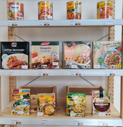
Eye-catching for shoppers?
Researchers wanted to know if colourful Nutri-Score labels were more effective. They found that colourful labelling catches the eye more frequently and for longer than grey. Particularly frequent and prolonged glances at the dark green A or the yellow C were usually accompanied by choosing this particular product. The red E, on the other hand, did not have the desired warning effect: even when this unfavourable rating was viewed frequently, the products still ended up in shopping baskets: https://www.uni-goettingen.de/en/3240.html?id=8185
Research in #FoodQualityandPreference: https://doi.org/10.1016/j.foodqual.2026.105933