Mundial Font Family by TipoType
TipoType’s Mundial Font Family Is the Sans-Serif Typeface That Thinks Globally and Designs Locally
Some typefaces arrive with a manifesto. Mundial is one of them. Released by the Uruguayan foundry TipoType, this 14-style sans-serif family carries a name that means “worldwide”—and that name is not decoration. It’s a thesis. The idea behind Mundial is deceptively simple: pull from multiple typographic traditions, synthesize them honestly, and arrive at something that feels cohesive rather than fractured. The result is a typeface that manages to feel both familiar and entirely its own.
Typography rarely gets credit for doing what Mundial quietly does. Most typefaces either commit fully to one historical lineage—Grotesque, Humanist, or Geometric—or they hybridize without direction, landing somewhere vague. Mundial takes the harder path. It synthesizes deliberately. Every design decision connects back to that core premise: cohesion above all, identity through unity, not uniformity.
The complete family is available on these platforms:
MyFonts FontspringSo why does this matter right now? Because designers are working across more languages, more markets, and more contexts than ever before. A brand launching simultaneously in São Paulo, Berlin, and Jakarta needs a typeface that doesn’t whisper one cultural accent too loudly. Mundial’s 219-language Latin support and its culturally inclusive design philosophy answer that need directly.
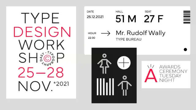
Mundial font family from TipoTypeThe complete family is available on these platforms:
MyFonts FontspringWhat Makes the Mundial Font Family Different from Other Neutral Sans-Serifs?
“Neutral” is a word designers often misuse. Many typefaces chase neutrality by stripping out personality—leaving behind something that’s technically functional but visually inert. Mundial doesn’t do that. Instead, it reaches something I’d call synthetic harmony: the state in which a typeface’s diverse influences have been resolved into a unified visual voice.
Look at its letterforms carefully. You’ll spot moments that feel reminiscent of mid-century European grotesques—tight apertures, measured stroke contrast. Then turn a corner, and you’ll notice subtler humanist touches: a gentle warmth in certain curves, a rhythm that breathes. Neither tradition dominates. Both inform the whole.
This is what TipoType means when they say the main characteristic of Mundial is “the summary, the cohesion, and the sum that results in more than each individual part.” That’s not marketing language. That’s an actual description of what happens when you set a headline in Mundial Bold and then flow body copy in Mundial Light below it. The family holds together. It has range without contradiction.
The Synthetic Harmony Principle in Type Design
Let me introduce a framework worth naming: the Synthetic Harmony Principle. It describes typefaces that derive their identity not from a single stylistic tradition but from the deliberate, coherent integration of multiple ones. Typefaces built on this principle resist easy categorization. They resist it on purpose.
Mundial exemplifies this principle better than most contemporary sans-serifs. Its designers—the TipoType team, led by Fernando Díaz, Martin Sommaruga, and Vicente Lamónaca—didn’t set out to make a “Latin American Grotesque” or a “digital-era Humanist.” They set out to make something that could belong anywhere. That’s a much harder design problem, and it shows in the execution.
Compare this to typefaces that wear their tradition on their sleeve. Helvetica signals Swiss precision. Gill Sans signals British eccentricity. Neither is better nor worse for doing so. But the Mundial typeface signals something different—a kind of cosmopolitan confidence. It says, “I come from everywhere, and I work everywhere.”
Mundial Font Technical Specifications: What Designers Actually Get
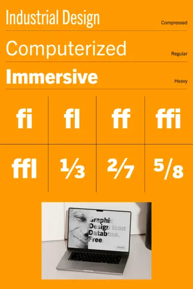
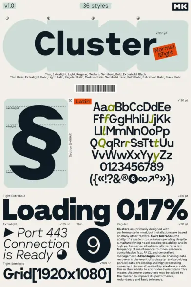
Let’s talk specifics, because Mundial’s technical depth is genuinely impressive. The family ships with 14 styles across 7 roman and 7 italic weights. Those weights run from Thin through Black, giving designers the full range of expressive options—from airy editorial use to bold headline applications.
The OpenType feature set is thorough. Mundial supports localized forms, stylistic sets, stylistic alternates, ordinals, superiors, subs, old-style numerals, tabular numerals, self-building fractions, kerning, ligatures, discretionary ligatures, and case-sensitive forms. That’s not a checklist—it’s a working toolbox. Each of those features has real-world implications for typesetting quality.
Language Coverage as a Design Feature
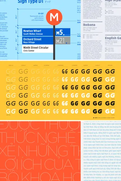
Mundial supports 219 languages. That number deserves a pause. Most professional typefaces cover the major European languages and stop there. Mundial extends to languages including Welsh, Swahili, Māori, Quechua, and dozens of creole and indigenous languages. The glyph count sits at 745 characters.
This isn’t just a technical achievement. It’s an extension of the typeface’s core identity. A font named “Worldwide” that only works in Western European contexts would be a contradiction. The language support resolves that contradiction completely. Mundial’s available formats include OTF, TTF, WOFF2, WOFF, EOT, and SVG—covering every serious deployment scenario from print to web to app.
For designers working on global brand systems, this comprehensiveness eliminates a recurring headache: needing separate typefaces for different regional deployments. Mundial handles the Latin-script world in a single, coherent family.
Mundial Font in Use: Where This Typeface Performs Best
I’ve been watching how designers use Mundial across editorial, branding, and digital contexts. A few use cases stand out as particularly strong.
In editorial design, Mundial’s weight range allows it to carry an entire publication. Thin and Light work beautifully for extended body text—open enough to be comfortable at small sizes and distinctive enough to avoid blandness. The Bold and Black weights hit hard in headlines without feeling aggressive. That balance is rarer than it sounds.
In brand identity work, Mundial’s cultural neutrality is its biggest asset. It doesn’t announce itself the way more opinionated typefaces do. This makes it ideal for international brands that need consistency across markets without privileging any single cultural register. The font communicates quality and modernity without pinning those qualities to a specific geography.
The Mundial Narrow Companion: Extending the System
TipoType also developed Mundial Narrow, a condensed companion with its own weight range. The narrow variant is particularly suited to corporate identity work and editorial applications where column space is tight. It inherits Mundial’s cosmopolitan spirit and its tradition-blending approach, while offering the proportional flexibility that narrow typefaces uniquely provide.
Together, Mundial and Mundial Narrow form a robust type system. You can run the standard cut for hero content and long-form text, then shift to Narrow for data-dense contexts or tight layouts. The two families share enough DNA to coexist without visual conflict. That’s good type-system thinking.
TipoType’s Design Philosophy and What It Means for Mundial
TipoType is a Uruguayan foundry with over twelve years of type design practice. Their catalog spans a wide range of styles, but a consistent thread runs through it: attention to Latin American typographic culture alongside engagement with international design traditions.
Mundial fits that picture precisely. It emerges from a foundry that understands what it means to design for a globalized but culturally differentiated world. TipoType isn’t based in Zurich or New York. That matters. The perspective they bring to a typeface like Mundial is genuinely distinct from what you’d get from a European or North American foundry working in the same category.
This is what I’d call the Peripheral Clarity Effect: the tendency for foundries working outside the dominant typographic centers to produce typefaces with unusual synthetic range, precisely because they’re not anchored to any single tradition’s gravity. Mundial is a strong example of this effect. Its synthesis reads as natural rather than engineered, because it comes from a design culture that has always synthesized.
How Mundial Reflects a Broader Shift in Contemporary Type Design
The field of type design has been moving toward greater cultural inclusivity for years. Variable fonts, extended language support, and culturally responsive design systems are all part of this shift. Mundial arrived before the variable font conversation became ubiquitous, but its language philosophy anticipates it.
More recently, designers have started pushing back against the homogenizing effect of the dominant neo-grotesque aesthetic—the clean, sterile, borderless corporate sans-serif that every tech company adopted around the same time. Mundial offers an alternative path. It’s clean, yes. But it’s not sterile. It has history in it, carefully managed.
I predict that typefaces built on the Synthetic Harmony Principle will dominate brand typography over the next decade. Brands need to communicate globally without erasing local resonance. A typeface that synthesizes traditions rather than suppressing them is the right tool for that task. Mundial is ahead of that curve.
Mundial Font Pricing, Licensing, and Where to Get It
The full Mundial family is available from MyFonts and Fontspring. Desktop licensing for the full family starts at $249 for a single computer. Web licenses scale by monthly page views. App licensing is also available.
Mundial is additionally included in Adobe Fonts, making it accessible to all Adobe Creative Cloud subscribers at no additional cost. If you’re already in the Creative Cloud ecosystem, Mundial is one of the better-kept secrets in that library.
For teams working across multiple applications and platforms, TipoType offers corporate licensing. The pricing reflects the typeface’s professional positioning—this is not a bargain-bin purchase—but the depth of the family justifies the investment for serious typographic work.
Is the Mundial Font Worth the Investment?
Yes, and here’s my honest case for it. You’re not buying 14 styles of a generic sans-serif. You’re buying a type system with genuine philosophical coherence, 219-language support, a comprehensive OpenType feature set, and an accompanying narrow family that extends your design options significantly. For branding agencies or in-house design teams working on global communications, that combination is genuinely hard to replicate at this price point.
The alternative—licensing multiple typefaces to cover different cultural or tonal contexts—costs more and produces less visual consistency. Mundial’s synthesis does the work that a collection of narrower typefaces can’t.
Mundial Font Pairing: What Works Best With It
Mundial’s temperament makes it a cooperative partner. Its neutrality gives other typefaces room to breathe. A few pairings worth exploring:
For editorial work, pair Mundial’s text weights with a high-contrast serif—something with strong thick-thin contrast. The tension between Mundial’s relatively monolinear strokes and a more dramatic serif creates visual hierarchy without requiring aggressive size differences. Rufina, also from TipoType’s catalog, works naturally here.
For digital product design, Mundial functions well as a single-family system. Use Thin and Light for body content and secondary labels, Regular for interface text, Demi-Bold for interactive elements, and Bold for navigation and primary actions. The weight range is calibrated well enough to sustain a full UI hierarchy without introducing a second family.
For brand identity, consider pairing Mundial with a distinctive display typeface that brings the cultural specificity Mundial deliberately avoids. Let the display face be the regional voice; let Mundial carry the operational communication. That’s a powerful and underused brand typography strategy.
What “Worldwide” Really Means as a Typographic Statement
Names carry expectations. Calling a typeface “Mundial”—Worldwide—is a bold claim. Most typefaces named for places or global ideals don’t fully deliver on those names. Mundial does, and it does so through restraint rather than ambition.
The name doesn’t promise visual fireworks. It promises something harder: the ability to work everywhere, for everyone, without demanding that everyone adapt to it. That’s the Cosmopolitan Restraint framework—the design posture in which a typeface achieves global utility not by erasing its identity but by ensuring that identity doesn’t impose.
Mundial’s identity is the synthesis. Not any one tradition. Not any one culture. The whole is larger than its parts. That’s a philosophical position as much as a typographic one, and it’s one that more type designers should take seriously.
The complete family is available on these platforms:
MyFonts FontspringTipoType built something genuinely useful with Mundial. More importantly, they built something genuinely coherent. In a typographic landscape crowded with neo-grotesque revivals and trend-chasing hybrids, that coherence is its own kind of originality.
Frequently Asked Questions About the Mundial Font
What type of font is Mundial?
Mundial is a sans-serif typeface designed by the TipoType team, including Fernando Díaz, Martin Sommaruga, and Vicente Lamónaca. It belongs to a category best described as a synthetic sans-serif—a typeface that deliberately blends grotesque and humanist traditions into a unified, culturally inclusive style. It does not align strictly with any single historical typeface genre.
How many styles does the Mundial font family include?
The Mundial font family includes 14 styles: seven roman weights and seven matching italics. The weights range from Thin to Black, covering the full spectrum from delicate text use to bold display applications.
How many languages does Mundial support?
Mundial supports 219 languages with Latin-based scripts. This includes major European languages, indigenous languages from the Americas and Oceania, and a wide range of creole and regional languages. The glyph count is 745 characters.
Where can I buy or download the Mundial font?
You can purchase Mundial directly from MyFonts and Fontspring. If you have an Adobe Creative Cloud subscription, Mundial is available through Adobe Fonts at no additional cost.
What is Mundial Narrow?
Mundial Narrow is a condensed companion family to Mundial. It shares the same design philosophy and typographic DNA as the original, but features tighter proportions suited to corporate identity systems, editorial layouts, and any context where column width is limited. It also expands the Mundial type system for designers who need condensed and standard widths in a single, coherent family.
What OpenType features does Mundial include?
Mundial includes a comprehensive OpenType feature set: localized forms, stylistic sets, stylistic alternates, ordinals, superiors, subs, old-style numerals, tabular numerals, self-building fractions, kerning, ligatures, discretionary ligatures, and case-sensitive forms. These features support high-quality typesetting across both print and digital environments.
Is Mundial a good font for branding?
Yes. Mundial’s cultural neutrality, wide weight range, and extensive language support make it particularly well-suited for international brand identity work. It communicates professionalism and modernity without anchoring those qualities to any specific cultural tradition, which makes it effective across diverse markets.
What file formats does Mundial come in?
Mundial is available in OTF, TTF, WOFF2, WOFF, EOT, and SVG formats, covering desktop, web, and app deployment scenarios comprehensively.
How much does the Mundial font cost?
Desktop licensing for the full Mundial family starts at $249 for a single computer. Web and app licensing is also available and scales based on usage. Adobe Creative Cloud subscribers can access Mundial through Adobe Fonts at no additional cost.
Who designed the Mundial font?
Mundial was designed by the TipoType team, with Fernando Díaz, Martin Sommaruga, and Vicente Lamónaca among the credited designers. TipoType is a Uruguayan type foundry founded in 2007 with over twelve years of experience producing Latin-script typefaces for global markets.
Check out other high-quality typefaces in the Fonts category here at WE AND THE COLOR.
#font #fontFamily #fonts #Mundial #sansSerif #TipoType #typeface