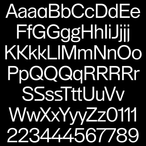
Lay Grotesk is a contemporary sans-serif #typeface designed by Massimiliano Vitti and published by #DueStudio in 2021.
Inspired by iconic grotesks like #Helvetica, Neue Haas Grotesk and Folio, Lay Grotesk combines the neutrality of Swiss #typefaces with a softer, more refined character.
https://due-studio.com/typefaces/lay-grotesk
#typedesign #typefacedesign #fontdesign #sansserif #typedesigner #font #webdesign #displayfont #typefoundry #therightfont
Due Studio | Lay Grotesk
Lay Grotesk is a contemporary sans serif typeface that reinterprets the style of the millestones grotesk like Helvetica, Neue Haas Grotesk and Folio. It carries on the idea of neutrality at the basis of Swiss typefaces, while smoothing out their rigidity. The more evident contrast softens the shapes making it elegant but at the same time without frills or other intrinsic meanings. It works very well at small sizes ensuring good readability, thanks also to the slightly reduced width of the letters which allows for denser text lines. However, at display sizes it reveals its geometric nature, exasperated in the design of some completely straight endings of the letters. There is therefore a formal alternation between soft and rigid, ‘human’ and ‘digital’ which makes it effective for different uses (from book design to corporate identity and poster design). The name clarifies its intentions: ‘Lay’, a timeless typeface for everyone. It consists of 785 glyphs, with various stylistic sets, OpenType features and case-sensitive forms, as well as many discretionary ligatures for both uppercase and lowercase. Lay Grotesk support the Latin Extended-A block. The family, in its 1.0 version, includes 5 weights from Regular to Black.