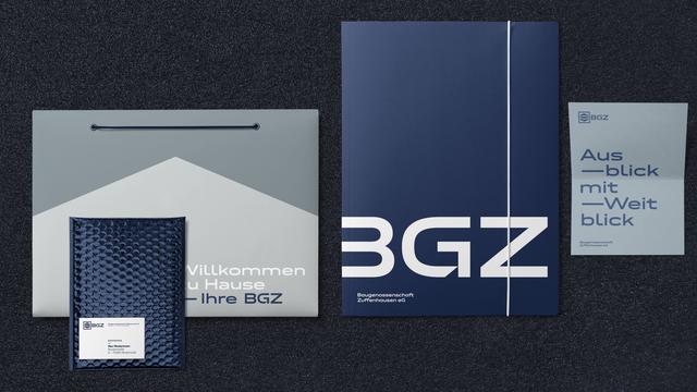
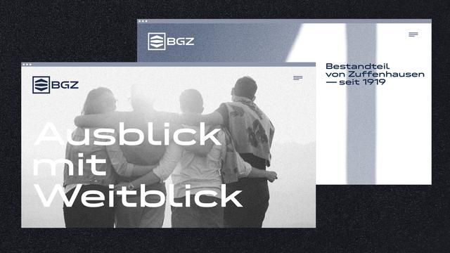
Seeing our #Fontwerk #fontsinuse really does make us smile. In this latest in-use case, Neue DIN helps Baugenossenschaft Zuffenhausen eG forge a new identity.

They recently looked to SCOPE, an interdisciplinary agency for architecture and interior design based in Stuttgart, to help them revamp and modernize their image.

The brand new BGZ logo features the semibold variant of Neue DIN XWide and it is also used as the #CorporateFont.

Check out the full case: https://fontwerk.com/text/baugenossenschaft-zuffenhausen-neue-din #ad

Baugenossenschaft Zuffenhausen

After more than 100 years: New logo, new corporate typeface (Neue DIN) and new colors for Baugenossenschaft Zuffenhausen

Fontwerk

The design agency tonic was tasked with coming up with a broad brand restructure and new #VisualIdentity for the Swiss energy supplier naturenergie. The company now has a brand new name, #naturenergie, a new color palette, new look and our very own Pangea by @koeberlin is now their #CorporateFont.

See Pangea in action: https://fontwerk.com/en/fonts-in-use/naturenergie-pangea

#ad

Naturenergie

Together with a large character set, Pangea’s range of services corresponds 100 percent to naturenergie’s brand essence: transparent, clear, powerful.

Fontwerk

Ein Fußballclub, der heutzutage etwas auf sich hält, legt sich eine eigene Hausschrift zu, findet auch Napoli. #Design #Branding #Typo #CorporateFont

https://www.designtagebuch.de/ssc-neapel-modifiziert-markenidentitaet/

SSC Neapel modifiziert Markenidentität - Design Tagebuch

Der SSC Neapel (Napoli), 1926 gegründet, präsentiert sich mit aufgefrischter Markenidentität. Eingebunden in eine zeitgleich lancierte Kampagne – „Proud To Be Napoli“ – stellt sich der italienische Meister der Saison 2022/23 im Visuellen neu auf, mit minimalistischem Logo und erstmals eigener Hausschrift.

Design Tagebuch